- From: Abma, J.D. (Jake) <Jake.Abma@ing.com>
- Date: Tue, 10 Dec 2019 14:05:47 +0000
- To: Alastair Campbell <acampbell@nomensa.com>
- CC: WCAG list <w3c-wai-gl@w3.org>
- Message-ID: <VI1PR03MB4462C681B9B85DB6262EEF77F15B0@VI1PR03MB4462.eurprd03.prod.outlook.com>
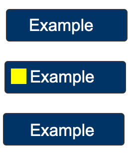
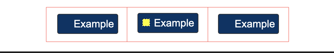
Ok I get that and also clear from a starting point for this SC, but with the examples given, what is your response / solution for the two examples?

Have a good solution to cover these to start with Or... will you stand by the fact that they should fail this SC?

PASS: Example from Understanding doc:

[cid:bcc96f75-cfd2-4e42-a063-df63e0bd185f]
FAIL: Same button but wider for bigger touch target OR even wider for mobile

[cid:6ce52eb3-b1fd-4474-af7e-58de5b21c159]

FAIL: Same buttons, but touch target area is made bigger and focusable

[cid:c12870ce-f0d0-4e22-b52b-bb110f70c4f3]
________________________________
From: Alastair Campbell <acampbell@nomensa.com>
Sent: Tuesday, December 10, 2019 2:52 PM
To: Abma, J.D. (Jake) <Jake.Abma@ing.com>
Cc: WCAG list <w3c-wai-gl@w3.org>
Subject: Re: Focus Visible (Enhanced)


Hi Jake,


Back on the list, but off the CFC thread so I can count it more easily ??


Basing the area required for the focus indicator on the size of the control was intentional for a couple of reasons:


  1.  A small indicator in a very large component (think ‘cards’) would easily be lost, the card could take up most of the screen, so a fixed size indicator based on an arbitrary small button size would not be visually apparent.

Proportional means it needs to be bigger for bigger UICs, this is about visually noticing things, not tapping them, different problems.

  2.  Testing is easier for a proportionally sized indicator. E.g. If you have a 1px outline with sufficient contrast, that’s a pass. That is easier for outlines and anything based on the size of the component.

Yes, it is fiddly when you have a fixed-size indicator that isn’t proportional, but if it were the other way around then most indicators would be fiddly to work out (i.e. if we decided on a fixed size of 200px squared, then you have to do a lot of calculations across different sized components that use a simple outline.


Cheers,


-Alastair


From: "Abma, J.D. (Jake)"


seems a way better and logical approach building on top of what we have (and see IF this may have it's own issues we might be able to solve)


________________________________

From: Jonathan Avila

Jake, sounds like you are asking for some threshold to be set.  If the area is bigger than x by y pixels then it passes regardless of comparison to longest side   I supposed this could have its own issues as well though for long thin indicators.


Jon


Hi Jonathan,


I know that but it's a bit of another issue.


See the next two images:


<focus-indicator-icon (1).png>


AND...

<focus-indicator-icon-stacked.png>


For the first one, the indicator is a pass / OK

For the second one I made the buttons just a bit bigger (wider) for increased touch target, but now the indicator fails!


ALSO


When this indicator (the yellow square) is fine for indication, WHY would it not be for other UICs (if the size of the UIC is bigger than for the Example buttons in Alastair's example)


We want the focus indicator to be 'seen' and if the square is enough to be seen, the size of the UIC shouldn't matter anymore for this SC.

________________________________

From: Jonathan Avila


Jake, I think the minimum area here is not of the button or control but the focus indicator which may be smaller than the longest side.   So if you had a focus indicator on the shorter side that was just a vertical line it would have to be thicker.  That is my understanding.


Jonathan

Sent from my iPhone


On Dec 10, 2019, at 5:37 AM, Abma, J.D. (Jake) <Jake.Abma@ing.com> wrote:

coming back on this CfC and my last comment: my biggest question would be WHY a focus indicator MUST be bigger than others (based on touch target)?


It just doesn't make sense if we compare them to other UICs and their indicator:


------------------------------


IF a focus indicator is enough, wouldn't this be enough in other cases too on the same page?


SO, shouldn't a clear focus indicator not be enough to be based on a specific size (as we have for AAA touch target)?


A clear focus indicator is a clear focus indicator, no matter how big the target area is.

________________________________

From: Alastair Campbell


>  doesn't the "or" clause then simply allow absolutely faint contrast
> ratio to be used, as long as the thickness is 2 CSS pixels?

All bullets have to be true, so this is in combination with the 2nd.
(https://raw.githack.com/w3c/wcag/wcag22-focus-visible-enhanced/understanding/22/focus-visible-enhanced.html )

I.e. the change of contrast has to be there (2nd bullet). *Then* it has to contrast with its adjacent colors *or* be thicker.

>    I'm assuming this is supposedly then covered by the following note

No, the note is for the 2nd bullet, although it hasn't changed since the third was added. Perhaps we need to make the note more specifically for the 2nd bullet then?

"E.g. Note: A focus indicator that is larger than the minimum area may have parts that do not meet the 3:1 focus contrast requirement, as long as an area equal to the minimum does meet the contrast ratio."

-Alastair

-----------------------------------------------------------------
ATTENTION:
The information in this e-mail is confidential and only meant for the intended recipient. If you are not the intended recipient, don't use or disclose it in any way. Please let the sender know and delete the message immediately.
-----------------------------------------------------------------
Attachments
- image/png attachment: focus-indicator-icon__1_.png

- image/png attachment: focus-indicator-icon-stacked.png
- image/png attachment: focus-indicator-icon-bigger-touch.png
Received on Tuesday, 10 December 2019 14:05:56 UTC