- From: David MacDonald <david100@sympatico.ca>
- Date: Thu, 6 Jun 2019 15:12:47 -0400
- To: Bruce Bailey <Bailey@access-board.gov>
- Cc: "w3c-waI-gl@w3. org" <w3c-wai-gl@w3.org>
- Message-ID: <CAAdDpDbvrLtjcsenzDhUuvr91t_Yw3GSwaR4xyo3shuDGEHzmg@mail.gmail.com>
Hi Bruce

I think we are trying to help more than just colour blindness with our
contrast algorithm.
https://www.w3.org/TR/UNDERSTANDING-WCAG20/visual-audio-contrast-contrast.html

I think some people with low vision are disproportionately affected by
perceived low contrast.

Having said that, I don't know what would need to be done to the algorithm
to improve it, and without, as Gregg said, significant input by
knowledgeable researchers, like Lighthouse did back in the day, who are
sensitive to the great amount of research put into our current algorithm,
with a proposal and a demonstration of the benefits of the improvements, I
wouldn't revisit the algorithm.


Cheers,
David MacDonald


*Can**Adapt* *Solutions Inc.*

Tel:  613-806-9005

LinkedIn
<http://www.linkedin.com/in/davidmacdonald100>

twitter.com/davidmacd

GitHub <https://github.com/DavidMacDonald>

www.Can-Adapt.com <http://www.can-adapt.com/>


*  Adapting the web to all users*
*            Including those with disabilities*

If you are not the intended recipient, please review our privacy policy
<http://www.davidmacd.com/disclaimer.html>


On Thu, Jun 6, 2019 at 2:28 PM Bruce Bailey <Bailey@access-board.gov> wrote:

> I am okay with the algorithm permitting certain poor contrast combinations
> because I would argue that its main purposes is to catch for
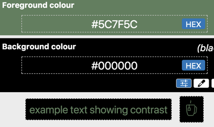
> colorblindness.  David, I fed your image [1] into:
> http://www.color-blindness.com/coblis-color-blindness-simulator
>
>
>
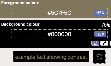
> Then I selected Red-Blind/Protanopia and got [2]:
>
> [image: Screenshot of a text example, dark green and black.]
>
>
>
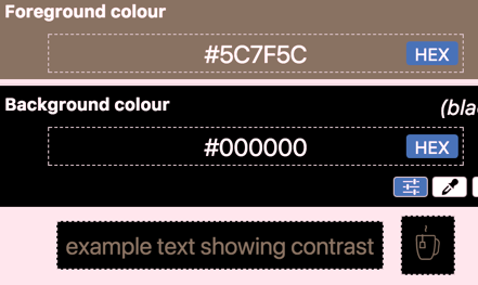
> Then I select Green-Blind/Deuteranopia to get [3]:
>
> [image: Screenshot of text sample, dark red and black.]
>
>
>
> For [1] I get a luminosity contrast ratio of 4.7:1 (but hex value I am
> sampling is 637E5F, not 5C7F5C)
> For [2] and [3] I get a luminosity contrast ratio of 4.6:1
>
>
>
> So [1] has marginal apparent contrast, but has marginal contrast for
> *everyone*, and someone with color blindness is not facing a
> disproportionate barrier.  So the algorithm is doing the job it is supposed
> to do!
>
>
>
>
>
> *From:* David MacDonald <david100@sympatico.ca>
> *Sent:* Monday, May 27, 2019 11:06 AM
> *To:* Gregg Vanderheiden RTF <gregg@raisingthefloor.org>
> *Cc:* Dick <wayneedick@gmail.com>; w3c-waI-gl@w3. org <w3c-wai-gl@w3.org>;
> Tom Jewett <tom@knowbility.org>; IG - WAI Interest Group List list <
> w3c-wai-ig@w3.org>
> *Subject:* Re: A color tutorial from Tom Jewett
>
>
>
> For me, I like the algorithm in general and think we should keep it.
>
>
>
> There are, however, a few color combinations that seem a little weird to
> me. Usually, a threshold contrast (4.5:1) it is when one is black. I think
> there has been a little buzz around that in the public.
>
>
>
> I'd like to see a study identifying these types of combinations that seem
> harder to see than some failing contrasts, with suggestions on adjustments
> we can adjust the algorithm.
>
>
>
>
>
> [image: image.png]
>
>
>
>
>
> Cheers,
> David MacDonald
>
>
>
> *Can**Adapt* *Solutions Inc.*
>
> Tel:  613-806-9005
>
> LinkedIn
>
> <https://nam01.safelinks.protection.outlook.com/?url=http%3A%2F%2Fwww.linkedin.com%2Fin%2Fdavidmacdonald100&data=02%7C01%7Cbailey%40access-board.gov%7C1b5326da65c547a55a4a08d6e2b513ff%7Cfc6093f5e55e4f93b2cf26d0822201c9%7C0%7C0%7C636945664695477655&sdata=GBjLUsQLwH0siu6Ys2kpvoAAiP9bAE2BnGD1yb8MtkM%3D&reserved=0>
>
> twitter.com/davidmacd
> <https://nam01.safelinks.protection.outlook.com/?url=http%3A%2F%2Ftwitter.com%2Fdavidmacd&data=02%7C01%7Cbailey%40access-board.gov%7C1b5326da65c547a55a4a08d6e2b513ff%7Cfc6093f5e55e4f93b2cf26d0822201c9%7C0%7C0%7C636945664695487667&sdata=IRoBFCtPwJirZ6he8nR%2FAx6gwrzlSioDYjcNLaUrGBA%3D&reserved=0>
>
> GitHub
> <https://nam01.safelinks.protection.outlook.com/?url=https%3A%2F%2Fgithub.com%2FDavidMacDonald&data=02%7C01%7Cbailey%40access-board.gov%7C1b5326da65c547a55a4a08d6e2b513ff%7Cfc6093f5e55e4f93b2cf26d0822201c9%7C0%7C0%7C636945664695497671&sdata=CRZWB%2BtB86wJC%2BBRLqy1IlpGqLco79SRLczLglftNzs%3D&reserved=0>
>
> www.Can-Adapt.com
> <https://nam01.safelinks.protection.outlook.com/?url=http%3A%2F%2Fwww.can-adapt.com%2F&data=02%7C01%7Cbailey%40access-board.gov%7C1b5326da65c547a55a4a08d6e2b513ff%7Cfc6093f5e55e4f93b2cf26d0822201c9%7C0%7C0%7C636945664695507679&sdata=pw%2Bz5BQ0%2B0Qujai2o8jp0rZ%2BdjamhpI1IUngfS1r7EE%3D&reserved=0>
>
>
>
> *  Adapting the web to all users*
>
> *            Including those with disabilities*
>
>
>
> If you are not the intended recipient, please review our privacy policy
> <https://nam01.safelinks.protection.outlook.com/?url=http%3A%2F%2Fwww.davidmacd.com%2Fdisclaimer.html&data=02%7C01%7Cbailey%40access-board.gov%7C1b5326da65c547a55a4a08d6e2b513ff%7Cfc6093f5e55e4f93b2cf26d0822201c9%7C0%7C0%7C636945664695517688&sdata=mESjvdFJnlfPa8Q%2BxplcLiRTXq%2B1alIQnXIrwPhWbNY%3D&reserved=0>
>
>
>
>
>
> On Sun, May 26, 2019 at 11:19 PM Gregg Vanderheiden RTF <
> gregg@raisingthefloor.org> wrote:
>
> Hi Wayne    (sorry tired)
>
>
>
> Here is some information that might be helpful.
>
>
>
> This topic seems to come up again every few years.
>
>
>
> Before diving into it again — it might be helpful to know all the work and
> research that went into developing the measure in the first place.  It
> takes into account much more than most measures of contrast do - -
> including both low vision and the different types of color blindness.
>
>
>
> The current contrast measure was developed based on both international
> standards and research on low-vision and color blindness - and was done in
> collaboration with research scientist at the Lighthouse for the blind.
> Over a year was spent on researching and developing it.   It was based on
> international standards and then adjusted to control for legibility and
> contrast when the different types of color blindness and low vision were
> applied.     We did this work because we were unable to find any other
> researchers who had done any work to account for these when coming up with
> their contrast measures.
>
>
>
> The current measure takes into account the following things
>
>    - Reseach on standard contrasts levels
>    - Research quantifying the need for increased contrast with reduced
>    visual acuity
>    - The quantification of the differences in contrast perceived with
>    different color combinations for people with different types of color
>    vision differences (including Protan, Deutan, Tritan, and Mono or Achro (no
>    color) vision differences.
>    - The range of contrast that would allow three items to maintain color
>    contrast with each other.  (That is -   A contrasts sufficiently with B
>    which contrasts sufficiently with C  without A and C having to be pure
>    black and white.
>    - And the full range of colors that would be possible and still meet
>    any color contrast requirements.   (In WCAG’s case   4.5:1 and 7:1)
>
>
>
> Any new efforts to revisit should be at least as thorough and take all of
> these into account quantitatively.
>
>    - By the way —If anyone is aware of such - please do let me know so I
>    can capture that other information on the DeveloperSpace
>    <https://nam01.safelinks.protection.outlook.com/?url=http%3A%2F%2Fds.gpii.net%2F&data=02%7C01%7Cbailey%40access-board.gov%7C1b5326da65c547a55a4a08d6e2b513ff%7Cfc6093f5e55e4f93b2cf26d0822201c9%7C0%7C0%7C636945664695527696&sdata=K9GCkFZ4COd6duUtIgH2Ip6gY%2BPOaunYDpuQaqRqCl8%3D&reserved=0>
>    - a  central reference being developed to support developers, policy etc.
>
>    - (the MasterList
>    <https://nam01.safelinks.protection.outlook.com/?url=https%3A%2F%2Fds.gpii.net%2Flearn%2Faccessibility-masterlist&data=02%7C01%7Cbailey%40access-board.gov%7C1b5326da65c547a55a4a08d6e2b513ff%7Cfc6093f5e55e4f93b2cf26d0822201c9%7C0%7C0%7C636945664695537704&sdata=xb%2B66wkoeI8LdFfi2eln47%2B81Vn%2FTH5%2Fuhd3CTUCo9k%3D&reserved=0> may
>    also be of interest — with a full page devoted to applications, tools and
>    research for each of the 80+ access strategies identified  - with a $50
>    reward for any strategy not listed or covered by a listed strategy )
>
>
>
>
>
> As to the age of the tool — we are using tools that are hundreds of years
> old in science all the time.
>
>  The age is not really relevant.
>
>
>
> Is there something else that makes you think the old tool is no longer
> valid?
>
>
>
> If so — that is where we should start.  With what the perceived problem is
> with the old tool.
>
> What has changed that made it no longer work?
>
>
>
> All the best.
>
>
>
> Gregg
>
>
>
>
>
>
>
> On May 23, 2019, at 2:53 PM, Wayne Dick <wayneedick@gmail.com> wrote:
>
>
>
> I think it is time to look at contrast and color.
>
> Our formula may be the one, but it may not. This would really be a
> research effort.
>
> As mentioned before, we can calibrate any new test on the same scale we
> use now so that the user interface of tests won't need to change much.
>
> What we need muster is our talent in the mathematics, physics, electrical
> engineering, vision science, photography and art.
>
>
>
> There has been enough concern expressed about the current formula that it
> seems reasonable to review our research and improve it if needed.
>
>
>
> Maybe we need a different formula. Maybe we need to do more with
> accessibility testing to ensure standardized evaluation. I just don't know,
> but I am concerned with the distrust of our numbers.
>
>
>
> I could use some suggestions about how to proceed organizationally. This
> is not controversial. We are using a 10 year old tool in rapidly evolving
> technology. A calm scientific review is in order. Tom Jewett and I are
> happy to contribute.
>
>
>
> Best to All, Wayne
>
>
>
> Best, Wayne
>
>
>
>
>
>
>
>
Attachments
- image/png attachment: image001.png

- image/png attachment: image002.png

- image/png attachment: image003.png

Received on Thursday, 6 June 2019 19:13:25 UTC