- From: David MacDonald <david100@sympatico.ca>
- Date: Mon, 27 May 2019 11:06:15 -0400
- To: Gregg Vanderheiden RTF <gregg@raisingthefloor.org>
- Cc: Dick <wayneedick@gmail.com>, "w3c-waI-gl@w3. org" <w3c-wai-gl@w3.org>, Tom Jewett <tom@knowbility.org>, IG - WAI Interest Group List list <w3c-wai-ig@w3.org>
- Message-ID: <CAAdDpDZ+GRW_5ShF7G2OtRe-bortOZ=ODn4Jmu4kEBGD38wChQ@mail.gmail.com>
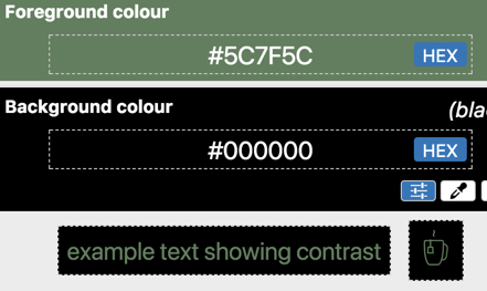
For me, I like the algorithm in general and think we should keep it.

There are, however, a few color combinations that seem a little weird to
me. Usually, a threshold contrast (4.5:1) it is when one is black. I think
there has been a little buzz around that in the public.

I'd like to see a study identifying these types of combinations that seem
harder to see than some failing contrasts, with suggestions on adjustments
we can adjust the algorithm.


[image: image.png]


Cheers,
David MacDonald


*Can**Adapt* *Solutions Inc.*

Tel:  613-806-9005

LinkedIn
<http://www.linkedin.com/in/davidmacdonald100>

twitter.com/davidmacd

GitHub <https://github.com/DavidMacDonald>

www.Can-Adapt.com <http://www.can-adapt.com/>


*  Adapting the web to all users*
*            Including those with disabilities*

If you are not the intended recipient, please review our privacy policy
<http://www.davidmacd.com/disclaimer.html>


On Sun, May 26, 2019 at 11:19 PM Gregg Vanderheiden RTF <
gregg@raisingthefloor.org> wrote:

> Hi Wayne    (sorry tired)
>
> Here is some information that might be helpful.
>
> This topic seems to come up again every few years.
>
> Before diving into it again — it might be helpful to know all the work and
> research that went into developing the measure in the first place.  It
> takes into account much more than most measures of contrast do - -
> including both low vision and the different types of color blindness.
>
> The current contrast measure was developed based on both international
> standards and research on low-vision and color blindness - and was done in
> collaboration with research scientist at the Lighthouse for the blind.
> Over a year was spent on researching and developing it.   It was based on
> international standards and then adjusted to control for legibility and
> contrast when the different types of color blindness and low vision were
> applied.     We did this work because we were unable to find any other
> researchers who had done any work to account for these when coming up with
> their contrast measures.
>
> The current measure takes into account the following things
>
>    - Reseach on standard contrasts levels
>    - Research quantifying the need for increased contrast with reduced
>    visual acuity
>    - The quantification of the differences in contrast perceived with
>    different color combinations for people with different types of color
>    vision differences (including Protan, Deutan, Tritan, and Mono or Achro (no
>    color) vision differences.
>    - The range of contrast that would allow three items to maintain color
>    contrast with each other.  (That is -   A contrasts sufficiently with B
>    which contrasts sufficiently with C  without A and C having to be pure
>    black and white.
>    - And the full range of colors that would be possible and still meet
>    any color contrast requirements.   (In WCAG’s case   4.5:1 and 7:1)
>
>
> Any new efforts to revisit should be at least as thorough and take all of
> these into account quantitatively.
>
>    - By the way —If anyone is aware of such - please do let me know so I
>    can capture that other information on the DeveloperSpace
>    <http://ds.gpii.net/>  - a  central reference being developed to
>    support developers, policy etc.
>    - (the MasterList <https://ds.gpii.net/learn/accessibility-masterlist> may
>    also be of interest — with a full page devoted to applications, tools and
>    research for each of the 80+ access strategies identified  - with a $50
>    reward for any strategy not listed or covered by a listed strategy )
>
>
>
> As to the age of the tool — we are using tools that are hundreds of years
> old in science all the time.
>  The age is not really relevant.
>
> Is there something else that makes you think the old tool is no longer
> valid?
>
> If so — that is where we should start.  With what the perceived problem is
> with the old tool.
> What has changed that made it no longer work?
>
> All the best.
>
> Gregg
>
>
>
> On May 23, 2019, at 2:53 PM, Wayne Dick <wayneedick@gmail.com> wrote:
>
> I think it is time to look at contrast and color.
> Our formula may be the one, but it may not. This would really be a
> research effort.
> As mentioned before, we can calibrate any new test on the same scale we
> use now so that the user interface of tests won't need to change much.
> What we need muster is our talent in the mathematics, physics, electrical
> engineering, vision science, photography and art.
>
> There has been enough concern expressed about the current formula that it
> seems reasonable to review our research and improve it if needed.
>
> Maybe we need a different formula. Maybe we need to do more with
> accessibility testing to ensure standardized evaluation. I just don't know,
> but I am concerned with the distrust of our numbers.
>
> I could use some suggestions about how to proceed organizationally. This
> is not controversial. We are using a 10 year old tool in rapidly evolving
> technology. A calm scientific review is in order. Tom Jewett and I are
> happy to contribute.
>
> Best to All, Wayne
>
> Best, Wayne
>
>
>>
>
Attachments
- image/png attachment: image.png
Received on Monday, 27 May 2019 15:06:50 UTC