- From: David MacDonald <david100@sympatico.ca>
- Date: Sat, 26 May 2018 21:48:10 -0400
- To: Andrew Kirkpatrick <akirkpat@adobe.com>
- Cc: WCAG <w3c-wai-gl@w3.org>
- Message-ID: <CAAdDpDYHo9aY1u+z9YcpDHj3tEB3uw-45yJPKNVvYzFvBF1-iA@mail.gmail.com>
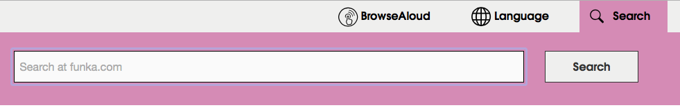
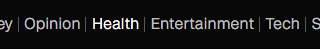
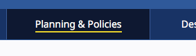
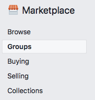
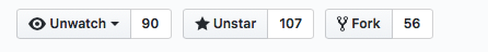
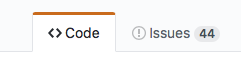
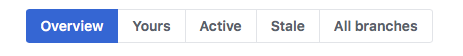
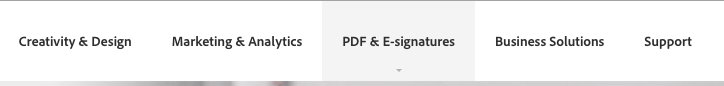
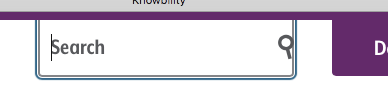
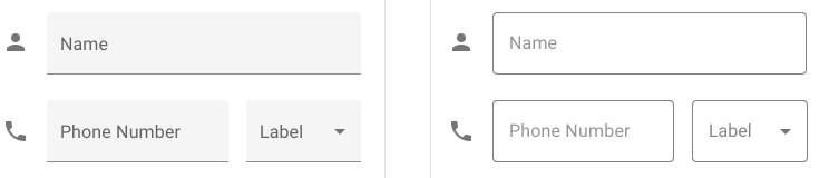
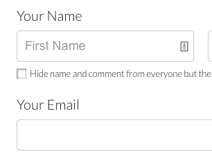
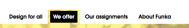
Given the limited implementation experience, I think we should take the
most liberal interpretation possible in the understanding doc without
sending us back the CR. A future version can strengthen requirements but
with backward compatibility future versions can't be loosened until Silver.

> ... Visual information used to indicate states
<https://www.w3.org/TR/WCAG21/#dfn-states> and boundaries of user interface
components <https://www.w3.org/TR/WCAG21/#dfn-user-interface-components>,...

I think having just one boundary (i.e, underline in #12, overline in #2)
with the proper ratio should be ok... if so we need to interpret the plural
of "boundaries" as:

"All of your component*(s)* have boundary*(s). There are are more than one
components on the page therefore boundaries is plural"

Rather than

"Each of the component's boundar**ies** must have sufficient contrast"

My questions about the pass/fail determinations

   - Not sure why #3 passes. The button and the border are less than 3:1
   - Not sure why #4 passes for the non selected items, is that because
   they are (inactive). I wouldn't call them that because they are clickable.
   - Not sure why 7 passes. The arrow dropdown doesn't have sufficient
   contrast
   - Not sure why 10 passes. The boundaries for the clickable region
   (Search) is less than 3:1
   - Not sure why 13 passes. The boundaries for the clickable region (light
   purple) is less than 3:1


Cheers,
David MacDonald


*Can**Adapt* *Solutions Inc.*

Tel:  613.235.4902

LinkedIn
<http://www.linkedin.com/in/davidmacdonald100>

twitter.com/davidmacd

GitHub <https://github.com/DavidMacDonald>

www.Can-Adapt.com <http://www.can-adapt.com/>


*  Adapting the web to all users*
*            Including those with disabilities*

If you are not the intended recipient, please review our privacy policy
<http://www.davidmacd.com/disclaimer.html>

On Sat, May 26, 2018 at 6:42 PM, Andrew Kirkpatrick <akirkpat@adobe.com>
wrote:

> AGWG’ers,
>
>
>
> **WARNING – lengthy but important and time-critical email!**
>
>
>
> We have a few concerns raised about 1.4.11 Non-text contrast:
>
>
>
>    1. Concern from Funka (see Word doc attachment at
>    https://lists.w3.org/Archives/Public/public-comments-wcag20/
>    2018May/0001.html
>    <https://lists.w3.org/Archives/Public/public-comments-wcag20/2018May/0001.html>)
>    that the Color limitations for buttons with text on a colored background
>    are too limiting. People either won’t be able to use yellow or will need to
>    use an extra border and that will be unpopular for designers. This is the
>    same issue as the concern about boundaries in Issue 914:
>    https://github.com/w3c/wcag21/issues/914
>    <https://github.com/w3c/wcag21/issues/914>.
>    2. Does the hover state indicator need to have 3:1? (Issue 913:
>    https://github.com/w3c/wcag21/issues/913
>    <https://github.com/w3c/wcag21/issues/913>)
>
>
>
> *So, what do we do? I think that it helps to look at a bunch of examples:*
>
>
>
> As a reminder, this is the SC text:
>
> 1.4.11
>
> The visual presentation <https://www.w3.org/TR/WCAG21/#dfn-presentation> of
> the following have a contrast ratio
> <https://www.w3.org/TR/WCAG21/#dfn-contrast-ratio> of at least 3:1
> against adjacent color(s):
>
> *User Interface Components*
>
> Visual information used to indicate states
> <https://www.w3.org/TR/WCAG21/#dfn-states> and boundaries of user
> interface components
> <https://www.w3.org/TR/WCAG21/#dfn-user-interface-components>, except for
> inactive components or where the appearance of the component is determined
> by the user agent and not modified by the author;
>
> *Graphical Objects*
>
> Parts of graphics required to understand the content, except when a
> particular presentation of graphics is essential
> <https://www.w3.org/TR/WCAG21/#dfn-essential> to the information being
> conveyed.
>
>
>
>
>
>    1. Knowbility’s search box. There is 4.5:1 text that indicates that
>    there is something for the user to activate. It is a search box and when
>    you click on it the placeholder text shifts to the left and exposes the
>    full area of the input.
>
>
>
>
>
>    1. Github’s tab interface. It is pretty clear which tab has the
>    selected state because of the red accent, but there is definitely not 3:1
>    contrast between the background colors of “code” and “issues”, nor is the
>    line between these 3:1.
>
>
>
>    1. Github buttons. For the “unwatch” button, the contrast between the
>    inside of the button and the outside is 1.08:1, and between the border line
>    and the outside background is 1.62:1. The contrast between the unwatch text
>    and the little triangle that indicates the drop down is 13.79:1.
>
>
>    1. Github buttons #2. The contrast everywhere is sufficient except in
>    the thin border line around the not-currently-selected items.
>
>
>    1. New WAI site. The difference in contrast between a hovered item and
>    a non-hovered item in the nav is 1:40:1, but there is a high-contrast
>    underline that is also part of the hover.
>
>
>    1. CNN. Contrast of hovered and non-hovered text is greater than
>    4.5:1. Contrast between the hovered and non-hovered text is 1.84:1.
>
>
>
>    1. Adobe. The light gray background appears on hover and the tiny
>    little triangle appears. The text has sufficient contrast in hover and
>    non-hover states, but the hover background and triangle don’t.
>
>
>
>
>
>    1. LevelAccess – high-contrast throughout.
>
>
>
>
>
>    1. Funka. Active/selected tab shows sufficient contrast for state. The
>    non-selected tabs don’t use color to indicate the boundaries.
>
>
>
>    1. Funka Search. The three items in the top nav – the left two don’t
>    use color to indicate the boundary. The right button does but the contrast
>    isn’t 3:1.
>
>
>    1. Funka search open. Once the search button is open, everything seems
>    to have suffient 4.5/3:1 contrast.
>
>
>
>    1. Material design. Text fields come in two forms. The example on the
>    left has a field background that is less than 3:1 with the background, but
>    the line marking the bottom boundary of the field is 3.28:1 on the
>    background. For the triangle in the drop down the ratio is 3.02:1 relative
>    to the field background.  On the right, the border has a 3.64:1 ratio to
>    the background, but it goes all the way around.
>
>
>
>    1. Material design selection. The selected item on the left has a
>    greater than 3:1 ratio for the checked/unchecked box, but the purple
>    background is not 3:1. On the right, the purple activated color has >6:1
>    contrast against the light purple and >7:1 against the white, but the
>    purple background is less than 3:1 against the white.
>
>
>
>    1. GoFundMe donate page: The “your name” label text (not properly
>    labeled) is >4.5:1, but the field border and placeholder text are less than
>    3:1.
>
>
>    1. Buttons with specific boundaries – contrast between states is
>    1.75:1, so to some people this just looks like one green area.
>
>
>
>    1. Facebook marketplace active area indicator. The greatest contrast
>    is the whitish background of groups and the thin border between that and
>    the light grey background. 1.22:1 contrast.
>
>
>
>    1. Bootstrap checkbox. The checkbox is 1.30:1 contrast relative to the
>    background.
>
> https://getbootstrap.com/docs/4.1/components/forms/#inlineFormCustomSelect
> <https://na01.safelinks.protection.outlook.com/?url=https%3A%2F%2Fgetbootstrap.com%2Fdocs%2F4.1%2Fcomponents%2Fforms%2F%23inlineFormCustomSelect&data=02%7C01%7Cakirkpat%40adobe.com%7C05736cdf6373468230e408d5c31ae33d%7Cfa7b1b5a7b34438794aed2c178decee1%7C0%7C0%7C636629442639781231&sdata=TMFTI316LNA3T8bUUPXyKIZFx7xFqdw5wbyvsbke4Tw%3D&reserved=0>
>
>
>
>
>
>
>
> *Interpretation:*
>
> My interpretation of the SC, and what I believe that the WG intended is
> that:
>
>    1. Visual information that is important to identifying the state or
>    existence (boundary) needs to be at least 3:1.
>    2. All visual aspects of a UI Component at not required to meet 3:1,
>    only if it is required to identity the state or existence of the control.
>    3. For some components, text that is 4.5:1 is entirely sufficient to
>    meet the requirements of 1.4.11.
>       1. Are we requiring a full boundary around links (which are UI
>       Components)? I don’t believe so.
>       2. Are we ok with a set of tabs like in example #9 above, or does
>       each tab need a full boundary to indicate the click area? I believe so.
>    4. If a color is less than 3:1, you need to pretend that it doesn’t
>    exist at all and assess whether the component passes based on other
>    information.
>       1. Compare the same set of tabs in example #9 and consider whether
>       it is less accessible if the non-active tabs have a pale color background.
>    5. Hover is covered, but not relative to the component’s own non-hover
>    state. What is covered is that the hover state needs to meet the 3:1 ratio
>    for any non-text content. This means that if there is an icon in a button
>    that fades out when hovered, it would fail (just like is the case for 1.4.3
>    if text in a hovered button fades on hover).
>
>
>
> *With my interpretation the examples above are rated:*
>
>    1. Pass
>    2. Borderline fail – perhaps an uncomfortable pass?
>    3. Pass
>    4. Pass
>    5. Pass
>    6. Pass
>    7. Pass
>    8. Pass
>    9. Pass
>    10. Pass
>    11. Pass
>    12. Pass – the right side example passes easily. The left side, with
>    the underline border is, I think, an uncomfortable pass. Like a lined paper
>    form, people can figure out the rough size of the fields by proximity and
>    spacing, so one line is minimally sufficient.
>    13. Pass
>    14. Is interesting – this example clearly fails, but if the control
>    was properly associated with the label would that help since that creates a
>    clickable region that has sufficient contrast and then the control becomes
>    more visible when focused because of the focus rectangle or input carat?
>    15. Fail – the contrast for the boundary is particularly significant
>    in this situation.
>    16. Fail – the contrast for the selected state. This is an example of
>    communicating information by color alone and the contrast doesn’t make up
>    for the color.
>    17. Fail - Similar to #14. Some might argue that if the label is
>    properly associated that this makes the text label and image part of one
>    control and therefore ok, and we should be clear about that in a technique
>    or failure.
>
>
>
> If you find that you are agreeing that my interpretation reflects the
> intent of the Working Group, or that you are disagreeing that it reflects
> the intent of the Working Group, please say so.
>
>
>
> I have a pull request that implements changes in the Understanding
> document in line with this: https://github.com/w3c/wcag21/
> pull/943/files?utf8=✓&diff=split
>
>
>
> *Is there a downside?*
>
> One of the comments we received requested that we implement a requirement
> for a thicker boundary around components. This would unquestionably help
> people, but also creates problems in that we are specifying UI Components,
> including links and other interactive controls. Are we requiring that
> individual items within a select/drop down show clear boundaries since each
> is a separate clickable region? Both of these come into play if the strict
> interpretation of this SC is the intent of the group.
>
>
>
> I believe that we need to be unified and clear about this SC’s
> interpretation, and soon!
>
>
>
> AWK
>
>
>
Attachments
- image/png attachment: image012.png
- image/png attachment: image007.png
- image/png attachment: image006.png
- image/png attachment: image017.png
- image/png attachment: image004.png
- image/png attachment: image011.png

- image/jpeg attachment: image018.jpg
- image/png attachment: image001.png

- image/png attachment: image003.png
- image/png attachment: image016.png
- image/png attachment: image005.png
- image/png attachment: image008.png
- image/png attachment: image009.png

- image/png attachment: image002.png
- image/png attachment: image013.png
- image/png attachment: image015.png
- image/png attachment: image010.png
- image/png attachment: image014.png

Received on Sunday, 27 May 2018 01:48:42 UTC