- From: Glenda Sims <glenda.sims@deque.com>
- Date: Wed, 28 Dec 2016 14:25:20 -0600
- To: Alastair Campbell <acampbell@nomensa.com>
- Cc: David MacDonald <david100@sympatico.ca>, GLWAI Guidelines WG org <w3c-wai-gl@w3.org>
- Message-ID: <CAH2ngES4XtRb6Jx8Oe35thrpaCQSZegVOECnhNXNh_4i5fyeYA@mail.gmail.com>
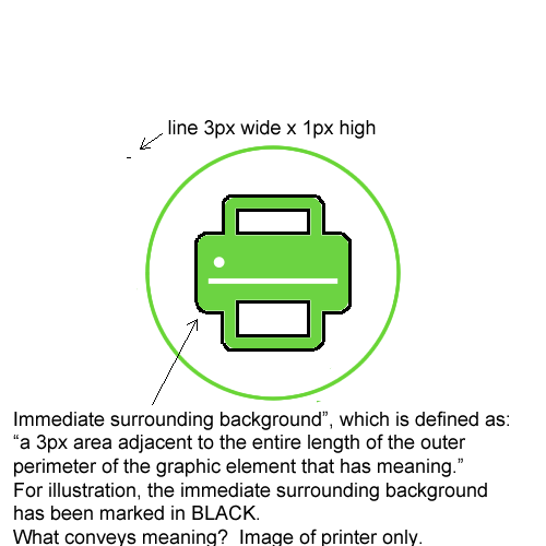
Alastair,

You asked:
"b) I’m not sure where the 3px around the graphic came from originally
(Glenda?), but I would like to use the same logic of the thick/thin aspect.
If the adjacent shape/line is under 3px, that’s fine, but it needs the
stronger contrast level. The last pie chart example is a good illustration
of that."

Glenda's response :)

The 3px is a consistent measurable size for testing.  I'm trying to clearly
define where you pull the sample pixels from for testing color contrast in
a graphic.  My original thought pattern that lead to 3px was this:

   - 1px is tiny, i think it is too small.
   - 2px may be enough...but I'm not sure
   - 3px seems like a good number...now time to do some research
   - I asked LVTF for feedback on 3px as a measurement for "thick"...and
   compared it to the "large text" principal in WCAG 2.0 SC 1.4.3 where 18
   point or 14 point bold text was considered large.  Alastair volunteered to
   measure the average width of 18 point text (in different fonts) and 14
   point bold (in different fonts) and Alastair's research showed that indeed
   3px was the most common width for large text.

My personal thought is...whether we are talking about the color contrast of
a visual focus indicator (that happens to be a border around
something)...or we are talking about color contrast in a complex
informational image (like a pie chart)...that we will need to define the
immediate area surrounding the informational graphical element...so we will
get consistent results when different experts apply this proposed SC.

How would I tell people to "measure" the color contrast?  I would say:


   1. Look at the informational graphic.
   2. Determine which elements of the graphic convey meaning.
   3. *Immediate surrounding outside perimeter area* - Draw an imaginary
   outline exactly 3px wide (in your mind) around the outside of each graphic
   element that has meaning.
   4. Observe the color contrast between the informational graphic element
   and it's immediate surrounding outside perimeter area.  Select a
   representative color pixel from the informational graphic element AND
   select a representative color pixel from the immediate surrounding.
   5. Compare the color of the graphic element and it's immediate
   surrounding.
   6. Example:  this green printer icon (that is being used as an image
   button to print) to it's immediate surrounding.  The printer icon is green
   (#6CD241) and the immediate surrounding is white (#FFFFFF).
   7. The color contrast between ##6CD241 and #FFFFFF is only 1.92 to 1.
   8. This icon would fail color contrast.

[image: Inline image 1] image of printer icon. printer is drawn in green
(#6CD241) against a white background.

[image: Inline image 2]
**************************************************************************************************
Illustration image of the area that is considered to be the immediate
surrounding background of the printer icon (which is defined as the 3 px
area adjacent to the entire length of the outer perimeter of the graphic
element that has meaning.  For illustration, the immediate surrounding
background has been marked in black.  What conveys meaning?  Image of
printer only.  There is also a light green circle around the printer, but
it has no meaning, so no color contrast is required.  There is also a white
button on the printer...that button is not essential to understand that
this is a printer, so the white button does not have a color contrast
requirement.

Yes..this is detailed...but I think it is possible to define and make it
testable and consistent.

Glenda

glenda sims    |   team a11y lead   |    deque.com    |    512.963.3773


*web for everyone. web on everything.* -  w3 goals

On Thu, Dec 8, 2016 at 3:36 PM, Alastair Campbell <acampbell@nomensa.com>
wrote:

> David wrote:
> > Should we be requiring the image have contrast with the background on
> all sides or just one or some sides.... ?
>
>  As it stands, the SC text [1] says you test “against their immediate
> surrounding background”, which is defined as:
> “a 3px area adjacent to the entire length of the outer perimeter of the
> element.”
>
> I think this could be refined, partly because it implies you have to test
> every side (a), and partly because the 3px clashes with the thick/thin
> concept (b).
>
> a) In the pie chart example [1 under examples], the bit you need to
> discern to understand is the contrast between each slice, the contrast
> against the outside of the pie is not (that) important. There are other
> places where understanding can be gained from the contrast between two
> things but not a third. Difficult to do in SC text though.
>
> b) I’m not sure where the 3px around the graphic came from originally
> (Glenda?), but I would like to use the same logic of the thick/thin aspect.
> If the adjacent shape/line is under 3px, that’s fine, but it needs the
> stronger contrast level. The last pie chart example is a good illustration
> of that.
>
> To achieve (b) I think we can just remove the word ‘background’, so you
> test “against their immediate surrounding”.
>
> To achieve (a) is harder, I can't see how to adjust this: "are essential
> for understanding the content" to say that you only have to test the sides
> needed for understanding?
>
> Kind regards,
>
> -Alastair
>
> 1] https://www.w3.org/WAI/GL/low-vision-a11y-tf/wiki/index.php?
> title=Informational_Graphic_Contrast_(Minimum)&oldid=2609
>
>
Attachments
- image/png attachment: printIconhowtomeasurecontrastv2markedinblack.png
- image/png attachment: printericonv2.png

Received on Wednesday, 28 December 2016 20:25:55 UTC