- From: Barclay, Daniel <daniel@fgm.com>
- Date: Tue, 31 Mar 2009 17:48:33 -0400
- To: <site-comments@w3.org>
- Message-ID: <49D28FB1.8010800@fgm.com>
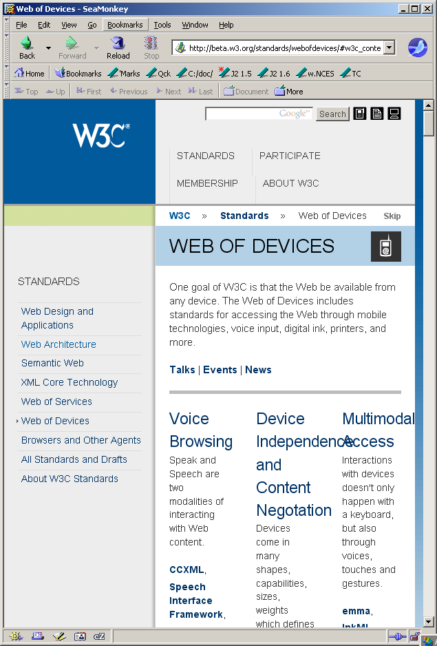
Regarding the page http://beta.w3.org/, etc.


The left navigation column also takes up too much space at narrower
windows widths.

In the attached screen shot, see how large a fraction of the width of the
page and browser display pane is taken by the left navigation column.

At least make the width proportional to the page or viewport width so that
it doesn't take up a larger fraction of the horizontal space in windows that
are tall rather than wide.


Also, notice how, once the user scrolls down below the extent of the left-
column content (e.g., to read the main-column content), the columns' horizontal
space is entirely wasted, for the entire height of the browser pane.

Ideally, make the left navigation column into a float (or move it to something
at the top (e.g., such as a good (wrappable) form of tabs), so that that
the left-side space in the browser pane can be used to display part of the main
content once the user has scrolled down beyond the extent of the left-column
navigation content.


Browser: SeaMonkey 1.1.14
Mozilla/5.0 (Windows; U; Windows NT 5.1; en-US; rv:1.8.1.19) Gecko/20081204 SeaMonkey/1.1.14


Daniel
--
(Plain text sometimes corrupted to HTML "courtesy" of Microsoft Exchange.) [F]
Attachments
- image/png attachment: W3C_beta_2.PNG
Received on Tuesday, 31 March 2009 21:49:18 UTC