- From: Barclay, Daniel <daniel@fgm.com>
- Date: Tue, 31 Mar 2009 17:42:39 -0400
- To: <site-comments@w3.org>
Received on Tuesday, 31 March 2009 21:44:16 UTC
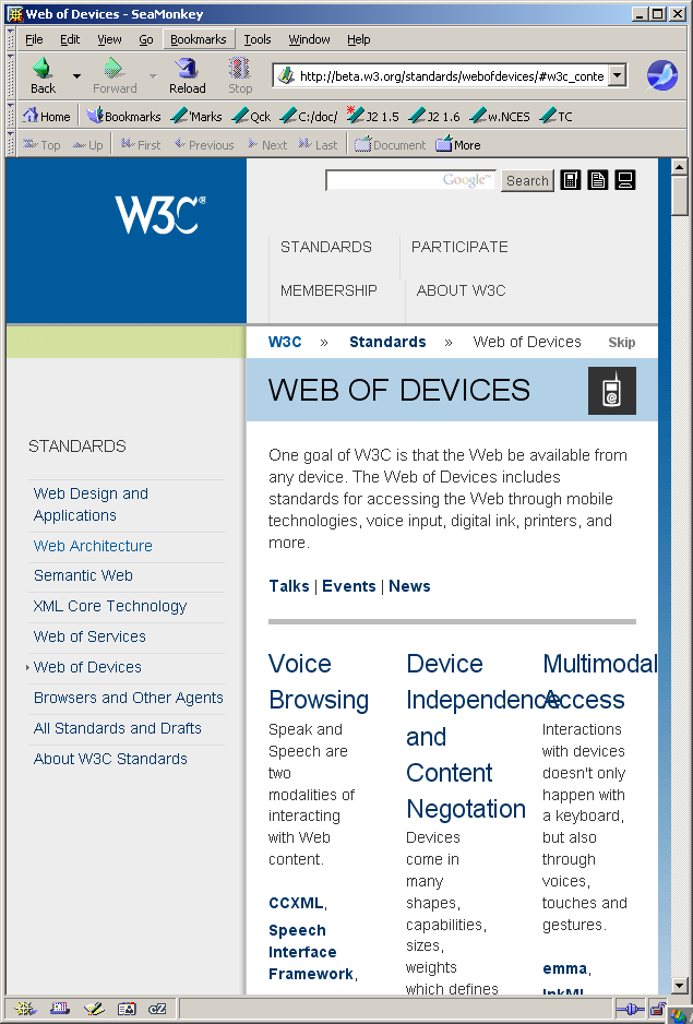
Regarding the pages at http://beta.w3.org/, etc.:


The new design wastes significant amounts of screen space.

In the attached screen shot, notice how much empty space there is at the top
of the page.  In particular, there is considerably more vertical distance above
and below the "STANDARDS," "PARTICIPATE," etc., links than there needs to be
(and, of course, that vertical space is wasted all the way across the page and
display pane).


Browser: SeaMonkey 1.1.14
Mozilla/5.0 (Windows; U; Windows NT 5.1; en-US; rv:1.8.1.19) Gecko/20081204 SeaMonkey/1.1.14

Daniel
--
(Plain text sometimes corrupted to HTML "courtesy" of Microsoft Exchange.) [F]
Received on Tuesday, 31 March 2009 21:44:16 UTC