- From: <noah_mendelsohn@us.ibm.com>
- Date: Fri, 20 Mar 2009 14:54:03 -0400
- To: site-comments@w3.org
- Cc: "Ian B. Jacobs" <ij@w3.org>
- Message-ID: <OFE2515893.48390BE8-ON8525757F.00675BA3-8525757F.0067AF95@lotus.com>
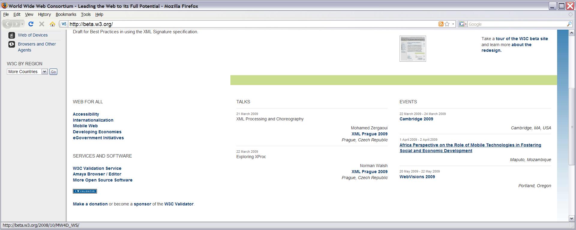
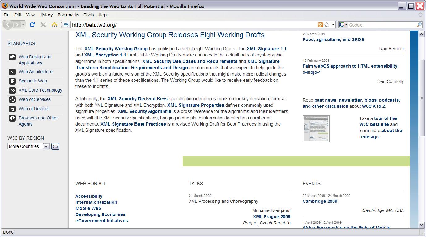
Thank you for the opportunity to comment on the new W3C site design.  Many
of the detail pages, e.g. for particular W3C activities look very good to
me, but I'm afraid that I don't find the layout of the home page appealing
at all. On my screen, which is admittedly quite wide, there is quite a bit
of white space with information sort of floating in it.  I think that part
of the problem is some lack of background color differentiation or border
lines to separate the vertical columns.   See attached file
NewW3CHomePage.jpg.

Also, the fact that (ignoring the grey on the left, which works fine) the
upper and lower areas are two and 3 columns respectively also seems a
little visually jarring and hard to scan.  See the file named capture2
below to see what I mean.  The "Web for All" bit is just sort of hanging
out there, to my eye, and you have to think a bit to realize what that
green bar is doing.


Noah Mendelsohn
(I am co-chair of the W3C TAG, but please note that these are my personal
comments.  The do not necessarily reflect the opinions of others on the
TAG or of my employer, IBM Corp.)

--------------------------------------
Noah Mendelsohn
IBM Corporation
One Rogers Street
Cambridge, MA 02142
1-617-693-4036
--------------------------------------
Attachments
- image/jpeg attachment: NewW3CHomePage.JPG
- image/jpeg attachment: NewW3CHomePageCapture2.JPG
Received on Friday, 20 March 2009 18:55:44 UTC