- From: Barclay, Daniel <daniel@fgm.com>
- Date: Wed, 1 Apr 2009 13:22:13 -0400
- To: <site-comments@w3.org>
- Message-ID: <49D3A2C5.2020903@fgm.com>
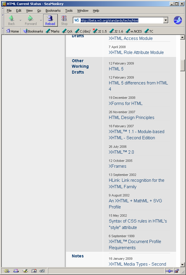
I wrote:
> Regarding the page at http://beta.w3.org/standards/webarch/
>
> Breaking the main column down into a left column and a right column
> (repeating the breakdown at the top level of the page structure) frequently
> wastes a lot of horizontal space.

Notice in the attached screen shot how taking a whole column for section
headings (e.g., Other Working Drafts), wastes all of that width for almost
the entire height of the content to the right that it labels).

For those section headings, could you find a more space-efficient layout?
Perhaps having the label cells span two columns and narrowing the first
column like this would work (view this in a fixed-width font, of course):

...
|     |                                  |
+-----+----------------------------------+
| Other Working Drafts                   |
+-----+----------------------------------+
|     | HTML 5                           |
+-----+----------------------------------+
|     | HTML 5 differences from HTML 4   |
+-----+----------------------------------+
| next label text                        |
+-----+----------------------------------+
|     |                                  |
...


Daniel
--
(Plain text sometimes corrupted to HTML "courtesy" of Microsoft Exchange.) [F]
Attachments
- image/png attachment: W3C_beta_5.PNG
Received on Wednesday, 1 April 2009 17:22:57 UTC