- From: Myles C. Maxfield <mmaxfield@apple.com>
- Date: Sun, 04 Aug 2019 22:23:14 -0700
- To: "w3c-webfonts-wg (public-webfonts-wg@w3.org)" <public-webfonts-wg@w3.org>
- Message-id: <CABFC9A1-558D-4A00-B8C6-880720E3970C@apple.com>
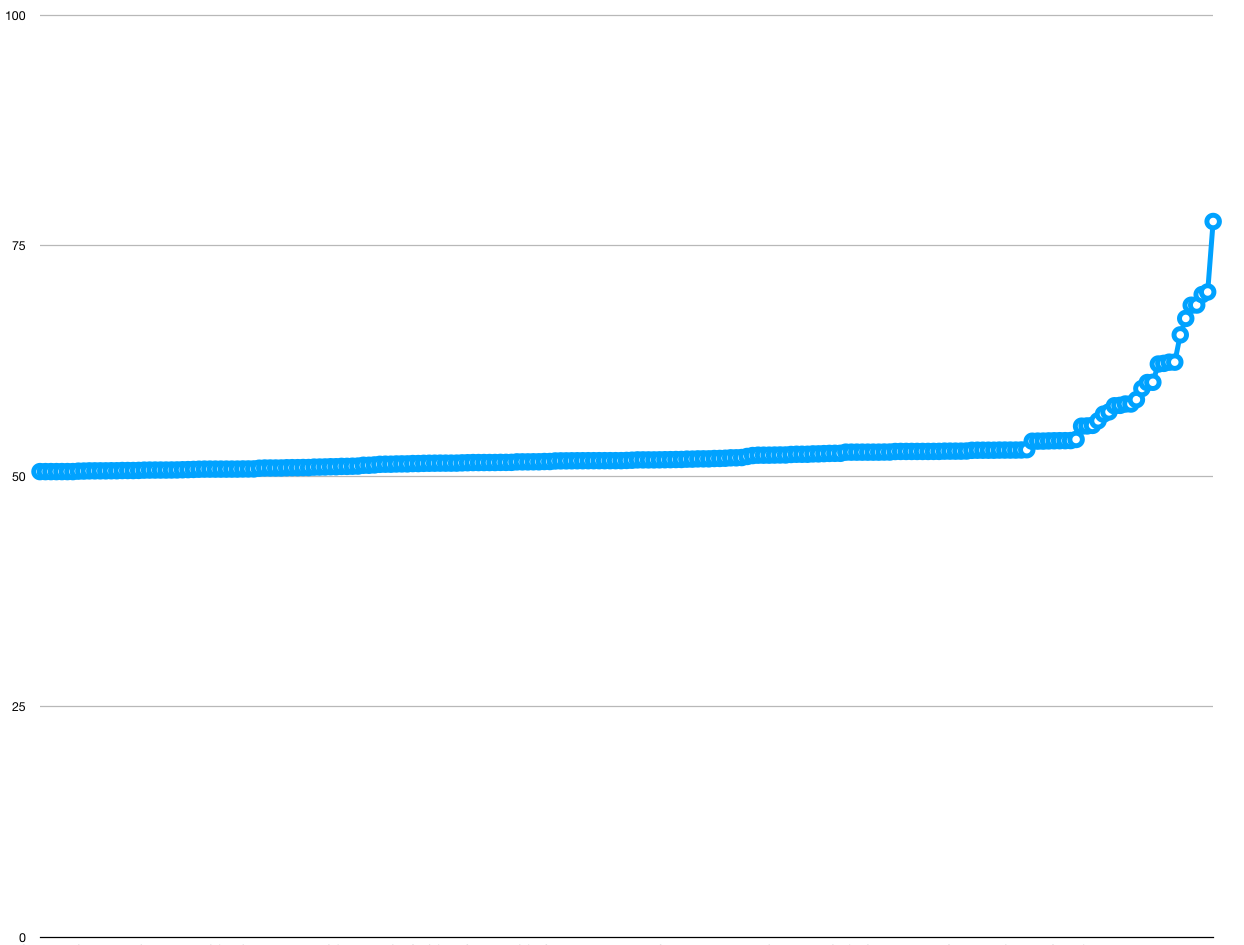
Hi, all!

I did some investigation into how the size of the glyph closure scales with the number of input glyphs. Here are the results:


Each font on the system is a curve on that graph. The X axis is how many glyphs were requested to be present in the font subset, as a percentage of the total number of glyphs in the file. The Y axis is how many glyphs ended up in the glyph closure, as a percentage of the total number of glyphs in the file.

A straight line from the bottom left to the top right indicates that the number of input glyphs equals the number of glyphs in the glyph closure. This means that either A) There are no shaping rules, or B) The shaping rules for a particular glyph only rely on a small number of other glyphs. The straighter the line, the more “embarassingly parallel” the font is to split up, and the more a codepoint-based solution would work. The higher above y=x a particular font’s curve lies, the less effective a codepoint-based solution becomes, because no matter how few characters you think you need, you actually need a huge percent of the font file to show them.

When I gathered this data, I iterated through every font on the system, and for each font, created ’n’ subsetted fonts, where ’n’ is the number of glyphs in that font. Each subsetted font holds glyphs 0-n from the original font, plus whichever additional glyphs the glyph closure requires. The choice of picking glyphs 0-n is an intentional one; in general, fonts tend to keep letters from the same alphabet in adjacent glyphs, and most fonts that support non-alphabetic languages don’t have many shaping rules.

There are 217 fonts on that graph, so you can see that the vast majority of fonts are very close to the y=x line, indicating that a codepoint-based solution is often good enough. However, a fair amount of fonts deviate dramatically from this line. I wanted to characterize this, so I wanted to calculate a “curvy-ness” for each line on the graph, which would indicate how close it is to y=x. After staring at the Wikipedia page for Curvature for a while and not immediately understanding enough of it, it occurred to me that, because the curves are all strictly increasing and are all bound by the same domain and range, simply taking the integral of each curve would give me a rough estimate for what I want. The y=x curves will have an integral of around 0.5, and the curves that deviate dramatically from that will have an integral approaching 1.0. So, here’s the integrals (each font is a point on this chart):


And here is some information from the fonts which deviate dramatically from y=x:

SIMPO.TTF
Simplified Arabic
Arabic
55.430566795
SIMPBDO.TTF
Simplified Arabic
Arabic
55.455180571
BAHNSCHRIFT.TTF
Bahnscrift
Cyrillic; Greek; Latin
55.515716155
SIMPFXO.TTF
Simplified Arabic Fixed
Arabic
56.010571152
TRADO.TTF
Traditional Arabic
Arabic
56.738334771
TRADBDO.TTF
Traditional Arabic
Arabic
56.978956981
MAJALLA.TTF
Sakkal Majalla
Arabic
57.645557254
MAJALLAB.TTF
Sakkal Majalla
Arabic
57.688329142
MUSEOSANSFORDELL-BOLD.TTF
Museo Sans For Dell

57.835886141
MUSEOSANSFORDELL-REGULAR.TTF
Museo Sans For Dell

57.835886141
ANDLSO.TTF
Andalus
Arabic
58.310219424
ROBOTO-REGULAR.TTF
Roboto

59.5144
MSUIGHUR.TTF
Microsoft Uighur
Arabic; ug-Arab
60.165190808
MSUIGHUB.TTF
Microsoft Uighur
Arabic; ug-Arab
60.193214853
PHAGSPAB.TTF
Microsoft PhagsPa
Phags-pa
62.174107469
PHAGSPA.TTF
Microsoft PhagsPa
Phags-pa
62.244791699
MMRTEXT.TTF
Myanmar Text
Myanmar
62.375873702
MMRTEXTB.TTF
Myanmar Text
Myanmar
62.375873702
ALDHABI.TTF
Aldhabi
Arabic; Arabic (Nastaliq variant)
65.334787002
ARABTYPE.TTF
Arabic Typesetting
Arabic
67.119839053
URDTYPEB.TTF
Urdu Typesetting
Arabic; Arabic (Nastaliq variant)
68.552915869
URDTYPE.TTF
Urdu Typesetting
Arabic; Arabic (Nastaliq variant)
68.574514189
SEGOESCB.TTF
Segoe Script
Cyrillic; Greek; Latin
69.708548333
SEGOESC.TTF
Segoe Script
Cyrillic; Greek; Latin
69.9902052035
HIMALAYA.TTF
Microsoft Himalaya
Tibetan
77.638392788

One last thing: while gathering this data, I discovered that creating a subset for a font can be extremely slow. For example, creating a subset with half of the glyphs of PingFang takes 40 seconds on my laptop. From the explanation above, I was creating one subset for every glyph of every font on the system, which means that gathering this data took quite a long time. After realizing how long this would take, I decided to run this on the most powerful computer I have access to, which happens to be my gaming machine that runs Windows. Therefore, the corpus this was run on is all the fonts that are preinstalled on my Windows machine. I’m in the process of gathering the same kind of data from the Google Fonts corpus and from the set of fonts preinstalled on macOS.

Also, the smart server approach to streamable fonts creates two subsets and then computes a binary diff, which could take a seriously long time if it’s built on top of fonttools. I hope we can make sure that this additional cost is included in the model we build.

Thanks,
Myles

P.S. If the size of the font is small, it sort of doesn’t matter how well it scales. I’ll soon send a scatter plot of the integrals on one axis against file sizes on another axis, so we can see if these difficult fonts actually matter.
Attachments
- text/html attachment: stored
- image/png attachment: Screen_Shot_2019-08-04_at_9.51.54_PM.png

- image/png attachment: Screen_Shot_2019-08-04_at_9.52.08_PM.png
Received on Monday, 5 August 2019 05:23:48 UTC