- From: Shawn Henry <shawn@w3.org>
- Date: Mon, 27 Jun 2005 16:56:55 -0500
- To: WSTF <public-wai-eo-site@w3.org>
- Message-ID: <42C07627.30607@w3.org>
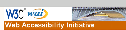
Subject: [Moderator Action] Some thoughts about the new design
Date: Mon, 27 Jun 2005 21:49:24 +0000
From: Henk Snetselaar <H.Snetselaar@bartimeus.nl>
To: <public-wai-eo-site@w3.org>

Dear WSTF folks,

Just some thoughts about the new design of the WAI pages. Many people do need a clear but not so busy site to concentrate on what they are looking for. The box under the navigation is by its format already clear as having some extra options. So there is no need  for a list format or brackets around the options.

The link 'W3C Home' is not clear, without hovering the mouse over the word 'W3C Home' there is no format clue to know that this is a link to the W3C homepage. It is even a bit strange as solitude word on top of the navigation.

To me it is not clear to be on the Web Accessibility Initiative web site. This is because of the fact that the word Web Accessibility Initiative is rather small and is a part of a long sentence. See my sample what I thought would be more clear. (wai.png)

What I already said in last call, the two logos appear to me as if the web site is representing two different organizations. That's why I was in favour of a WAI logo that is more in the look and feel of the W3C logo. Or it should be much smaller that the W3C logo. (See image wai2.png).

Best regards,
Henk


++++++++++++++++++++++++++++++++++++++++
H. Snetselaar
Bartimeus Educational Institute for the Blind and Partially Sighted &
Foundation Bartiméus Accessibility
Utrechtseweg 84, 3702 AD  Zeist, the Netherlands
Tel: +31-(0)30-6982211 or +31(0)30-6982350
Fax: +31-(0)30-6982388
E-mail: H.Snetselaar@bartimeus.nl
Website: www.bartimeus.nl and www.accessibility.nl
Zie voor disclaimer (Read our disclaimer): www.accessibility.nl/algemeen/disclaimer
++++++++++++++++++++++++++++++++++++++++
Attachments

Received on Monday, 27 June 2005 21:57:06 UTC