- From: Hall, Charles (DET-MRM) <Charles.Hall@mrm-mccann.com>
- Date: Mon, 20 Oct 2014 16:49:43 +0000
- To: Kevin Mack <kmack418@gmail.com>
- CC: "public-respimg@w3.org" <public-respimg@w3.org>
- Message-ID: <D06AB25F.1A762%charles.hall@mrm-mccann.com>
This absolutely makes more sense.
The expression in the query is against the element properties – either independently (your original example), or within media type properties (second example).
The syntax in that case may need some love, as the comma serves as the logical operator ‘or’.
So this:
@media screen and (max-width: 800px), .zone--b and (min-width: 600px) { }
Might be this:
@media screen and (max-width: 800px) and .zone--b and (min-width: 600px) { }
Charles Hall
UX Architect, Technology
t / 248.203.8723 m / 248.225.8179
e / charles.hall@mrm-mccann.com
skype / charles.h.all
360 West Maple Road, Birmingham MI 48009
w / www.mrmworldwide.com
[cid:E71567AD-137F-4E3E-A5A9-F88E4BBF5581]
Creativity. Technology. Performance.
From: Kevin Mack <kmack418@gmail.com<mailto:kmack418@gmail.com>>
Date: Monday, October 20, 2014 at 12:24 PM
To: "Charles Hall (DET-MRM)" <charles.hall@mrm-mccann.com<mailto:charles.hall@mrm-mccann.com>>
Cc: "public-respimg@w3.org<mailto:public-respimg@w3.org>" <public-respimg@w3.org<mailto:public-respimg@w3.org>>
Subject: Re: Element Query and Selector Media Query Types
That's an interesting approach to. Let me show you an example of what I'm thinking:
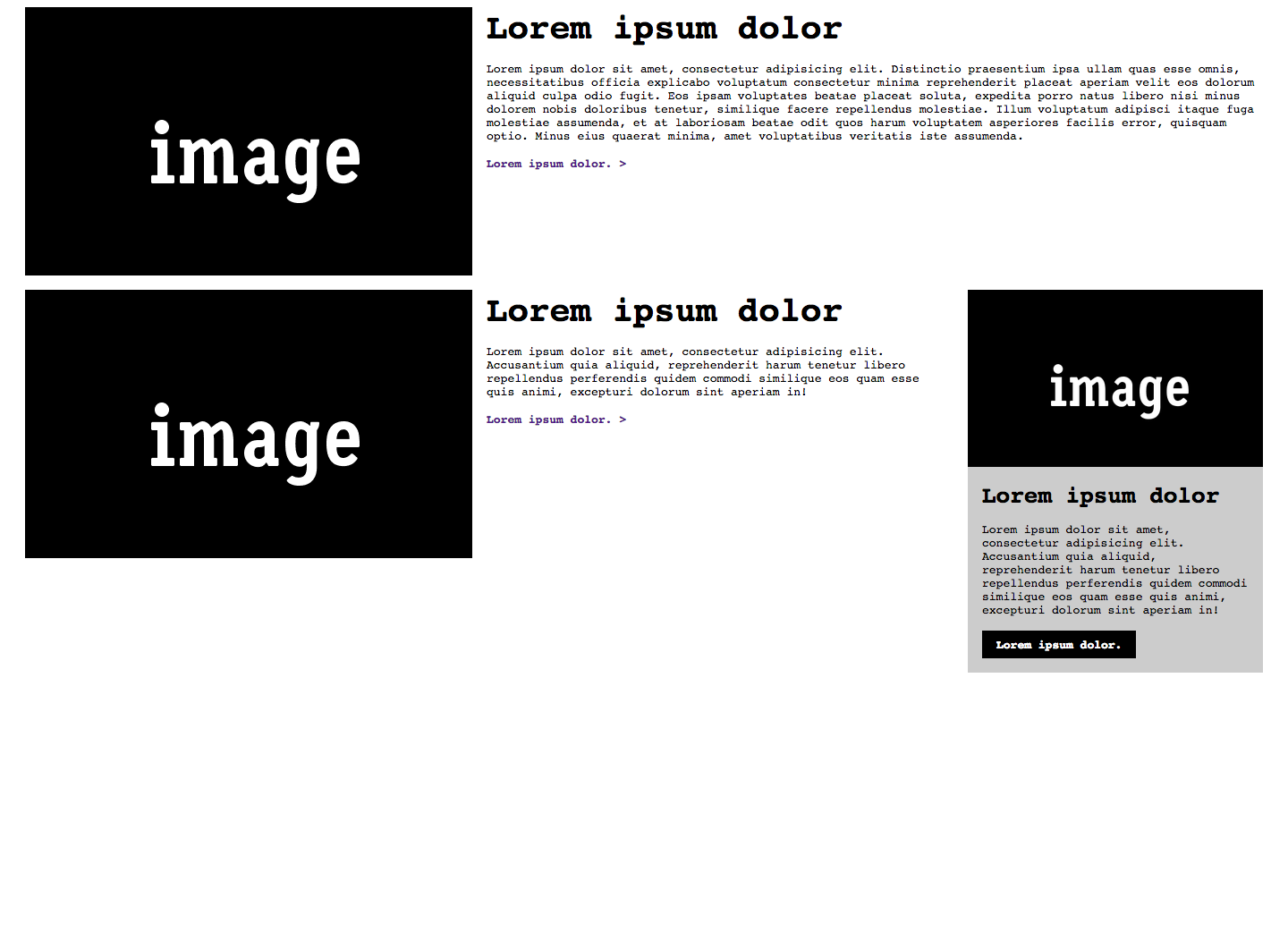
Here is a wider screen view using the same module (.media) but in three uses in the same layout:
[cid:ii_i1i0qriv2_1492e52279dc64b0]
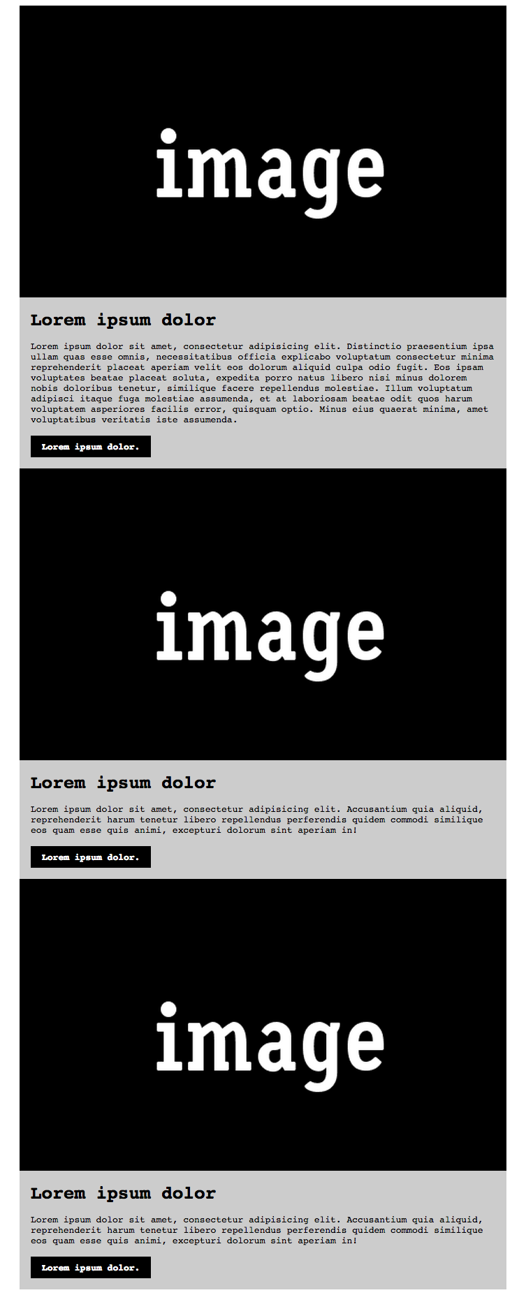
And here's the same at a smaller:
[cid:ii_i1i0rfwp3_1492e52a27b46c81]
Now this looks like a typical feature/type approach to RWD (and this can be done pretty easily). The big difference is that the last .media is rendered as the smaller view version at a larger view, how this is done is because it's based off of the parent container's width (.zone--b). Here's what this code would look like:
HTML
<div class="container">
<div class="media">
<div class="media__asset">
<img class="image-full" src="http://placehold.it/500x300/000000/FFFFFF&text=image" />
</div>
<div class="media__details">
<h3 class="media__title">
Lorem ipsum dolor
</h3>
<p class="media__detail__content">
Lorem ipsum dolor sit amet, consectetur adipisicing elit. Distinctio praesentium ipsa ullam quas esse omnis, necessitatibus officia explicabo voluptatum consectetur minima reprehenderit placeat aperiam velit eos dolorum aliquid culpa odio fugit. Eos ipsam voluptates beatae placeat soluta, expedita porro natus libero nisi minus dolorem nobis doloribus tenetur, similique facere repellendus molestiae. Illum voluptatum adipisci itaque fuga molestiae assumenda, et at laboriosam beatae odit quos harum voluptatem asperiores facilis error, quisquam optio. Minus eius quaerat minima, amet voluptatibus veritatis iste assumenda.
</p>
<a class="media__details__cta" href="#">
Lorem ipsum dolor.
</a>
</div>
</div>
<div class="zone--a">
<div class="media">
<div class="media__asset">
<img class="image-full" src="http://placehold.it/500x300/000000/FFFFFF&text=image" />
</div>
<div class="media__details">
<h3 class="media__title">
Lorem ipsum dolor
</h3>
<p class="media__detail__content">
Lorem ipsum dolor sit amet, consectetur adipisicing elit. Accusantium quia aliquid, reprehenderit harum tenetur libero repellendus perferendis quidem commodi similique eos quam esse quis animi, excepturi dolorum sint aperiam in!
</p>
<a class="media__details__cta" href="#">
Lorem ipsum dolor.
</a>
</div>
</div>
</div>
<div class="zone--b">
<div class="mediab">
<div class="mediab__asset">
<img class="image-full" src="http://placehold.it/500x300/000000/FFFFFF&text=image" />
</div>
<div class="mediab__details">
<h3 class="mediab__title">
Lorem ipsum dolor
</h3>
<p class="mediab__detail__content">
Lorem ipsum dolor sit amet, consectetur adipisicing elit. Accusantium quia aliquid, reprehenderit harum tenetur libero repellendus perferendis quidem commodi similique eos quam esse quis animi, excepturi dolorum sint aperiam in!
</p>
<a class="mediab__details__cta" href="#">
Lorem ipsum dolor.
</a>
</div>
</div>
</div>
</div>
CSS
body {
font-family: monospace;
}
* {
box-sizing: border-box;
}
.image-full {
display: block;
height: auto;
width: 100%;
}
.container {
max-width: 1400px;
}
.container:after {
content: "";
clear: both;
display: table;
width: 100%;
}
@media screen and (min-width:1440px) {
.container {
margin-left: auto;
margin-right: auto;
}
}
@media screen and (max-width:1440px) {
.container {
margin-left: 20px;
margin-right: 20px;
}
}
@media screen and (min-width: 800px) {
.zone--a, .zone--b {
float: left;
}
.zone--a {
width: 75%;
}
.zone--b {
padding-left: 1rem;
width: 25%;
}
}
.media {
padding-bottom: 1rem;
}
.media__title, .media__detail__content {
margin-bottom: 1rem;
}
.media__details {
padding-left: 1rem;
}
.media__detail__content {
margin-top: 0;
}
.media__details__cta {
font-weight: 700;
text-decoration: none;
}
@media screen and (min-width: 800px) {
.media {
display: table;
width: 100%;
}
.media__asset,.media__details {
display: table-cell;
vertical-align: top;
}
.media__asset {
width: 500px;
}
.media__title {
margin-top: 0;
font-size: 3em;
}
.media__details {
padding-left: 1rem;
}
.media__details__cta:after {
content: ">";
}
}
@media screen and (max-width: 800px), .zone--b and (min-width: 600px) {
.media {
background-color: #ccc;
}
.media__title {
font-size: 2em;
margin-top: 1rem;
}
.media__details__cta {
background-color: #000;
color: #FFF;
display: inline-block;
padding: .5rem 1rem;
}
.media__details {
padding-right: 1rem;
}
}
Looking at the code above, using .zone--b and (min-width: 800px)makes the design change based off of the parent's width of .zone--b. zone--b is rendered at 350px at larger viewport (25% of the 1400px of .container). This covers the case for parent-child selector query and then aligns with viewport to selector (traditional) and how they can be used together.
Does this help or add more confusion?
On Mon, Oct 20, 2014 at 11:25 AM, Hall, Charles (DET-MRM) <Charles.Hall@mrm-mccann.com<mailto:Charles.Hall@mrm-mccann.com>> wrote:
Hi Kevin,
I’m not entirely clear on your use cases.
My understanding of @media queries:
Conditionally check for media type (print, screen, all), then any number and/or type of expressions (height, orientation, color), then any explicit or range of value (60em, 25%, 50vw) and apply what follows when all produce a match.
So, in the case of Element queries, I believe that they would check for element type (<aside>, <input>, <blockquote>), then any number and/or type of attributes (dir=, target=, data-name=), then any explicit or partial value ("ltr", "#top", "mathBox"), then any other condition required, and apply what follows when all produce a match – simply now in CSS, and no longer limited to JS/jQuery.
A use case could be: “I have 2 dynamic aside elements that share multiple classes and attributes and I need a simple CSS selector that does not require source order or complex combinators.”
The structure and syntax in this case would be something like this:
@element aside and (data-name="mathBox") {
fieldset { border: 1px solid red; }
}
This of course can currently be written with an attribute selector (below), but I wanted to write a very simple syntax as a starting point.
fieldset [data-name="mathBox"] { border: 1px solid red; }
I hope this adds another perspective to the conversation.
Thanks,
Charles Hall
UX Architect, Technology
t / 248.203.8723<tel:248.203.8723> m / 248.225.8179<tel:248.225.8179>
e / charles.hall@mrm-mccann.com<mailto:charles.hall@mrm-mccann.com>
skype / charles.h.all
360 West Maple Road, Birmingham MI 48009
w / www.mrmworldwide.com<http://www.mrmworldwide.com>
[cid:AE61867F-0797-445A-BFFF-BE8D67A69A1E]
Creativity. Technology. Performance.
From: Kevin Mack <kmack418@gmail.com<mailto:kmack418@gmail.com>>
Date: Monday, October 20, 2014 at 9:45 AM
To: "public-respimg@w3.org<mailto:public-respimg@w3.org>" <public-respimg@w3.org<mailto:public-respimg@w3.org>>
Subject: Re: Element Query and Selector Media Query Types
Resent-From: <public-respimg@w3.org<mailto:public-respimg@w3.org>>
Resent-Date: Monday, October 20, 2014 at 9:46 AM
Wanted to see if anyone else had any thoughts/opinions on Element Query and Selector Media Query Types? I want to really start pushing these but I want to make sure that I have support of the community and these have been thought-through.
Let me know, it's very appreciated // Thank you!
Kevin Mack
On Sun, Oct 12, 2014 at 4:39 PM, Kevin Mack <kmack418@gmail.com<mailto:kmack418@gmail.com>> wrote:
Hello hello!
With the success of Picture Element/@srcset, I feel we should continue the momentum. I have a suggestion for two new media-query types, they are: content and "selector" (including pseudo selectors) queries. Both would utilize the same media-query features that already exist and extend the use of media-queries to create more modular, portable, reusable code.
The idea is have a solutions for the "Element Query" and "Content Query", which has been handled frequently by JavaScript.
The Element Query would work similar to how an iframe works within a container – the container has the constraints of width and the content inside the iframe has a client width of the container.
Here's one use-case of what I imagine the Element Query working like:
<style>
.container {
max-width: 1000px;
margin-right: auto;
margin-left: auto;
}
.nav {
display: block;
margin-top: 0;
margin-bottom: 0;
padding-left: 0;
list-style: none;
}
@media .nav and (max-width: 800px) {
.nav__item {
display: block;
}
}
@media .nav and (min-width: 801px) {
.nav__item {
display: inline-block;
}
}
</style>
<div class="container">
<ul class="nav">
<li class="nav__item">
<a href="#">
Lorem ipsum dolor
</a>
</li>
<li class="nav__item">
<a href="#">
Consectetur adipisicing elit
</a>
</li>
<li class="nav__item">
<a href="#">
Impedit ut accusamus
</a>
</li>
<li class="nav__item">
<a href="#">
Lorem ipsum dolor
</a>
</li>
</ul>
</div>
Second is the Content Query that's best described in this example: if I have two headlines, "This Is My Title" and "This Is A REALLY Long Title for a Section". If the content has a max-width of 30em, then apply a fixed max-width to make the title look "more presentable" at a larger viewport.
<style>
@media content and (min-width: 30em) {
.section-title {
max-width: 16em;
}
}
</style>
<h1>
This Is A Title
</h1>
<h1 class="section-title">
This Is A REALLY Long Title
for a Section
</h1>
I am eager to see solutions like these in place, it would dramatically reduce development time and promote best practices for developing CSS/HTML in a responsive experience.
Thoughts?
- Kevin Mack
Attachments
- image/png attachment: 5D510C5C-1CCD-479C-A466-98D1FC580B9B_12_.png
![5D510C5C-1CCD-479C-A466-98D1FC580B9B[12].png](att-0011/5D510C5C-1CCD-479C-A466-98D1FC580B9B_12_.png)
- image/png attachment: 5D510C5C-1CCD-479C-A466-98D1FC580B9B_11_.png
![5D510C5C-1CCD-479C-A466-98D1FC580B9B[11].png](att-0011/5D510C5C-1CCD-479C-A466-98D1FC580B9B_11_.png)
- image/png attachment: smaller.png

- image/png attachment: larger.png

Received on Monday, 20 October 2014 20:36:25 UTC