- From: Joe Berkovitz <joe@noteflight.com>
- Date: Sat, 13 Jan 2018 11:50:56 -0500
- To: Marek Ledvina <ledvina.m@gmail.com>
- Cc: public-music-notation-contrib@w3.org
- Message-ID: <CA+ojG-YEsonhpY7Ah=pd18Z0_avS0gR1auPU56bfg=1Qx864Ww@mail.gmail.com>
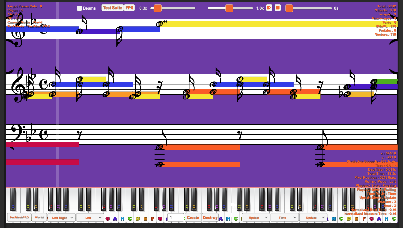
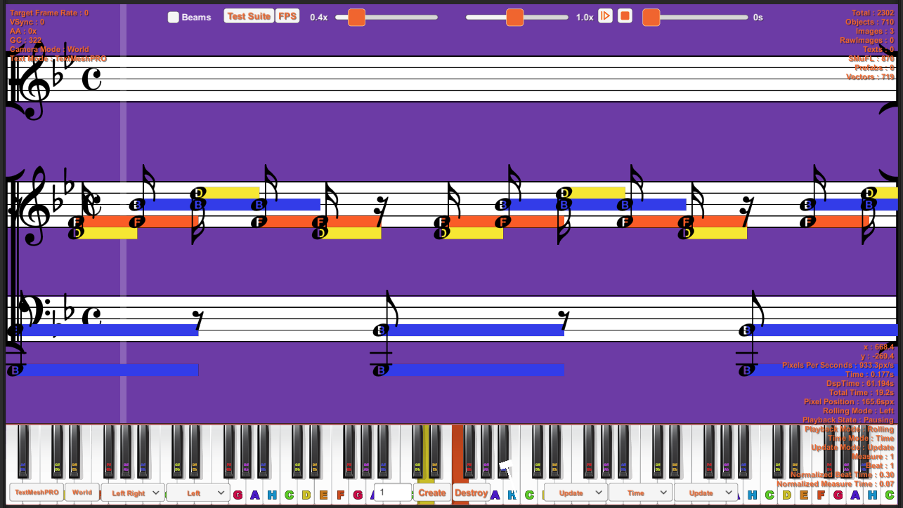
Marek, Glenn,

Please file an issue in the SMuFL repository (
https://github.com/w3c/smufl/issues) describing what you think is missing,
why it is needed, and what you think is needed. That is the group's process
for proposed changes and additions.

Thank you!

Best,

.            .       .    .  . ...Joe

Joe Berkovitz


On Sat, Jan 13, 2018 at 4:10 AM, Marek Ledvina <ledvina.m@gmail.com> wrote:

> I also noticed that nothe head with names and with solfege are a bit
> larger than normal note heads. Which causing issues in rendering stem
> alignment. See attachments. I feel like the size needs to be be unified
> otherwise developers have to resize programatically named and solfege
> noteheads.
>
> M.
>
>
>
>
> On Jan 13, 2018, at 3:16 PM, Glenn Linderman <v+smufl@g.nevcal.com> wrote:
>
> On 1/12/2018 5:32 PM, Marek Ledvina wrote:
>
> Hello Joe,
> We are currently working on solfege exercises and found out that SMuFL is
> completely missing the chromatic solfege syllables “note heads" like you
> can find it for example here http://openmusictheory.com/
> chromaticSolfege.html
> Current Bravura only contains scale degrees ( 7 ) syllables ( do, re, mi,
> fa, sol, la, ti [si] ) which is nice start but not usable for teaching
> materials.
> We need  “do, di, re, ri, mi, fa, fi, so(l), si, la, li, ti, (do)” and
> “do, ti, te, la, le so(l), se, fa, mi, me, re, ra do"
> Can I ask anyone to include them into SMuFL Bravura font?
> Thank you very much, Marek.
>
>
>
> I've noticed the lack of solfege support in those noteheads also, when
> looking for characters for the very related topic of the various tonic
> sol-fa and numbered notations.  While the simplest forms of tonic sol-fa
> were designed to be "typeset" by using a typewriter
>
>
> |  do re mi  - |
>
> |   1  2  3  - |
>
>
> other forms use a bit more complex notation.  There is some information
> about numbered note systems in Wikipedia[1][2][3].
>
> While even much of the more complex notations can be produced with various
> carriage movements on a typewriter, the development of proportional fonts,
> makes it harder to achieve proper overstriking for a consistent look using
> modern technology. Some of the fonts do a better job than others, and one,
> Doulos Cipher[4] from SIL, makes a good try at being pretty complete, but
> it uses graphite font technology, which has somewhat limited support.
>
> There are a fair number of variations in numbered note systems popularly
> used from place to place, with some special symbols not found in most fonts
> designed for orthography, making it somewhat hard to find an appropriate
> font for the numbered note systems. Wikipedia doesn't seem to delve into
> the regional differences between variations, nor does it include sufficient
> detail about any one of them to be confident of completeness of usage or
> rules in their articles.
>
> I have various samples of numbered notation used together with lyrics, and
> some include it between the staves of CWMN (using ordinary noteheads).
> Other samples show four-part harmony using do re mi, together with lyrics.
> But while samples of usage are great, and many of the usages can be figured
> out by examining those examples, it would be great to find a complete
> exposition of the rules for various variations. I'm presently going by some
> of what Wikipedia says, some by the various samples I have, and some by
> asking questions of people that use the notation (but they are not likely
> true experts on the notation).
>
> Because each note may have a cluster of other symbols around it, it seemed
> to be that the easiest way to achieve support in a variety of contexts and
> applications would be to custom design a font with the following
> characteristics:
>
> 1. The numbers are centered, and non-spacing.
> 2. Various dots, double dots, overbars, underbars, and accidentals, and
> fermatas that are placed above, below, or to the left of the basic number
> should be positioned on the same alignment point, and also be non-spacing.
> 3. Hyphens and dots that follow the notes could have the same alignment
> point for the first one, but then space over sufficiently that using them
> again would produce normally-spaced appearance.
> 4. Additional "normal" characters might be included to allow creation of
> the various notations for specifying key signatures and time signatures.
>
> The above would suffice for a notation application.  While I chose a
> centered alignment point, the techniques would work equally well for any
> other alignment point, as long as the relative positioning of the
> characters were appropriate to their use, and they were non-spacing.
>
> For use in a text application, each group of characters forming a note
> group would then be followed by an appropriate width space to "complete"
> the group, and maybe another one or two to reach an minimally spaced point
> to start another group, or, of course, even more spacing to reach parity
> with associated lyrics on a nearby line.
>
> It appears the Doulos Cipher font uses Graphite for combining characters
> (a more complex solution to character overlays than non-spacing, but
> perhaps more limited in total number of combined characters?), and to
> achieve some level of support for longer beams and slurs to also be
> positioned as "slur tips" with a note group, and in the appropriate
> software that includes Graphite, complete slurs would appear.
>
> Not finding support for numbered notation systems in SMuFL, and not
> finding any existing font that had sufficient documentation, character set,
> and quality for a current project, I described the above needs to a friend
> who cobbled together a font using characters from existing public domain
> sources, and repositioned their alignment points and widths to achieve the
> above characteristics. It works well in my notation application (under
> development, and mostly using SMuFL), together with the slur and beam
> drawing support in that application. I likely didn't find and include all
> the characters that might be needed for full support of various numbered
> notation systems, but I did include everything I needed for a current
> project, and a bit more for potentially similar projects.
>
> I didn't find any standard codepoints for such characters or uses, and
> fear that our font, if released to the public, will contribute to the music
> font mojibake that SMuFL is attempting to correct.  Is there any support
> for the idea of including a range of characters for numbered notation
> systems within SMuFL?  I'd be happy to adjust my current font and
> application to conform to such a range if it existed.  I did currently pick
> a range high in the private use area that SMuFL is targeting, not currently
> used by SMuFL, but there may be reasons I'm unaware of that would make it
> not be the best range.  There is some redundancy with some SMuFL
> characters, done to allow for them to be non-spacing, and have alignment
> points that make the spacing calculations for the numbered notation simple.
>
>
> [1] https://en.wikipedia.org/wiki/Numbered_musical_notation
> [2] https://en.wikipedia.org/wiki/Tonic_sol-fa
> [3] https://en.wikipedia.org/wiki/Gamelan_notation
> [4] http://scripts.sil.org/cms/scripts/page.php?site_id=nrsi&
> id=ciphermusic
>
>
>
Attachments
- image/png attachment: movable_solfege.png
- image/png attachment: tone_names.png
Received on Saturday, 13 January 2018 16:51:23 UTC