- From: Andrew Somers <andy@generaltitles.com>
- Date: Tue, 21 Sep 2021 01:39:08 -0700
- To: Jonathan Avila <jon.avila@levelaccess.com>
- Cc: "public-low-vision-a11y-tf@w3.org" <public-low-vision-a11y-tf@w3.org>
- Message-Id: <2FE89938-1DD1-49D8-B084-2200F504C62C@generaltitles.com>
Hi Jonathan, thank you, I think we’re mostly on the same page, my responses inline below:
> On Sep 20, 2021, at 6:24 AM, Jonathan Avila <jon.avila@levelaccess.com> wrote:
>
> Hi Andy, thank you for sharing these suggestions. I have provided some questions and personal thoughts below regarding the items:
> Minimum background brightness for dark text on a light background, requiring the background be no darker than #a0a0a0 (Addresses the 2.x dark pairs failure).
> [Jonathan] I’m not clear exactly what you are stating here – If you are talking about #a0a0a0 (gray) on white #FFF– that would be 2.6:1 contrast. If you are talking about #a0a0a0 on #000 that would be 8:1 contrast using the current algorithm. While I agree full white on a black background can be problematic – 8:1 contrast isn’t enough for some users with low vision. What other values could be considered and can you please clarify which colors are for which background/foreground with your suggestion.
First, WCAG reporting 8:1 in that instance is a misnomer, WCAG 2.x is simply wrong, as has been established by myself and others.
In this particular potential SC, #a0a0a0 (or potentially #999) would be the darkest permissible BACKGROUND when the text was darker than the background. This would not apply when the text was lighter than the background.
Here’s a link and example of #a0a0a0 with the darkest possible text:
https://www.myndex.com/SAPC/?BG=a0a0a0&TXT=000000&DEV=98G4g&RSH=false&SEL=radioDynamic&BUF=SAPC-G <https://www.myndex.com/SAPC/?BG=a0a0a0&TXT=000000&DEV=98G4g&RSH=false&SEL=radioDynamic&BUF=SAPC-G>
If WCAG 2.x was perceptually accurate, that would be less than 4.5:1 … also if WCAG 2.x was perceptual, If the background was #909090 and black text, that would be an equivalent of about 3:1. (These comparisons are based more or less on APCA 0.98 G—4g constants, which are perceptually uniform).
The importance of this SC is that it helps mitigate the fact that WCAG 2.x in increasingly inaccurate with dark color pairs.
The fact that WCAG 2.x reports 8:1 for #a0a0a0 / #000 is part of the problem: that pair is NOT 8:1, and WCAG 2.x is simply wrong in reporting such a high contrast. I and many others have demonstrated that 2.x contrast is literally a coinflip. I am here to fix that problem more than anything else.
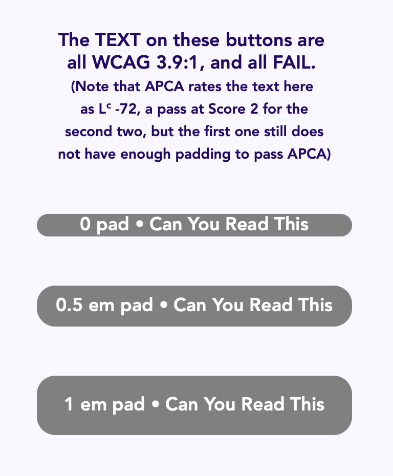
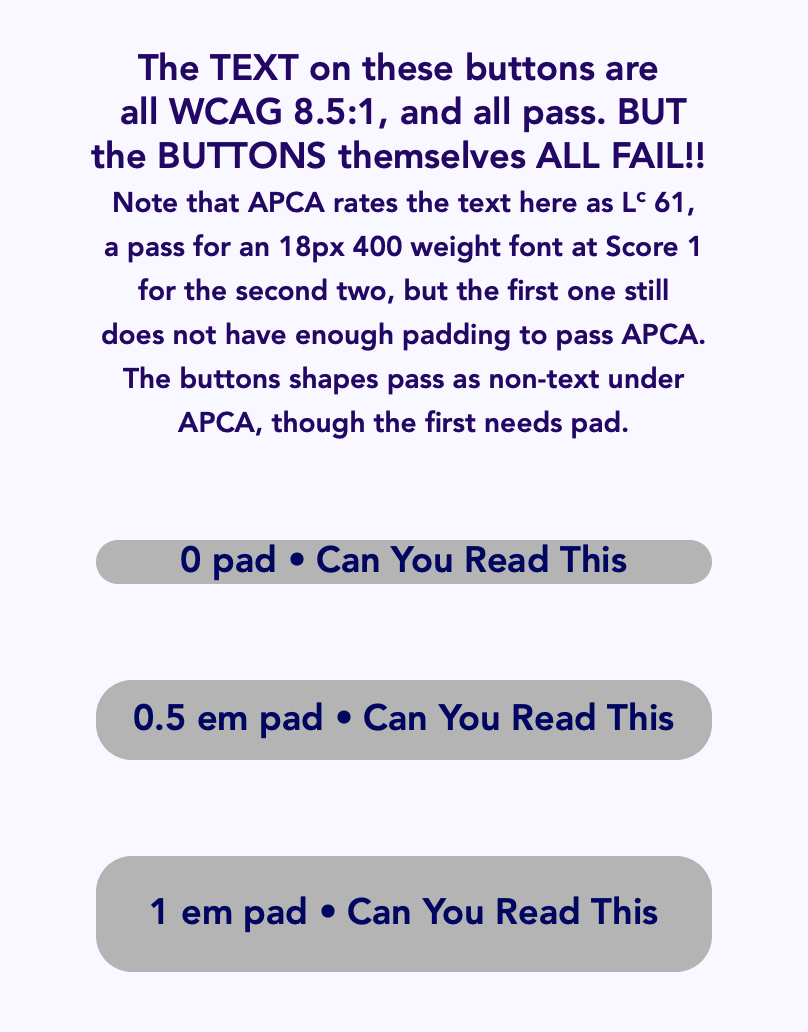
> Minimum padding around text of 1em, *if* the text container’s background (div) is more than 2:1 contrast with the larger surrounding background. (addresses local adaptation issues)
> [Jonathan] This seems like it would come up often with buttons. Adding 1em would significantly increase the size of all buttons potentially spreading out controls too much impacting people with limited field of vision. It would be good to get some mockups created to show and discuss how we might find something that achieves the goal and is practical to implement.
I didn’t clarify: 1em is more for a div of body text with block of text. For a button, 0.5em is potentially a better metric, though this is also about the use case where the text color is darker than both the button and the surrounding background. If the text is the essentially the same color as the surrounding background, then the padding is not as needed.
Examples:
These also demonstrate how WCAG fails in terms of perception and uniform predicted contrast, passing when it should fail and failing when it should pass for instance.
> Minimum contrast for body text as above at 7:1 (11:1 preferred). Body text defined as more than two lines of related text in a block or column.
> [Jonathan] This would be very useful. I personally find this issue beyond body text though and I would like to discuss extending this to links and interactive elements as well.
Yes, I mention body text as it is the “big crisis”… in classical design, 10:1 is considered a minimum contrast for blocks of text. I agree that it can apply to other elements as well.
APCA corrects this by using a perceptually accurate metric. The question is, how granular can we be? Initially, APCA is very granular in terms of context of use, etc...
> No fonts lighter than 300 weight for body text, and no smaller than 14px for body text (16px recommended) (addresses important spatial frequency limitations on perception).
> [Jonathan] Personally I find 300 weight fonts too thin and would recommend 400 weight for body or really any text as that is the default regular weight for fonts anyway.
Yes, I think we discussed this a bit some months ago, the "bold is not always bold" issue.
It works under APCA because APCA defines a sliding scale for weight and size. For a WCAG 2.x patch, it may be that things need to set at 400. But correcting the contrast math problem would also be very helpful as I hope I’ve shown.
The larger problem is the non standard aspect of font weights and non standard x-height (or lack of an x height metric).
Some of these are things I listed as suggested agenda items….
Thank you!!
Andy
Andrew Somers
Senior Color Science Researcher
PerceptEx Perception Research Project <https://www.myndex.com/perceptex/>
- address redacted for list -
<https://www.myndex.com/perceptex/>
>
> Jonathan
>
> From: Andrew Somers <andy@generaltitles.com <mailto:andy@generaltitles.com>>
> Sent: Thursday, September 9, 2021 3:41 PM
> To: public-low-vision-a11y-tf@w3.org <mailto:public-low-vision-a11y-tf@w3.org>; Jonathan Avila <jon.avila@levelaccess.com <mailto:jon.avila@levelaccess.com>>; Shawn Henry <shawn@w3.org <mailto:shawn@w3.org>>; Bruce Bailey <Bailey@Access-Board.gov <mailto:Bailey@Access-Board.gov>>; Christopher Loiselle <chris.loiselle@oracle.com <mailto:chris.loiselle@oracle.com>>; Sam Waller <sdw32@cam.ac.uk <mailto:sdw32@cam.ac.uk>>
> Subject: Regarding contrast P'atch fixes"
>
> CAUTION: This email originated from outside of the organization. Do not click links or open attachments unless you recognize the sender and know the content is safe.
>
> In reference to Sam’s query regarding adding SCs to WCAG 2.x contrast to improve it, In the fall of 2019, I had been working on some “patch” SCs for WCAG 2.2 to create stepping stones to the contrast metric for Silver, but I was not able to get them researched and fully formed to submit by the deadline, as I was too busy preparing the larger work for Silver.
>
> To quickly sum up some of what I had been proposing/working on for contrast for 2.2, that got stuck on the back burner.
>
> Minimum background brightness for dark text on a light background, requiring the background be no darker than #a0a0a0 (Addresses the 2.x dark pairs failure).
>
> Minimum padding around text of 1em, *if* the text container’s background (div) is more than 2:1 contrast with the larger surrounding background. (addresses local adaptation issues)
>
> Minimum contrast for body text as above at 7:1 (11:1 preferred). Body text defined as more than two lines of related text in a block or column.
>
> No fonts lighter than 300 weight for body text, and no smaller than 14px for body text (16px recommended) (addresses important spatial frequency limitations on perception).
>
> These do not address the issues with reverse polarity of light text on dark, though that problem is solved with APCA, which also includes corrections for the above, which is why we have been discussing an “alternate” SC as outlined on the Wiki here:
>
> https://www.w3.org/WAI/GL/low-vision-a11y-tf/wiki/Ideas_for_scope_and_work_topics_(August_2021)#Proposed_WCAG_2.3_Alternate_Contrast_SC_.28APCA_lite.29 <https://www.w3.org/WAI/GL/low-vision-a11y-tf/wiki/Ideas_for_scope_and_work_topics_(August_2021)#Proposed_WCAG_2.3_Alternate_Contrast_SC_.28APCA_lite.29>
>
>
> Supplemental Guidance
>
> Is this on GitHub where I can fork it so I can work on it? The first thing I’d like to address is the ambiguous nature of a number of entries. There is a number of uses of terms like “many” or “most” with no real quantification or supporting references. I think starting there, the rest of the document will start to fall into place.
>
> ALSO,
>
> If you are interested, this is a link to the “Introduction to Color for Accessibility” that I wrote for the Mozilla site in their accessibility section. It’s in a slightly different format, but covers a lot of what I’d think should be in the “Supplemental Guidance”.
>
> https://developer.mozilla.org/en-US/docs/Web/Accessibility/Understanding_Colors_and_Luminance <https://developer.mozilla.org/en-US/docs/Web/Accessibility/Understanding_Colors_and_Luminance>
>
> This is written in terms of a general scope of visual accessibility issues and the relation to web content.
>
>
> Thank you!
>
>
> Andy
Attachments
- text/html attachment: stored
- image/png attachment: Screen_Shot_2021-09-21_at_1.17.37_AM.png

- image/png attachment: Screen_Shot_2021-09-21_at_1.17.53_AM.png
- image/png attachment: Screen_Shot_2021-09-21_at_1.17.44_AM.png
- image/png attachment: myndexheademail7.png

Received on Tuesday, 21 September 2021 08:39:39 UTC