- From: Katie Haritos-Shea <ryladog@gmail.com>
- Date: Sat, 21 Sep 2019 12:55:47 +0900
- To: Andrew Somers <me@andysomers.com>
- Cc: Wayne Dick <wayneedick@gmail.com>, Jim Allan <jimallan@tsbvi.edu>, public-low-vision-a11y-tf <public-low-vision-a11y-tf@w3.org>
- Message-ID: <CAEy-OxHM8TgSupH87jsWEXtEPWcfaEAY=WjL1=nXJsFcs+=OpQ@mail.gmail.com>
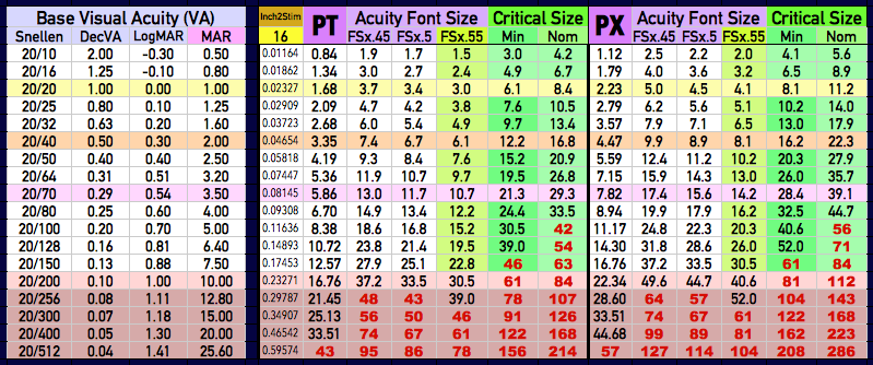
Please be open-minded and polite in comments and responses.

On Sat, Sep 21, 2019, 12:40 PM Andrew Somers <me@andysomers.com> wrote:

> Hi Wayne. What are you doing?
>
> *No, my information is not out of date.*
>
> Wayne, you're referencing things out of context when you don't even know
> what the context is. It is beyond infuriating, and your assertions are
> meritless.
>
> The information in my post that you are attacking is based on *current*
> international standards, and the most recent research.
>
> *But here's the really funny thing* (at least I'm trying to laugh as
> opposed to being angry) the paper that you're claiming is most recent: *"Does
> Print Size Matter” **Legge, Bigelow *is from 2011 and it is a *REVIEW
> paper of the last 40 years of research* and not new experimental
> research! So please don't try to make some spurious claim that it's somehow
> superseding previous research, when in fact it is a *review* of previous
> research. You're an academic, you should know better.
>
> But here’s the most hilarious part: I read and cite Legge et.al.
> frequently,* INCLUDING this exact paper.* I read it over three months
> ago. In fact It's one of the papers that will end up in the bibliography.
> And it’s the paper that led to the work we are doing in terms of aligning
> font metrics based on x-heights among other things.
>
> I actually read this paper, and I actually understand it. However I’m not
> sure you do as you made several meritless statements deriding the very
> rough draft of an outline that I had posted (and which I posted for an
> unrelated issue). Your statements indicate a misunderstanding of the
> underlying material. While of course your comments were infuriating to say
> the least, I am trying to take a proactive approach to explain the body of
> knowledge to you and hopefully correct misunderstandings for you and anyone
> else reading. If you realize
>
>
> *I’m Not Researching Printed Books.*
> And printed material is not really what I am talking about. That posted
> outline is unrelated to any of your comments. Nevertheless, as I stated in
> the post,* it is a very ROUGH draft and it is NOT a published report.* I
> posted it in response to a user that was making a lot of unfounded
> assertions.  My intent was to (hopefully) give him a little more
> information as to what issues are at stake as that user was clearly
> misunderstanding a lot of things and stirring things up as opposed to being
> constructive.
>
> And importantly, I was never referring to* "16 inches to the stimulus"*.
> That is more generally about reading printed words on paper, such as in a
> book. The research I am doing involves emissive displays (computer monitor)
> — and 16 inches is not necessarily the appropriate distance for displays,
> but still that has nothing to do with what I was discussing in that post.
>
> Again, you are way off base and out of context. At that instant I was
> discussing *comparative acuity levels*. That would be the meaning of the
> line were I say:
>
>>
>>    - *Classification of Acuity can be divided into three broad groups:*
>>
>> Notice I did not say critical print size, though we do have original
> research on that pending.
>
> *Wayne Said: *Here is the math. The normal acuity limit at 16 in. is
> around 4.5pt with really clean eye chart font. Double that an you get 9pt,
> newspaper size. 2.5 of that is is 11-12pt rounding. Now if you have 20/40
> vision your critical print size at 16 in. is 9pt.  Double is 18pt and 2.5
> times is 22pt. at 16in. Of course 20/160 requires 8 times that. That is
> hard to do even digitally, but 4 times at 1/2 distance is effectively 800%.
>
>
> ??? Did you read this paragraph before sending? Didn't you say you were a
> mathematician? For a mathematician this paragraph is very unclear.
> Regardless not only do this and your other paragraphs have nothing to do
> with my post, it demonstrates a misunderstanding of several key concepts
> regarding research on reading speed which I hope to clarify below. BTW
> where did you get the numbers you're quoting? Because those are not from
> the cited Legge paper, nor are they in my post, *and in any event they
> are not correct* so I am assuming they are misreferenced.
>
>
> *LACK OF UNDERSTANDING*
> I suspect you don’t understand when acuity level is being referenced vs
> critical print size, because you are apparently confusing the two. You are
> also misunderstanding the nature of research stimulus sizes vs practical
> glyph sizes and font metrics. At any rate your math is using wrong values
> and wrong assumptions.
>
> For the record, I was not using 16” as the stimulus distance in anything I
> mentioned in my post. That’s something I guess you saw in the Legge paper.
> Further the cited acuity figures you indicate are incorrect, as are the
> assumptions regarding increasing the stimulus size, as are your
> misconceptions of critical print size.
>
> But to help us get on the same page, let’s start with stimulus distance.
> That paper was focused on reading, and mostly reviewed studies of reading
> printed materials (though some were indeed monitor based). 16” is a
> reasonable standard distance for a book or magazine, but not for a desktop
> monitor (22” to 40”), and not for a small mobile device (often as close as
> 4” to 5” to as far as 24”). 28” is a more useful monitor distance, and a
> more commonly used length. Since Acuity is based on visual angle, that
> means the physical font sizes will be different for the longer or shorter
> distance, etc.
>
> FWIW The measurement that's important in terms of research is visual
> angle. The visual angles that we are working with are essentially the same
> in the cited Legge paper and other research. But visual angle is what
> defines the CSS reference pixel:
>
> From W3C:
>
> The *CSS **reference pixel* is the visual angle of one pixel on a device
> with a pixel density of 96dpi and a distance from the reader of an arm’s
> length. For a nominal arm’s length of 28 inches, the visual angle is
> therefore about 0.0213 degrees. For reading at arm’s length, 1px thus
> corresponds to about 0.26 mm (1/96 inch).
>
>
>
>
> *PLAIN LANGUAGE*
> The outline I posted is up a work in progress for organizing some plain
> language ideas for functional needs, again, very rough. An idea behind
> plain language is to use only terms that are common knowledge. Visual angle
> is not plain language, but “20/20” in the US is fairly well understood as
> “normal” vision, as are the common font metrics like size. So the font
> sizes I mentioned are what people commonly know: the full point size, in *CSS
> it is called font-size* *(in the old days of lead type, called the point
> body, also referred to as the type size, see left of below diagram).*
>
>
>
> *RESEARCH IS DIFFERENT*
> “CSS font-size” is not what is used in reading speed research. The problem
> with using “font-size” for research as a way to measure fonts is that it is
> the entire font height from the top of the capitals to the bottom of a
> lower case descender, plus whatever built-in leading there may be. For
> vision research, we need a much more consistent and accurate measure, so we
> use a specific glyph, and one of the most common, and the one used in the
> cited Legge paper is called* x-height*. *(See the right of the diagram)  *
>
> x-height is the height from the baseline to the top of the lower case x.
> x-height was mentioned prominently in that paper because nearly all the
> font measurements for nearly all the referenced experiments indicated size
> by *x-height* and not font-size. For Times, a print font used throughout
> much research including the cited paper, the x-height is 0.45 of the total
> font-size. The fonts more commonly used on a computers display such as
> Verdana, tend to have an x-height of about 0.55 of the total font-size.
>
> Using Times as an example, this means that if the lower case x-height is
> 4.5 points, then the actual font-size is 10 points.
>
>
> *MATH IS FUN*
>
> *5 arc-minutes is the letter-acuity level for 20/20 — that is the
> specified definition.*
>
> What this means in a practical sense is the entire height of the letter
> *E* subtends 5 arc minutes of visual angle.
>
> When we are researching reading speed, we usually are using lowercase
> letters, then we use the lowercase *x-height* set to subtend five arc
> minutes of visual angle for the 20/20 letter acuity level as the baseline
> reference.
>
> There are 60 arc-minutes in one degree, thus 5 arc-minutes equals 0.08333°
> *MATH: *5/60 = 0.08333
>
> At 16 inches, visual angle 0.08333° equals 0.02327” as the x-height.
> *MATH* *simplified method, usable for small angles:* (16 * 0.08333) /
> (180 / pi)
>
> 0.02327” equals 1.68 points or 2.23 px for the 20/20 acuity limit x-height
> at 16” viewing distance.
> *MATH*: inches*72 = points *or* inches*96 = px
>
> Times x-height 1.68 pt equals 3.7 point  font size (20/20 acuity limit)
> Times x-height 2.23 px equals 5.0 px  font-size  (20/20 acuity limit)
> *MATH: *x-height / 0.45
>
> *ACUITY TO FONT SIZE CHART (BETA — 16” distance shown)*
>
>
> The "PT" section relates to font size by point, the "PX" section relates
> to font size by CSS pixels.
>
> The column under "PT" or"PX" is the *x-height*, which is at the acuity
> level (five arc min or 20/20).
>
>
>
> *UNDERSTANDING STANDARDS*
>
> As a point of reference, the common standards for display minimum text
> size for readability in ANSI, FAA, and others relates to *22 arc minutes*
> of visual angle.
>
> As established, the acuity limit is five arc-minutes.
>
> Using our example of Times, a font size of 22 arc minutes would have an
> x-height of 10 arc minutes.
>
> I don't think you have to be a mathematician to see that 10 arc minutes
> happens to be twice five arc minutes.
>
> Twice. Well let's see what did that paper say a critical print size was?
> Oh yeah, two times or more.
>
>
> *ALREADY BUIL**T IN*
>
> You see Wayne, the paper you cited is not defining anything new.
> Classical design concepts have essentially used critical print size going
> back hundreds of years. And it's existed in the standards for a very long
> time. You seem to think that everything in the past has been based on
> minimum acuity size, but nothing could be farther from the truth.
>
> The font standards for displays, and for reading material, etc. are not
> based on minimum acuity–they're based on readability. In other words the
> essence of critical print size is already built in as a factor of good
> design.
>
> *And to dispel a final misunderstanding*
> In the chart above, you’ll notice that some numbers of font size are red —
> this is because you can't just keep increasing the font size to increase
> reading speed. At a point, text gets too large and reading speed once again
> will start to decrease.
>
> This goes back to what I've been saying for the last several months about
> how human perception needs fit within the range. And it also points to
> problems with severe impairments, in that while they may need to text to be
> made very large so they can discern it, the fact that it is made very large
> in itself interferes with their ability to read it quickly. This also
> points to problems where zooming in text to help one person actually can
> cause problems for someone with a different impairment.
>
>
> *WAYNE: *The sizes suggested in WHO report will definitely result in size
> induced slow reading and a serious error rate.
>
>
> What WHO report? I’m not using it. The only reference in my post were the
> previous WHO *categories*, and I'm using the older categories because
> that's where it uses the term* "low vision"*. The new categories for the
> same 20/70 - 20/200 level uses the term* "moderate"* I don't know about
> you but I think low vision works better as a more descriptive term for the
> general public. The term ”moderate” makes it seem less important, or less
> impairing.
>
> The original work we are doing right now in terms of critical reading
> speed related testing is ongoing, so I will not comment further on CFS. And
> in the post did I discuss “critical print size” anywhere? No I did not, so
> I really don’t know why you decided to rip into me about critical print
> size, which you have just demonstrated you misunderstand. I did discuss
> critical *CONTRAST* which is different.
>
>
> *COMMUNICATION*
>
> In the future Wayne, when you want to rip some of my work apart
> (especially unfinished rough drafts), you might consider asking me first so
> that we make sure that we're on the same page, or at least so you
> understand the context, particularly in connection with what is clearly
> stated as a very rough draft.
>
> Whenever you have asked me questions in the past, I have given you a
> lengthy and in-depth response. When ever you asked what was going on a I've
> tried to read you in and keep you abreast of the status when I was able.
>
> So why is it that you seem to be interested in interfering, blocking, and
> disparaging my efforts and research? Because that has been your tone &
> attitude toward me since your very first post to me in April. Please stop.
>
>
>
> Regards,
>
> Andy
>
>
>
>
>
>
> On Sep 19, 2019, at 3:14 PM, Wayne Dick <wayneedick@gmail.com> wrote:
>
> Hi Jim,
>
> This information is out of date. The report may have been published
> recently, but the background research is old.
>
> The critical print size is about 2 times to 2 and 1/2 times the acuity
> limit. [legge, Bigelow, "Does Print Size Matter"]. This is true for normal
> and low vision. This means that 20/50 requires about 250% enlargement. 2/60
> requires 300% etc. for critical print size. If the person has central
> retina damage the magnification factor is greater.
>
> Here is the math. The normal acuity limit at 16 in. is around 4.5pt with
> really clean eye chart font. Double that an you get 9pt, newspaper size.
> 2.5 of that is is 11-12pt rounding. Now if you have 20/40 vision your
> critical print size at 16 in. is 9pt.  Double is 18pt and 2.5 times is
> 22pt. at 16in. Of course 20/160 requires 8 times that. That is hard to do
> even digitally, but 4 times at 1/2 distance is effectively 800%.
>
> The critical print size is the minimum size a person can read at optimum
> speed and error rate.  The sizes suggested in WHO report will definitely
> result in size induced slow reading and a serious error rate. These
> numbers look like the kind of pre-digital data that was used for 1.4.4. We
> need to stop that old data. When print was on paper, 200% was all anyone
> could achieve. A pamphlet enlarged to 400% would become a small
> encyclopedia. We can do lots better today with digital data in markup
> language.
>
> Best, Wayne
>
> On Thu, Sep 19, 2019 at 12:51 PM Jim Allan <jimallan@tsbvi.edu> wrote:
>
>> This comes from the AG (WCAG) list. Passing along for consideration.
>>
>> ---------- Forwarded message ---------
>> From: Andrew Somers <notifications@github.com>
>> Date: Tue, Sep 17, 2019 at 9:08 PM
>> Subject: Re: [w3c/wcag] Proposal for color and contrast (1.3.1, 1.4.1,
>> 1.4.3., 1.4.6, 1.4.11) (WCAG 3.0) (#901)
>> To: w3c/wcag <wcag@noreply.github.com>
>> Cc: Subscribed <subscribed@noreply.github.com>
>>
>> <snip>
>> A BRIEF ENCAPSULATION OF USER VISUAL NEEDS: *Visual Acuity deficits:*
>>
>> Acuity is essentially the ability to resolve a stimuli in the eye and
>> perceive it in focus. “Blurryness” is the plain language way to describe
>> poor acuity.
>>
>>    - A _primary_way to assist visual acuity is corrective refraction
>>    (glasses/contacts) which is outside scope. In terms of display or design,
>>    and for all other things being equal, acuity is assisted by the
>>    appropriate _SIZE_which needs to be within a range (not too small but also
>>    not too big) for best perception.
>>    - Some causes of acuity loss, such as cataracts, require surgery to
>>    correct.
>>    - Classification of Acuity can be divided into three broad groups:
>>       - *20/10 thru 20/63:* normal through near-normal. Existing
>>       standards tend to be built around this range, which relates to a font size
>>       of 12pt on the printed page. This serves as a “baseline” or foundation from
>>       which stronger accessibility needs can be defined. 20/30 is the lowest
>>       acuity for a private pilot, and 20/40 is the lowest for non-commercial
>>       drivers in most states.
>>       - *20/70 thru 20/200:* Low Vision, per the WHO definition. If a
>>       font at 100% size is good for 20/63, then if you double the size to 200%
>>       (24pt), you accomodate 20/150. To accomodate 20/200, then increase size to
>>       275% (33pt).
>>       - *Above 20/200:* Legally blind. 20/400 needs 550% larger size
>>       (66pt).
>>    - *Discuss* size adjust (user) and design minimums. And accommodating
>>    user changes without breaking content, etc. (methods).
>>
>> *Contrast Sensitivity deficits:*
>>
>> Contrast Sensitivity Function (CSF) can be impacted by poor acuity, by
>> retinal disease such as AMD, retinal migrains, by degraded ocular media
>> (cataract, etc), and by neurological problems (MS, neuropathy). *VERY
>> ROUGH (to be written):*
>>
>>    - CSF deficits caused due to poor acuity (blurry vision) is typically
>>    helped best by addressing the acuity issues when possible.
>>    - CSF is directly linked to spatial frequency (i.e. size), especially
>>    closer to threshold.
>>    - Increasing stimulus size will increase perceived contrast (within a
>>    range).
>>    - A key aspect of stimulus size is the stroke width of a font (i.e.
>>    font “weight”) — Increasing a font’s size increases perceived contrast, but
>>    largely due to the increase of stroke width as rendered to the screen.
>>    Stroke width is the aspect of a font that most closely follows Michelson
>>    Contrast (gratings).
>>    - Aging ocular media (lens, cornea, vitreous) can affect contrast,
>>    but moreover these can cause problems with glare which reduces perceived
>>    contrast, while simultaneously being made worse as stimulus contrast
>>    increases.
>>       - Intraocular glare reduces or obscures perceived contrast, but
>>       contrast perception is improved by _reducing the contrast _of what is being
>>       viewed.
>>       - Put another way, higher contrast objects cause more glare which
>>       reduces the “contrast legibility” versus lower contrast objects that cause
>>       less glare. The extreme example is headlights from an oncoming car at night.
>>    - *TBD Discuss: luminance contrast, threshold vs supra and critical
>>    contrast levels. Discuss design contrast. Discuss display luminance adjust
>>    (user). Discuss polarity.*
>>    - Contrast Sensitivity Function is typically measured with a
>>    Pelli-Robson style of chart, which measures the “just noticeable
>>    difference” or threshold of visibility.
>>       - A Pelli-Robson score of 2 indicates “perfect normal vision
>>       contrast” which equates to a contrast of 1% (i.e. 1.01 to 1 )
>>       - A score of 1.5 is a noticeable degrading of CSF, and equates to
>>       a contrast of 3% (i.e. 1.03 to 1)
>>       - A score of 1 is a serious contrast impairment, and equates to a
>>       threshold contrast of 10% (1.1 to 1)
>>       - These are a measure of the point where a stimuli becomes
>>       visible, which is useful in a clinical setting for detecting disease, but
>>       do not indicate the level of “critical contrast” where an item is “most
>>       readable.”
>>
>> *Visual Field deficits:*
>>
>> Closely related/essentially part of contrast sensitivity impairments are
>> those relating to visual field.
>>
>>    - Central vision loss is a loss of vision in the fovea (central
>>    vision) forcing these users to learn to read using their peripheral vision.
>>    - Peripheral blindness, or narrowing of the visual field (aka tunnel
>>    vision),
>>       - Makes it harder to notice changes in content (i.e. a warning
>>       message) outside of the area the user is looking directly at.
>>
>> *Color Vision deficits:*
>>
>> Color Vision Deficiency (protan, deutan, tritan CVD types) is primarily
>> helped by ensuring there is enough luminance contrast between items (i.e.
>> between text and a background, or between roadways on a map and geographic
>> features on the map).
>>
>>    - Also, ensure that color is not used as the sole means of providing
>>    information (that is, don’t rely on “red” as a color that means “stop” —
>>    descriptive text of symbols are also needed to communicate meaning.)
>>    - Protanopia (red deficient) may have problems with some monitor
>>    types (such as UHD/Rec2020) the red primary is close to the cut off for the
>>    green cone and is perceived much darker.. *(need plain language for
>>    this)*
>>    - sRGB monitors are recommended for Protanopia as the red primary is
>>    within the green cone sensitivity. The protan will see this red a little
>>    darker, which should be considered in calculating contrast.
>>    - The rare monochromats are also aided by luminance contrast, though
>>    may need to set the display to a monochrome mode, and have control over
>>    luminance and ambient illumination (such as for rod monochromacy).
>>
>> *Cognitive/Neurological related Visual Deficits:*
>>
>> 62% of the brain is involved in visual processing. Over 20% of the brain
>> is dedicated to visual processing, and of 42% processes visual in
>> conjunction with other senses such as auditory and tactile.
>>
>>    - The other impairment types above are mostly associated with the eye
>>    itself, these are associated with processing the signals from the eye.
>>    - Someone who had a stroke, and the stroke damaged some part of
>>    vision processing may have a problem with only that aspect of vision. For
>>    instance, if the motion detection part of the brain is damaged, they may
>>    see a car that is parked, but when the car moves it “disappears” in that
>>    the brain ignores it/it is nor “perceived” (“ *visual neglect* ”)
>>    - With *agnosia,* the visual pathways and brain are capable
>>    of _seeing_objects or people, but cannot _recognize_them.
>>    - Cognitive impairments, brain damage (from stroke or other incident)
>>    can also cause some of the functional problems normally associated with
>>    ocular impairments, such as  blurred vision, field loss, light sensitivity,
>>    hallucinations, etc.
>>    - Ocular migraines can directly interfere with vision by introducing
>>    “blockage” to vision, such as with ocular migraines auras, which can appear
>>    as zig zags in the vision, “seeing stars”, etc.
>>
>> In Closing
>>
>> Some of things you mention in your initial issue are fairly well
>> understood, and in fact making their way into either SC extensions for 2.2,
>> or new standards and guidelines for Silver. (One example is font weight, as
>> those proposed SCs are already being created).
>>
>> However, you make statements that are not supported by research, your
>> codepen notwithstanding. Visual perception is not binary logic, so
>> "absolute" statements don't really fly in a field where there *are no
>> absolutes.* Human perception is far more complex than can be determined
>> by some examples at maximum contrast.
>>
>> I have listed references and footnotes to authoritative research
>> supporting most of my posts in #695
>> <https://github.com/w3c/wcag/issues/695> and elsewhere, and I do suggest
>> reading through those references to gain a better understanding of the
>> underlying concepts. In particular you might want to read Legge's book
>> Psychophysics of Vision.
>>
>> And please keep in mind these standards are ultimately about the
>> functional needs of a very wide swath of users & impairments. It is needs
>> that should be considered, not so much the abstraction layer methods.
>>
>> Regards,
>>
>> Andy
>>
>> Andrew Somers
>> WAI Invited Expert
>>
>>
>> *Color Science Research Silver Task Force Low Vision Task Force*
>>
>> —
>> You are receiving this because you are subscribed to this thread.
>> Reply to this email directly, view it on GitHub
>> <https://github.com/w3c/wcag/issues/901?email_source=notifications&email_token=ABX5MLYG5JNF6RKSCJG4XVLQKGEQNA5CNFSM4IW5LFSKYY3PNVWWK3TUL52HS4DFVREXG43VMVBW63LNMVXHJKTDN5WW2ZLOORPWSZGOD66RWRA#issuecomment-532486980>,
>> or mute the thread
>> <https://github.com/notifications/unsubscribe-auth/ABX5ML4PMVIMF6MDCMNIXULQKGEQNANCNFSM4IW5LFSA>
>> .
>>
>>
>> --
>> Jim Allan, Accessibility Coordinator
>> Texas School for the Blind and Visually Impaired
>> 1100 W. 45th St., Austin, Texas 78756
>> voice 512.206.9315    fax: 512.206.9452 http://www.tsbvi.edu/
>> "We shape our tools and thereafter our tools shape us." McLuhan, 1964
>>
>
>
Attachments
- image/png attachment: Anatomy-of-Typography.png

- image/png attachment: Screen_Shot_2019-09-20_at_6.33.31_PM.png
Received on Saturday, 21 September 2019 03:56:27 UTC