- From: Jim Allan <jimallan@tsbvi.edu>
- Date: Thu, 5 Sep 2019 12:04:59 -0500
- To: JoAnne Juett <jjuett@salesforce.com>
- Cc: Andrew Somers <me@andysomers.com>, public-low-vision-a11y-tf <public-low-vision-a11y-tf@w3.org>, Wayne Dick <wayneedick@gmail.com>
- Message-ID: <CA+=z1Wn_pjpKh1+=uDL4_cg2K=Ei3g=d0hV+LMNvObAFN_r2iQ@mail.gmail.com>
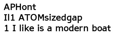
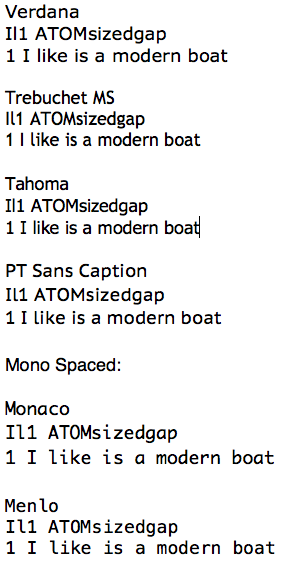
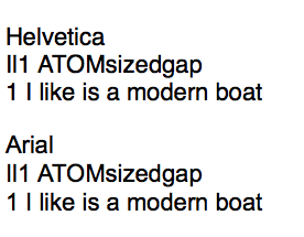
JoAnne,
are you talking about the word document on typeface accessibility?

On Thu, Sep 5, 2019 at 11:42 AM JoAnne Juett <jjuett@salesforce.com> wrote:

> Am I wrong, or are the pass and fail indicators different from the legend?
> The way I see them, it looks as though they fail 1.4.1.
>
> JoAnne C. Juett. PhD
> Sr. Accessibility Specialist
> B2C UX Product Design & Engineering
> Salesforce.com <http://salesforce.com/>
> Mobile: 317.410.8784
>
>
>
>
>
>
> On Tue, Sep 3, 2019 at 11:40 PM Andrew Somers <me@andysomers.com> wrote:
>
>> To add:
>>
>> Some fonts for readability for various impairments (cognitive included).
>>
>> *APHont: *
>>
>> APH created a font in 2003 for low vision, but to be honest I think there
>> are some better options. nevertheless, it is called APHont, and is free,
>> readily downloadable from various font sites.
>>
>> https://www.wfonts.com/font/aphont
>>
>>
>> *TIRESIAS:*
>>
>> I think I like *TIRESIAS INFOFONT *better, among other things lower case
>> rn next to each other, and the lower case l:
>>
>> https://www.fontsquirrel.com/fonts/tiresias-infofont
>>
>> But the fairly standard Verdana and some others also work well — I
>> particularly like Trebuchet as a more readable alternative to Futura— while
>> some very popular/common fonts like Helvetica have a few problems.
>>
>>
>> Despite popularity, Helvetica & Arial, have problems. such as I and l,
>> and rn next to each other:
>> Related, some fonts for DYSLEXIA have several helpful features:
>>
>> https://www.dyslexiefont.com/en/typeface/
>>
>> https://www.opendyslexic.org
>>
>>
>>
>> Andy
>>
>> *Andrew Somers*
>> *contact redacted*
>>
>> On Sep 2, 2019, at 2:03 PM, Wayne Dick <wayneedick@gmail.com> wrote:
>>
>> Hi,
>> This is a pretty good reason to let people choose their typeface. I find
>> Reith pretty clear, but the I1l distinction is less than I like. I still
>> choose Verdana or Tahoma for sans-serif and Georgia for serif. However, I
>> choose large enough see with reflow over all. Tweaking letter spacing and /
>> or word spacing is helpful too.
>> Best, Wayne
>>
>> On Thu, Aug 29, 2019 at 8:07 AM Jim Allan <jimallan@tsbvi.edu> wrote:
>>
>>>
>>> FYI
>>>
>>> From COGA and BBC
>>>
>>>
>>>
>>>
>>>
>>> --
>>> Jim Allan, Accessibility Coordinator
>>> Texas School for the Blind and Visually Impaired
>>> 1100 W. 45th St., Austin, Texas 78756
>>> voice 512.206.9315    fax: 512.206.9452 http://www.tsbvi.edu/
>>> "We shape our tools and thereafter our tools shape us." McLuhan, 1964
>>>
>>>
>>> --
>>> Jim Allan, Accessibility Coordinator
>>> Texas School for the Blind and Visually Impaired
>>> 1100 W. 45th St., Austin, Texas 78756
>>> voice 512.206.9315    fax: 512.206.9452 http://www.tsbvi.edu/
>>> "We shape our tools and thereafter our tools shape us." McLuhan, 1964
>>>
>>>
>>> --
>>> Jim Allan, Accessibility Coordinator
>>> Texas School for the Blind and Visually Impaired
>>> 1100 W. 45th St., Austin, Texas 78756
>>> voice 512.206.9315    fax: 512.206.9452 http://www.tsbvi.edu/
>>> "We shape our tools and thereafter our tools shape us." McLuhan, 1964
>>>
>>
>>

--
Jim Allan, Accessibility Coordinator
Texas School for the Blind and Visually Impaired
1100 W. 45th St., Austin, Texas 78756
voice 512.206.9315    fax: 512.206.9452 http://www.tsbvi.edu/
"We shape our tools and thereafter our tools shape us." McLuhan, 1964
Attachments
- image/png attachment: Screen_Shot_2019-09-03_at_7.50.14_PM.png
- image/png attachment: Screen_Shot_2019-09-03_at_7.39.46_PM.png

- image/png attachment: Screen_Shot_2019-09-03_at_8.17.06_PM.png
- image/png attachment: Screen_Shot_2019-09-03_at_8.30.40_PM.png
- image/png attachment: GeneralTitles3-Just-Logo33.png

Received on Thursday, 5 September 2019 17:04:13 UTC