- From: Andrew Somers <me@AndySomers.com>
- Date: Wed, 4 Sep 2019 15:57:34 -0700
- To: Alastair Campbell <acampbell@nomensa.com>
- Cc: public-low-vision-a11y-tf <public-low-vision-a11y-tf@w3.org>, Jim Allan <jimallan@tsbvi.edu>, Wayne Dick <wayneedick@gmail.com>, Jason Grieves <Jason.Grieves@microsoft.com>, Laura Carlson <laura.lee.carlson@gmail.com>
- Message-Id: <DB13DEA1-5127-45F1-96AA-2909DE16C6DA@AndySomers.com>
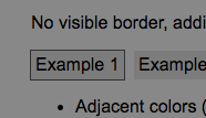
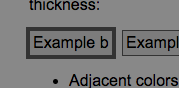
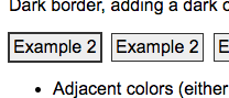
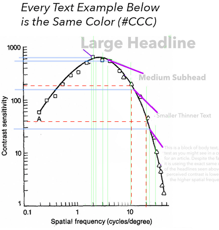
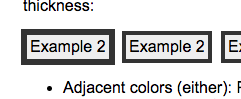
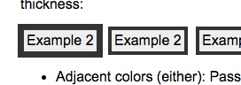
Hi Alastair, hope you had a good holiday, and of course hello to the LVTF team, and all,

NOTE TO ALL: there are many images in this message, if you don’t get them as they are stripped from the archive, please let me know and I will send directly.

Regarding the Examples Page & User Agents:

1) Just FYI the buttons are not functional using Safari, though the form fields are. In Safari the form fields all have the “autofill” clickable focus indicator from the user agent.

2) Some of my other user agents such as Chrome add things to the form fields, such as a pull-down auto-fill, which makes judging “focus” as far as the outlines a little harder to judge - but also of course plainly shows focus, if in an annoying way.

Both of these issues indicate problems with focus related to user agents, all of which have their own focus styling, which is inconsistent at best and in some cases hard (or unpredictable) to override. While I don’t know if this could be part of the SC, a blurb about this issue, encouraging testing on all browser types might be good to have in the understanding section.


On The Examples:

Regarding “1px” as it relates to contrast perception:

We had a recent research breakthrough here through some experiments relating to font size and stroke width. A general conclusion is that when contrast is closer to threshold (before contrast constancy begins to take effect) that it is font stroke width (weight) and not font size per se that determines where it fits on the CSF curve. The experiment test panels can be reviewed here:  https://www.myndex.com/WEB/WCAG_CE14weight <https://www.myndex.com/WEB/WCAG_CE14weight>  (non-responsive, desktop only)

This directly applies to the width of any border. Thinner borders (1px) need more contrast than thicker borders for the same contrast perception.

On the test page, a BG of #EEE and a 1px border of #333 is a WCAG contrast of nearly 11:1, that’s far more than the SC’s requirement of 3:1 (#888) as I understand it? Without my glasses on, the much higher contrast #333 is easier to see than the #888, though I can make out both when the brightest color is #EEE or higher.

I’d like to offer the suggestion that evaluation of the 1px border be set at 3:1 as that should provide a more instructive idea of how the SC works at the “minimum” level. ESPECIALLY if using a darker color pair. (This touches the other well discussed issues how WCAG maths don’t adjust for darker pairs).

For instance if the dark border remains at #333, but we use a darker BG #7C7C7C and achieve the SC 3:1, then I can’t distinguish the border 9without my glasses on) unless it is blinking. (and to be clear I am not suggesting blinking!!)

WCAG 3:1 contrast of a 1px border, dark on dark:


While Using Chrome:

These judgements made with my worst eye (OD) with no correction on. This eye has contrast and acuity issues in near vision, and is equiv 20/150 for near.

Example 1: As I mention above - at a 3:1 contrast it may not be enough. Regarding that unrelated SC we discussed for smaller thin fonts (with a 1px stroke width in body text) I am looking at 9:1 to 11:1 to be appropriate contrast levels. I don’t think that much contrast is needed here, but I’m also not sure that 3:1 is enough for a 1px border - on the other hand, 3:1 is certainly enough for a 4px border as in this example:


This relates to the effect spatial frequency has on perception & contrast. FWIW spatial frequency is playing a bigger role in research (not just mine) and future standards development.

Example 2: On that note, looking at example 2, it indicates a fail, BUT (and going back to your example colors as written):


So the fact that the 1px add-on does not contrast with the 1px unfocused border is not relevant BECAUSE the add-on literally DOUBLES the thickness of the border overall which has a substantial effect on contrast. It cuts the “cycles per degree” in half. If we assume a typical reading distance for near normal the 1px border is perhaps 20cpd, so when it doubles to 2px it drops to 10cpd, With 20cpd at a logCS of 40, the logCS of 10cpd is 200. (see red dashed lines below):


This CSF diagram relates more to near-threshold contrasts, nevertheless it helps illustrate the perception.

So, if you were adding a 1px “addon” focus border to an existing border that was 4px, so it became 5px, that’s only a 25% increase, and goes from 5cpd to 4cpd, and a minimal change in contrast:

4px to 5px focus:


In THIS case, this should fail as the CHANGE is not enough, either in size or contrast. But let's look at other width changes:

4px to 6px (50% thicker)


4px to 7px (75% thicker)


As such I’d suggest that the added border does not need to contrast with the existing border IF it makes the existing border wider-enough (as a percentage??) that focus is perceptually clear.


Example 3: Without correction I can see no difference or focus.

Example 13: I find this hard to call “contrasts with both element and BG” because it really doesn’t - it is close enough to BG that the effect is simply making the element smaller. I don’t think it’s a “fail” per se, but Example 11/11b is more of a pass than this.


This relates to the local adaptation and surround and/or simultaneous contrast effects we’ve discussed in the past. The bright white of the FORM ELEMENT completely shifts local adaptation, and there is little perceptual contrast between the two darker colors. This border is effectively assimilated (subsumed) by the BG.

Example 14: 14b is the best, this is echoing my comments on example 2 above. Next best is 14a which is called a fail. 14d is weakest, and weaker than 14a.

Example 15: b c and d are not overriding the USER AGENT defaults in Chrome, and I notice the user agent obliterates nearly all of the examples on the page (with the default user agent being easier to see.)

This leads to a concern that I think should be mentioned in understanding, perhaps asking the question if the author really needs to override the user agent focus to achieve their g design and usability goals.


Cheers,

Andy


Andrew Somers
Color Science Research & Engineering
Contact redacted for list archive purposes


> On Sep 1, 2019, at 4:14 PM, Alastair Campbell <acampbell@nomensa.com> wrote:
>
> Hi everyone,
>
> Thanks for the minutes Laura, I'm just catching up after vacation.
>
> I saw the focus-visible discussion, I thought it would be worth pointing to an updated version of the test page:
> https://alastairc.uk/tests/wcag22-examples/focus-more-visible-2.html
>
> Of particular interest for the discussion are the last couple of examples, where it demonstrates the outline separation and size aspects (examples 14 & 15).
>
> I'm not sure what the conclusion was of the discussion, but there was something about needing examples, and I already had those...
>
> Cheers,
>
> -Alastair
Attachments
- text/html attachment: stored
- image/png attachment: Screen_Shot_2019-09-04_at_2.27.37_PM.png
- image/png attachment: Screen_Shot_2019-09-04_at_2.35.36_PM.png
- image/png attachment: Screen_Shot_2019-09-04_at_2.42.49_PM.png
- image/png attachment: Screen_Shot_2019-09-04_at_2.50.16_PM.png
- image/png attachment: Screen_Shot_2019-09-04_at_2.58.54_PM.png

- image/png attachment: Screen_Shot_2019-09-04_at_3.02.54_PM.png
- image/png attachment: Screen_Shot_2019-09-04_at_3.03.20_PM.png
- image/png attachment: Screen_Shot_2019-09-04_at_3.24.10_PM.png

- image/png attachment: GeneralTitles3-Just-Logo33.png

Received on Wednesday, 4 September 2019 22:58:06 UTC