- From: Jonathan Avila <jon.avila@levelaccess.com>
- Date: Thu, 30 May 2019 13:41:18 +0000
- To: Michael Gilbert <mdgilbert@google.com>
- CC: Alastair Campbell <acampbell@nomensa.com>, W3C WAI ig <w3c-wai-ig@w3.org>, "public-low-vision-a11y-tf@w3.org" <public-low-vision-a11y-tf@w3.org>
- Message-ID: <BN6PR03MB31397BE30A6E1A6697A898C7F1180@BN6PR03MB3139.namprd03.prod.outlook.com>
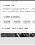
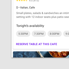
Michael, thank you for the additional details.    For me personally when color alone is used for links and buttons such as in the example image below from Material design – the purple bold “reserve table at this café” button appears to me like a heading and I immediately look below it for the reservation information.  Yes there is a faint gray line – but I’m pretty use to seeing gray lines between related content.    If I were on the desktop I would try and mouse over or tab to the area – on a touch screen I would likely scroll around before tapping anything looking for the reservation.

[https://storage.googleapis.com/spec-host-backup/mio-design%2Fassets%2F1ZN1vzXmrDrBOlhjGacaGT-v45oyCa_Qd%2Fbuttons-textbutton-text-label-dont-1.png]

In this case the only difference between the reserve link and the other headings on the page is that the link is purple – the other headings are bold and black – so to me it looks like a heading.

[cid:image004.png@01D516CA.C1F3C180]
Gray scaled screenshot above/attached

Regarding affordances – the lack of any border use with buttons seems to confuse the difference between links and buttons and what happens when you activate one versus the other (performing an action versus going somewhere else).     When the affordance is not clear it requires the user to mouse over, guess, tab to things, or simply use trial and error.

Regarding the tester program – in the past I spoke to people about participating in the program but when I told them I didn’t live in California - -I was told I was not eligible as they were looking for people in that area only.

Best Regards,

Jonathan

From: Michael Gilbert <mdgilbert@google.com>
Sent: Thursday, May 30, 2019 9:14 AM
To: Jonathan Avila <jon.avila@levelaccess.com>
Cc: Alastair Campbell <acampbell@nomensa.com>; W3C WAI ig <w3c-wai-ig@w3.org>; public-low-vision-a11y-tf@w3.org
Subject: Re: Non-text contrast research

CAUTION: This email originated from outside of the organization. Do not click links or open attachments unless you recognize the sender and know the content is safe.


Hello all,


First off, thank you to Alastair for kindly allowing us to share our work with the WCAG community. I personally hope that, first, the work we do can be useful to the larger WCAG community, and second, by incorporating the feedback we get here, we can deliver stronger and more useful research in general. To that end, I definitely appreciate the opportunity to receive and address questions; please forgive the delay in doing so, though, since there’s still an internal process we have to go through.


Speaking directly to the questions above:


Regarding replicating the study with those with cognitive impairments -- I agree this would be an interesting next step for this line of research. I’ll begin exploring this with others internally at Google, and will share an update here when I can. Note, however: additional observations using the protocol from this study won’t invalidate data already collected. The research already completed, qualitative in nature, aims to identify signals, not explicate prevalence.


Regarding adding a control group, timing responses, concern around confounds -- This is currently being planned. Whereas the prior qualitative study was intended to identify signals, I’m building a quantitative study that will allow us to control for possible confounds. There are two primary reasons we didn’t aim for a quantitative study to begin with: first, access to and size of the target population for this initial study meant that we would have had to spend much more time reaching an appropriate number of participants an appropriate number of times to be able to show significance of effect of design variation (recalling that our participants were from our Trusted Tester program [1], more on that below). And second, insights generated from qualitative work allow us to identify more foundational concerns – e.g., rather than first focusing on the impact of varying affordance contrast on a specific outcome measure (like time to click/tap), we are able to highlight a plethora of other design factors that impact the identifiability and perceived interactability of components. Follow-on experimental work, as we’re planning above, can then aim to estimate the size of the impact of those additional attributes.


Regarding concerns that results were intended to support existing Material guidelines (e.g., bias) -- As Alastair pointed out above, outlines or similar affordances aren’t required in WCAG guidance for buttons [2]; three of four buttons described in the Material spec do have an outline [3]. The goal of this study was intentionally scoped extremely narrowly to ensure that we could adequately identify signals, focusing only on two questions: varying only affordance contrast, are these components (1) identifiable, and are they (2) perceived as interactable.


Regarding concern that study participants were expert users, and Googlers -- None of the participants were Googlers. All of the participants were from our Trusted Tester program [1]. Testers participating in the panel aren’t limited by technical proficiency, so there are a broad range of prior experiences and skill sets represented. If anyone is curious about participating, please see the form at the bottom of the accessibility initiatives page ([4]).


In general, regarding limitations and next steps -- It’s true that while we haven’t addressed all the research questions with this study (e.g., separate experimental study, mentioned above), we are aiming to expand our understanding of the design space, and how users encounter, perceive, and interact with our designs. There’s a difference between trying to optimize a single product for a discrete outcome (e.g., findability, operationalized as time to click/tap) and trying to identify an area of expression where the design of an arbitrary product is more usable and accessible. One of the challenges of research for a design system rather than a product is aiming to find balance between both of those goals.


All that said, I very much appreciate the feedback, and I’m looking forward to working alongside everyone in this community moving forward!


Thanks,

-Michael


[1] https://www.google.com/accessibility/initiatives-research/


[2] https://www.w3.org/WAI/WCAG21/Understanding/non-text-contrast.html


[3] https://material.io/design/components/buttons.html#usage


[4] https://docs.google.com/forms/d/e/1FAIpQLSfcb-l0mCZ__09SSyFAuI_k2WBLR05URYbR_Stv9N42u7GTiw/viewform


On Fri, May 17, 2019 at 4:48 PM Jonathan Avila <jon.avila@levelaccess.com<mailto:jon.avila@levelaccess.com>> wrote:
My personal thoughts from reviewing the recording are that the goal seems to be to get research findings that support the material design tenants that borders are not needed and that other subtle affordances are acceptable because in the end after some amount of time the user can just figure it out.

When people with low vision look at a page we may only see small parts of the page and rely on other visual factors such as borders and non-word indicators when we can’t read the text that is in our best vision.    We do this to find and locate items.   Searching for a word on a page is extremely difficult with low vision – that’s why control+f is so important.  There is also visual latency where users with visual impairments take time to find something and may miss something they should otherwise be able to see – but miss it the first time.   Making the user rely on reading all the words or wading through little font differences to eventually figure out that something is actionable is not realistic for real people with disabilities.  This study doesn’t address the needs of users with cognitive and learning disabilities and seems to focus on expert users who are employees of Google.  There are many other aspects of this case such as relying on users to mouse over something, etc.  that raise questions about the exact methods used.  While I applaud the effort to conduct research – I personally feel there are to many confounding variables and not enough attention paid to the amount of time and other disabilities that make the results of limited use.

On many pages I resort to setting a large focus indicator with the Stylus extension and tabbing around and also setting a border on actionable elements via hover and mousing around to try and determine actionable elements on a page.

For me lack of borders causes the issue of not knowing the hit area for a target unless the mouse changes and then if there are two elements close by I’m not certain of which one is being targeted.  Borders provides confidence that I am within the hit area.   Lack of borders also is confusing regarding how things are related or grouped as it may be unclear what items are in the group or the type of action.  For example, the word “yes” by itself could be a yes radio button or a “yes” button.  One is checkable while the other performs some action that may take me somewhere else.  Having borders like square and circles gives me some affordance to know the type of response that will occur.  These are important aspects that must be considered.

Jonathan
.

From: Alastair Campbell <acampbell@nomensa.com<mailto:acampbell@nomensa.com>>
Sent: Friday, May 17, 2019 11:39 AM
To: W3C WAI ig <w3c-wai-ig@w3.org<mailto:w3c-wai-ig@w3.org>>
Subject: RE: Non-text contrast research

CAUTION: This email originated from outside of the organization. Do not click links or open attachments unless you recognize the sender and know the content is safe.

Hi Everyone,

Hopefully people will get a chance to review the slides and/or video I posted from Michael Gilbert and the team at Google [1]. Michael is now on this email group so can join in.

I thought I start the comments with what I took way from the results:


  *   The structure of the criteria text gives us some flexibility, where it says “Visual information required to identify user interface components and states”, if research finds that X, Y & Z other factors make the contrast irrelevant in a particular scenario that can be addressed fairly easily.

That is already the case for buttons where the understanding doc [2] says buttons don’t require borders.
  *   The remit of the guidelines is to prevent barriers that affect people with disabilities, it would be useful to have a control group or a comparison with other usability testing to help work out which factors impact people with low vision, compared to a general audience. (Not that it is a deciding factor, but it’s part of the equation.)
  *   I fully appreciate that more examples would help, but to make that a manageable task it would help to know which types of component people have struggled to apply the criteria to. Presumably the examples in the understanding document [2] cover some cases, which other components are people concerned with?
  *   This criteria (non-text contrast) is focused on having contrast for certain aspects, but it does not require particular design approaches/affordances. E.g. if an input doesn’t have any border it isn’t required to have a contrasting one.
However, lack of affordance is an issue for many folk (particularly with cognitive impairments [3]), it would be great to re-run the study with participants with cognitive impairments.
I’d just note that my brain is fairly wired-up to how the guidelines work, so I hope people less biased by that can comment as well 😊

Kind regards,

-Alastair

1] Page with video and link to slides:
https://alastairc.uk/tests/wcag21-examples/ntc-research-video.html

NB: If the slides don’t work in your screenreader make sure the accessibility setting is on:
https://support.google.com/docs/answer/6282736


2] Understanding doc:
https://www.w3.org/WAI/WCAG21/Understanding/non-text-contrast.html


3] COGA doc:
https://w3c.github.io/coga/techniques/index.html#use-clear-visual-affordances


--

www.nomensa.com<http://www.nomensa.com/> / @alastc


--
Michael Gilbert |  Senior UX Researcher  | mdgilbert@google.com<mailto:mdgilbert@google.com> | go/mxr<http://go/mxr>
Attachments
- image/png attachment: image004.png

- image/png attachment: image003.png

Received on Thursday, 30 May 2019 13:41:47 UTC