- From: Laura Carlson <laura.lee.carlson@gmail.com>
- Date: Fri, 3 May 2019 13:41:44 -0500
- To: Jim Allan <jimallan@tsbvi.edu>
- Cc: public-low-vision-a11y-tf <public-low-vision-a11y-tf@w3.org>
Received on Friday, 3 May 2019 18:42:12 UTC
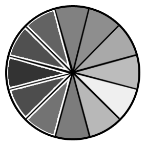
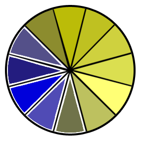
Hi Jim and all,

Attached are simulated examples of color blindness for the
requirements doc that meet Non-text Contrast. 1.4.11. I added a white
border around some of the slices in order to achieve 3:1 or better
contrast.

Not sure if we want to use the new images or not. I guess it depends
on if we  consider the current presentation of graphics essential to
the information being conveyed.

Thoughts?

Kindest Regards,
Laura

On 4/30/19, Jim Allan <jimallan@tsbvi.edu> wrote:
> http://htmlpreview.github.io//?https://github.com/w3c/low-vision-a11y-tf/blob/jim-edits/requirements.html
>
>
> --
> Jim Allan, Accessibility Coordinator
> Texas School for the Blind and Visually Impaired
> 1100 W. 45th St., Austin, Texas 78756
> voice 512.206.9315    fax: 512.206.9452 http://www.tsbvi.edu/
> "We shape our tools and thereafter our tools shape us." McLuhan, 1964
>


--
Laura L. Carlson


Received on Friday, 3 May 2019 18:42:12 UTC