- From: Glenda Sims <glenda.sims@deque.com>
- Date: Tue, 9 Oct 2018 16:07:31 -0500
- To: public-low-vision-a11y-tf <public-low-vision-a11y-tf@w3.org>
- Message-ID: <CAH2ngETTz3y_ZbZPpjndcjYJ2mAsu0F9jOoGbk5iYN1oiuxTpA@mail.gmail.com>
Dear & Wonderful LVTF,

I have a question on WCAG 2.0 SC 1.4.5 Images of Text
<https://www.w3.org/TR/2008/REC-WCAG20-20081211/#visual-audio-contrast-text-presentation>
and
what is considered a pass or fail (from a normative, minimum bar
perspective).

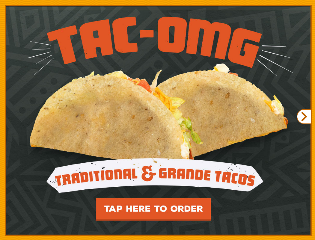
Question 1: Image of two tacos.

   - Image of Text at the top of the image reads "TAC-OMG".  This text is
   curved (displayed in an arc).
   - Image of Text below the tacos reads: TRADITIONAL & GRANDE TACOS"
   - Image of Text on a button just below that...this text reads "TAP HERE
   TO ORDER"


[image: tacomg.png]


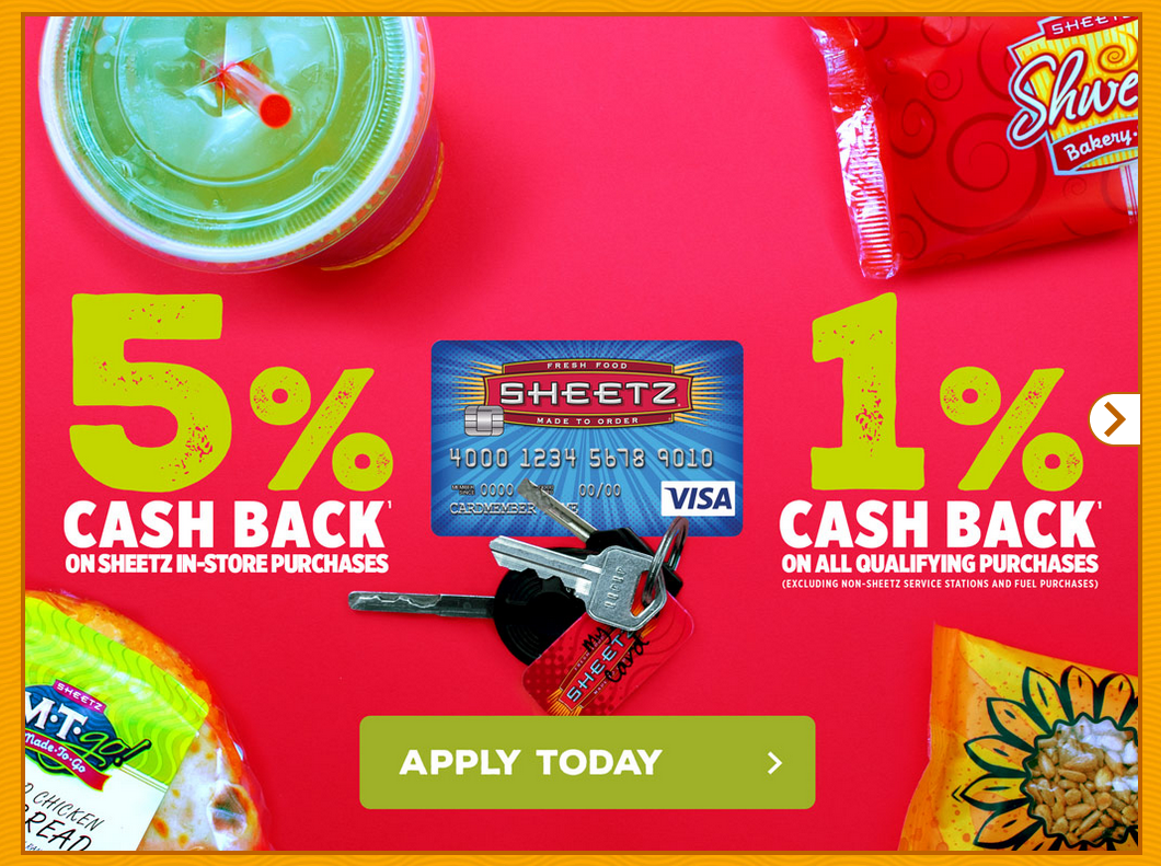
Question 2: Advertisement for 5% cash back or 1% cash back

   - Image of Text on the left of the image reads "5% CASH BACK ON IN-STORE
   PURCHASES".  I've smudged out the company name.
   - Image of Text at the right of the image: "1% CASH BACK ON ALL
   QUALIFYING PURCHASES (EXCLUDING NON-smudged SERVICE STATIONS AND FULL
   PURCHASES)"
   - Image of Text on a button just below that...this text reads "APPLY
   TODAY"

[image: ad.png]

Can I get your LVTF consensus opinion on would you call out these two
images a failures of 1.4.5 under WCAG 2.0 or not?

Thanks tons,
Glenda

*glenda sims <glenda.sims@deque.com>*, cpacc
<http://www.accessibilityassociation.org/certification>   | team a11y lead
| 512.963.3773

        deque systems <http://www.deque.com>  accessibility for good
Attachments
- image/png attachment: tacomg.png

- image/png attachment: ad.png

Received on Tuesday, 9 October 2018 21:08:21 UTC