- From: Alastair Campbell <acampbell@nomensa.com>
- Date: Wed, 14 Jun 2017 15:54:17 +0000
- To: "Repsher, Stephen J" <stephen.j.repsher@boeing.com>, Glenda Sims <glenda.sims@deque.com>, public-low-vision-a11y-tf <public-low-vision-a11y-tf@w3.org>
- Message-ID: <VI1PR0901MB09268E8F6A534487F66D9553B9C30@VI1PR0901MB0926.eurprd09.prod.outlook.>
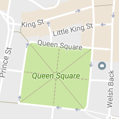
[Steve] Yes, my point was just that arguments for or against need to be based on either common knowledge or logic, or research.  Saying text is harder doesn’t pass the former.

Hi Steve,

I think we need some examples then, because (as someone who's vision is just about corrected to 20/20 with glasses), it does appear logical that lines and blocks are easier to perceive than equivalently contrasting text.

I can only state that from personal experience, perhaps it is different with low-vision (rather than it being a smooth acuity continuum).

Taking the attached map screenshot, the white roads next to the grey blocks are not great for contrast, but sizing plus gestalt perception makes them easier to perceive than the small text.


[Steve] I’m just going to have to disagree.  I strain my eyes all the time viewing things like this, and a map with tons of lines and labels is actually a perfect example.

[AC] And it is the lines, not the labels?

It seems logical to people without low-vision that lines & blocks  would be easier, so we either need examples to demonstrate why it isn't, or some research (even if we have to do it ourselves).


[Steve] On a bar chart, for example, a bar may need to be distinguished from 3 adjacent colors (2 bars on either side and the background).  A thin border with good contrast to the background solves the problem and then any color for the bars passes.

It doesn't solve the problem, in that case the colours all need to be at the opposite end of luminance from the border, which cuts it down the choice of different colours a lot. Or you have to separate the bars.

For example, on the last example here:
https://github.com/w3c/wcag21/issues/9

The pie chart has to 'explode' (i.e. the slices have gaps between them) and one of the lighter slices needs a border as well.

Cheers,

-Alastair
Attachments
- image/png attachment: Screen_Shot_2017-06-14_at_10.21.36.png
Received on Wednesday, 14 June 2017 15:54:54 UTC