- From: Scott McCormack <scott.mccormack@ssbbartgroup.com>
- Date: Wed, 16 Nov 2016 19:59:02 +0000
- To: "public-low-vision-a11y-tf@w3.org" <public-low-vision-a11y-tf@w3.org>
Received on Wednesday, 16 November 2016 19:59:36 UTC
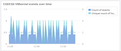
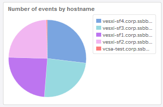
Here are a couple of screenshots of a line graph and a pie chart that fail color contrast checks between the different chart elements. The line chart is particularly bad as I have trouble seeing the green line amongst the blue and I have no color vision deficiencies. Someone who is color blind would have a great deal of trouble identifying the separate elements of these charts correctly or separating elements adjacent to one another.

To correct for things like this we need:
- Color contrast requirements have to apply to informational graphics (like charts and graphs) as well as text while exempting pictorial graphics
- Color contrast must be sufficient so that all elements in an informational graphic can be distinguished individually
- Color contrast must be sufficient so that adjacent items can be distinguished from one another.

---
Scott McCormack
Principal Technical Consultant  -- IT Manager
SSB BART Group
scott.mccormack@ssbbartgroup.com
(415)624-2712 (o)
www.ssbbartgroup.com


Received on Wednesday, 16 November 2016 19:59:36 UTC