- From: John Yunker <jyunker@bytelevel.com>
- Date: Wed, 22 Dec 2004 07:22:07 -0800
- To: GEO <public-i18n-geo@w3.org>
- Message-Id: <3E51C7E6-542D-11D9-800D-000A95D947EC@bytelevel.com>
Hi all,

Included below is an FAQ submission for review and input. This is one
of possible several that could be devoted to navigation advice. There
are also three visuals used as part of the FAQ; these are attached.

Thanks.
John Yunker

==============================


Question

I plan to use a pull-down menu on my company's home page to direct Web
users to their country Web sites, Are there any best practices I should
be aware of?


Background

As companies launch an increasing number of country and/or language Web
sites, user-friendly global navigation grows in importance. The term
"global gateway" is frequently used to refer to the visual and
technical devices that Web sites employ to direct visitors to their
specific locales. One of the more popular devices is a pull-down menu
on the home page that includes links to the other locales.


Answer

The pull-down menu is not a silver bullet for global navigation and it
may not be the best solution for your Web site. If your site supports
only a handful of locales, it is better to avoid using a pull-down menu
altogether and simply include links directly to these sites. Also, if
your company offers more than 20 locales, a pull-down menu may not be
the most usable solution, as it results in endless scrolling for Web
users from Venezuala, the US, among others. Instead, consider using a
splash page that includes all locales organized by region. See Ikea.com
or 3com.com for reference.


However, if you do decide to use a pull-down menu, here are some best
practices to keep in mind:

 1. Locate the pull-down menu at the top of all Web pages, preferably
to the right side. This location is highly visible, reducing the chance
that the visitor will not find it. Furthermore, an increasing number of
Web sites have located their global gateways in this location,
condition Web users to come to expect it here.

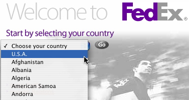
2. Do not put the US at the top of the menu. Many Web sites,
particularly those that have very long pull-down menus, place the US at
the top of the list to save their US visitors from scrolling to the
bottom of the list. FedEx, shown below, includes the US at the top of
the menu. (image: fedex.jpg) Unfortunately, doing this sends the wrong
message to all other Web visitors. In order to convey the image of a
global company, you must treat users from all locales equally.

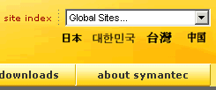
3. Translate the menu options as necessary. Instead of including a link
on the pull-down menu that reads, for example, "French" the link should
read "Francais." Details like this make a big difference in ensuring
truly global usability. Note that due to font and character set
limitations, text display of non-Roman languages isn't always
practical. In these cases, the Web site may include links to these
languages separate from the pull down menu, as demonstrated by the
Symantec Web site. (image: symantec.gif)

4. Include an icon of a globe or map next to the pull-down menu. You
cannot expect Web users who are not fluent in English to understand
"Select language." Icons speak to users regardless of what language
they speak. See the example below from the Philips Web site. (image:
philips.jpg)

==================
Attachments
- image/jpeg attachment: fedex.jpg

- image/jpeg attachment: philips.jpg

- image/gif attachment: symantec.gif

Received on Wednesday, 22 December 2004 15:22:47 UTC