- From: Bobby Tung <bobbytung@wanderer.tw>
- Date: Mon, 9 Nov 2015 09:00:25 +0800
- To: Internationalization Working Group <public-i18n-core@w3.org>
- Cc: Richard Ishida <ishida@w3.org>
- Message-Id: <5EA006CC-3656-48A3-9583-5F1C52A8432A@wanderer.tw>
Here’s issues discussed at tpac.

PDF version: https://www.dropbox.com/s/0sdoclj0bcx2fdc/Chinese%20Issues%20from%20CLREQ.pdf
Chinese Issues from CLREQ

1. Generic font families

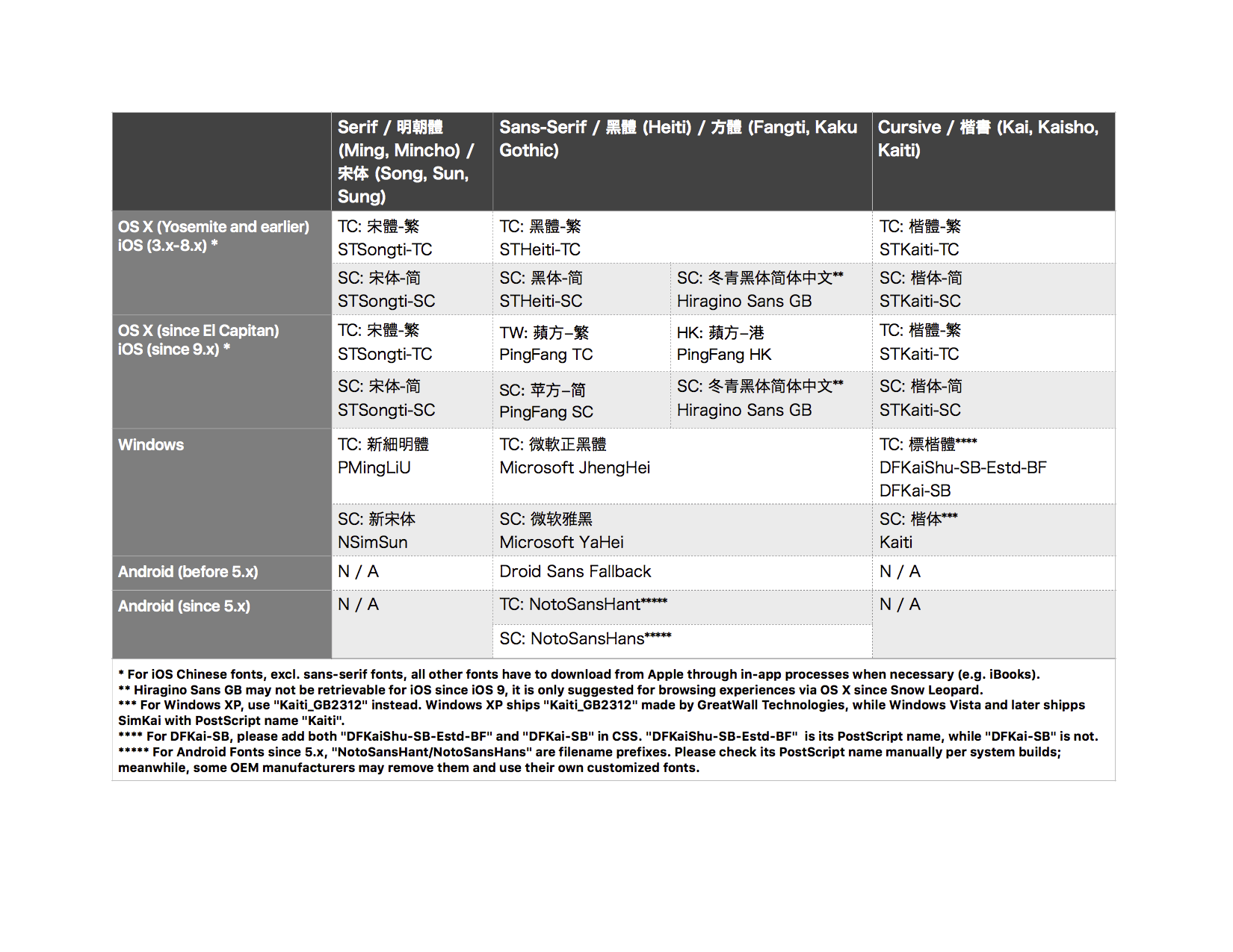
In CLREQ 2.2.1 Four Frequently-used Typefaces for Chinese Character <http://www.w3.org/TR/clreq/#four_commonly_used_typefaces_for_chinese_composition>, there are four typefaces: Song/Kai/Hei/Fangsong. Most of all browsers map Song as serif, and Hei as Sans-serif. For cross platform interoperational purpose. We should find the way to let author easily to use Kai and Fangsong on web.

In Taiwan, government document format recommend to use Kai. In China, GB/T 9704–2012《党政机关公文格式》 recommend to use Fangsong in title and body text.

Proposal

For kai, we recommend browser and ebook reading system vendors to map OS kai font to generic family ‘cursive’(i.e. font-family: cursive). It’s already implied in latest version of Safari. And Firefox will follow soon.

For Fangsong, there are some proposals listed below:

Fangsong a.k.a Souchoutai(宋朝体) in Japan is considered as ‘italic’ form of Minchotai(明朝体)/serif. But there’s no Chinese font set Fangsong as ‘italic’ with Song in same family.
Propose a new generic font family ‘fangsong’. But it is somehow too specific.
Propose a new generic font family ‘antique’. In movable type era, Fangsong is a typeface between Kai and Song. We believe in other scripts as Latin and Japanese, there are same style typeface fit the definition.
Propose a new generic font family ‘formal’. If nation body have their own official document format guide to assign certain typeface. It should be mapped to this family.

Attachment: Latest OS specified Chinese font courtesy by 孫志貴

2. Character Grid

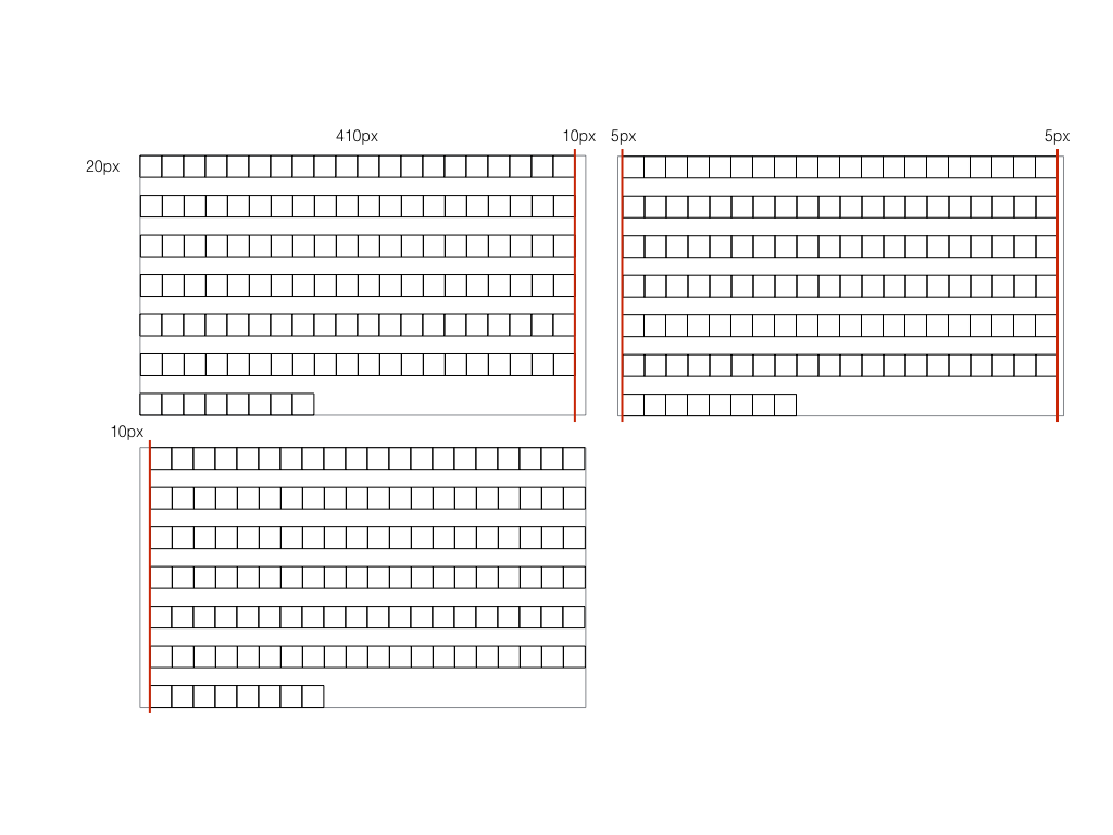
In CLREQ <http://www.w3.org/TR/clreq/#type_area> and JLREQ <http://www.w3.org/TR/jlreq/#basic_templates_of_page_formats>, when we design Kihon-hanmen/Type Area, length of a line should be multiple integer of character size. This requirement is stronger in Traditional Chinese than Japanese and Simplified Chinese.

For now, most Japanese and Chinese ebooks depend on text-align: justify to let start/end of the line aligned well. If we want to go further for layout setting such as text-spacing in CSS text module level 4  <https://drafts.csswg.org/css-text-4/#text-spacing-property>. We probably should find a way to let length of a line to fit multiple integer of character size.

As figure below. Character size is 20px, and the container’s width is 410px. If we move 10px to margin or padding, it will fulfill the concept of Character Grid. That means justify will not add extra letter-spacing.


Additional requirement

Prohibition Rule for Traditional Chinese

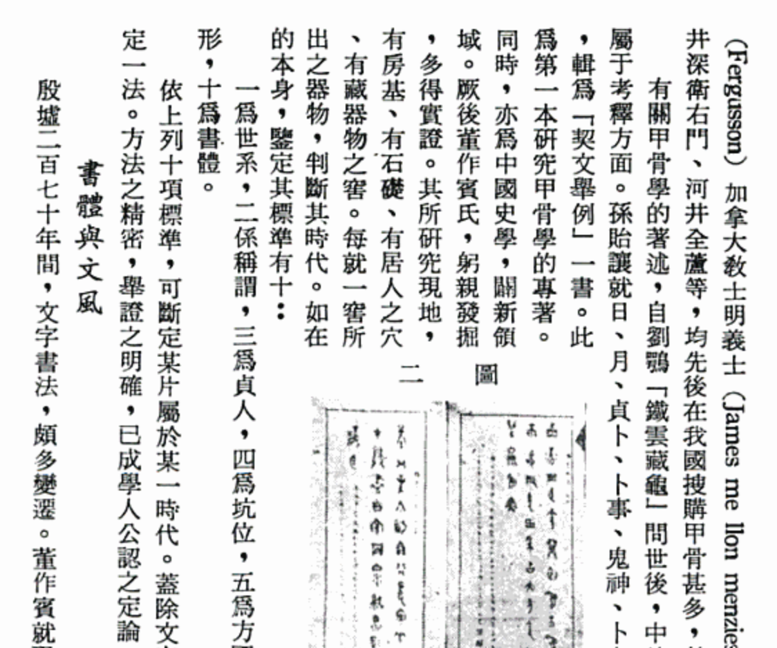
In some Traditional Chinese books, prohibition rule is not required for layout, include: fullwidth comma, fullwidth period, end brackets those are forbidden in CSS text module level 3 line-break: loose <http://www.w3.org/TR/css3-text/#line-break-property>.

For now word-break: break-all could fit this requirement in all browsers.

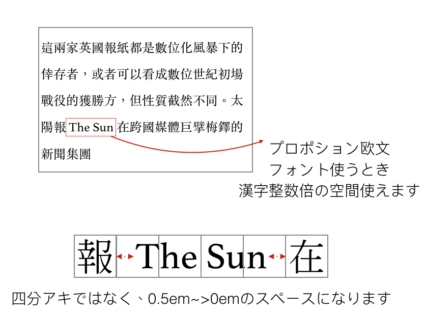
With proportional Latin word inline.

If there is a Latin word inline, the space should equal to multiple integer of character size. Than means extra spacing between ideographs and non-ideographic letters should be automatic added more than 0em but less than 0.5em.

We still need more use case about:

When Latin word in end of line. How should it align to;
When Latin word in start of line. How should it align to;
when Latin word in end of line and it’s length longer than the space. How should we deal with it? move it to next line, or hyphenation if possible, or break it anywhere between letters?
It’s already in CLREQ 3.2 <http://www.w3.org/TR/clreq/#chinese_and_western_mixed_text_composition> , Eric Liu will give more details before end of year.

3. Baseline adjustment

Baseline issue is not addressed in CLREQ.

I found that some browsers deal ideographic baseline and alphabet baseline with default adjustment so that it may align well in Japanese but somehow higher in Chinese. I’m still investigating if it is a font issue.

But the baseline issue do not only happens to ideographic and alphabet, we still have other scripts with hanging baseline as hebrew, tibetan, devanagari,etc. So that we may need a mechanism to adjust font’s baseline in the future.

4. Use OpenType feature to place Bopomofo Tone Mark to right position

We have a basic experimental project to imply Bopomogo tone marks position adjustment by OpenType substitute position(GPOS). But it only works on latest Safari.

The font’s detail as attachment.

https://www.dropbox.com/s/5t4avqgcio56020/Implement%20Bopomofo%20Tone%20Mark%20with%20OpenType%20feature%20.pdf?dl=0
Attachments
Received on Monday, 9 November 2015 01:01:10 UTC


