- From: Tien-Ren Chen <trchen@chromium.org>
- Date: Thu, 22 Sep 2016 00:44:02 -0700
- To: Matt Woodrow <mwoodrow@mozilla.com>
- Cc: "Tab Atkins Jr." <jackalmage@gmail.com>, Rik Cabanier <cabanier@gmail.com>, "/#!/JoePea" <trusktr@gmail.com>, Chris Harrelson <chrishtr@google.com>, Simon Fraser <simon.fraser@apple.com>, "public-fx@w3.org" <public-fx@w3.org>
- Message-ID: <CAKxkHO9PEQOMFuw-wKyCmWxtPh6DUfE+vfdH1btvHVHi3QYf9w@mail.gmail.com>
On Wed, Sep 21, 2016 at 6:28 PM, Matt Woodrow <mwoodrow@mozilla.com> wrote:
> On 22/09/16 12:41 PM, Tien-Ren Chen wrote:
>>
>> I don't think group opacity can be properly defined without
>> flattening. What if some planes in the group are non-opaque themselves
>> and later intersect with non-opaque planes outside of the group?
>>
>> Specifically, how would you define the expected behavior for this
>> particular example? http://jsbin.com/tepixi/
>>
> Right, I totally agree with this.
>
> Opacity *does* require flattening, and if there are planes outsides the
> group that want to be sorted with planes within the group, there isn't a way
> to properly define behaviour.
>
> My point is that when we do the flattening for opacity, we should do so in
> the coordinate space of the root element of the preserve-3d context (by
> propagating ancestors transforms down through the opacity), since this
> results in better rendering for the cases where sorting across the opacity
> boundary isn't required (and there *is* a reasonable definition for the
> right behaviour).
In Chromium's new rendering model we internally see flattening as a
combo of two operations:
A. Modify the accumulated matrix so that the depth of inner 3D context
will be propagated to screen space intact.
B. A grouping property that performs depth sorting on planes collected
so far, and output as an atomic group (i.e. child stacking context).
The depth component of the output will be applied using the current
accumulated matrix.
Let me try to rephrase your approach, basically you want
transform-style:preserve-3d + opacity to perform just operation B but
not operation A. For example:
<style> div { transform-style: preserve-3d; } </style>
<div style="perspective:1000px;">
<div style="transform:rotateX(-20deg);">
<div style="opacity:0.7; background:rgba(255,0,0,0.7);
transform:rotateY(45deg);" >
<div style="background:rgba(0,255,0,0.7);
transform:rotateY(-90deg);"></div>
</div>
<div style="background:rgba(0,0,255,0.7);
transform:translateZ(30px);"></div>
</div>
</div>
Should render equivalent to:
<style> div { transform-style: preserve-3d; } </style>
<div style="perspective:1000px;">
<div style="transform:rotateX(-20deg);">
<div style="transform-style:flat; opacity: 0.7;
transform:rotateY(45deg)matrix3d(1.4142131, 0.36397033, 0.0,
-0.0010641774, 0.0, 1.0641773, 0.0, -0.00036396993, 0.0, 0.0, 1.0,
0.0, 0.0, 0.0, 0.0, 1.0);">
<div style="transform:perspective(1000px)rotateX(-20deg);">
<div class="grid" style="background:rgba(255,0,0,0.7);
transform:rotateY(45deg);" >
<div class="grid" style="background:rgba(0,255,0,0.7);
transform:rotateY(-90deg);"></div>
</div>
</div>
</div>
<div class="grid" style="background:rgba(0,0,255,0.7);
transform:translateZ(30px);"></div>
</div>
</div>
Where the matrix3d(...) just undo the 2D part of the accumulated
matrix. i.e. matrix3d(...) =
flatten(perspective(1000px)rotateX(-20deg)rotateY(45deg))^-1
So that preserve-3d + opacity will propagate the accumulated matrix to
its descendants, and its descendants will perform depth sorting with
total matrix. The result will be projected back to the plane that has
the opacity property.
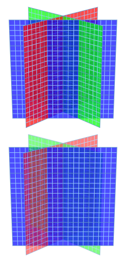
http://jsbin.com/huveseq/ (Note: written in TR spec. Only tested on
Chrome! See attached PNG for expected rendering.) demonstrates this
proposal. I think I've seen this approach with a certain vendor in
some weird corner case. However IMO this definition is not very
useful... It is hard to understand intuitively, not backward
compatible, and doesn't solve the use case /#!/JoePea have.
> For cases like yours, there is no right behaviour, so we're just picking
> which fallback sucks the least.
>
> - Matt
>
>
>
Attachments
- image/png attachment: huveseq-expected.png
Received on Thursday, 22 September 2016 07:44:43 UTC