- From: Rik Cabanier <cabanier@adobe.com>
- Date: Fri, 7 Jan 2011 17:37:16 -0800
- To: Alan Gresley <alan@css-class.com>
- CC: Simon Fraser <smfr@me.com>, Cameron McCormack <cam@mcc.id.au>, Charles Pritchard <chuck@jumis.com>, "ed@opera.com" <ed@opera.com>, "public-fx@w3.org" <public-fx@w3.org>
- Message-ID: <8A13F0222395BD428969E5BA529EFA74776712E92B@NAMBX01.corp.adobe.com>
Hi Alan,
No, my dropshadow is different.
In your example (<http://css-class.com/test/css/shadows/box-shadow-blur-offset-light.htm>) the outside of the element (aka the box) has the shadow applied.
All of the testcases work with this box, not with the content inside of it.
What I'm looking for is something that would shadow the elements within the box.
If the box contained a set of images, text and svg blocks, the box's image would cast a shadow on it previous siblings. The elements within the box should not interact with each other.
The shadow would be calculated using the visible part of the element and be visible through non-opaque elements.
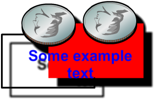
I attached an example of what this looks like. The html for this image would look like:
<div style="filter: dropshadow;">
<div style="..."></div> <!-- stroked rect -->
<div style="..."></div> <!-- filled rect -->
<p style="..">Some example text</p>
<img src="coin.svg" style="..."></img>
<img src="coin.svg" style="..."></img>
</div>
Rik
-----Original Message-----
From: Alan Gresley [mailto:alan@css-class.com]
Sent: Wednesday, January 05, 2011 11:44 PM
To: Rik Cabanier
Cc: Simon Fraser; Cameron McCormack; Charles Pritchard; ed@opera.com; www-style@w3.org
Subject: Re: [css3] support for filters
On 6/01/2011 5:32 PM, Rik Cabanier wrote:
>> No, if the source order is altered (negative margins, etc), then
>> shadows appear over sibling elements. This list message [4] cover
>> this somewhat. The interplay of the shadow in this svg document,
>> http://css-class.com/test/svg/shadow-transparent-background.svg is
>> totally govern by the source order. If the rect with the salmon
>> background appears later in the source than the other rect elements,
>> then it would be painted higher and partially cover both the
>> transparent yellow box and the shadow.
> I think you misunderstood me. I said that the elements WITHIN the
> element that has a drop shadow applied should not interact with each
> other, much like text-shadow where glyphs shouldn't draw shadows over
> each other.
Are we talking about box-shadow [1] or is your drop shadow different?
Currently box-shadows can be cast over sibling elements if the later element (b) is position by CSS to appear visually before the element (c). This is demonstrated in this demo [2] and happens since each element is the same z-axis or stacking order so the tree order determines the painting order [3].
Concerning text-shadow, glyphs do draw shadows over each other if the tree order is altered. These are two demos [4] [5] that shows this clearly. In the later demo, note the elaborate painting order (scroll the overflow box to see).
> Also, I think you're looking for an extension to the box-shadow
> property, while I'm looking for a generic way to express filters.
> Maybe if filters can accomplish your requirement, there is no need to
> extend box-shadow...
>
> Thanks for the links! I'll try to catch up on the history of this
> feature.
>
> Rik
What makes you so sure that we are talking about two different things?
Take for the example the svg filter feGaussianBlur. This can be done already with box-shadow but with a blur that is more intense when further out in the shadow. Demo [6].
Are you aware that CSS box-shadow already has built in the capacity to behave like filters. For svg, to create a filter, you need another element.
<rect filter="url(#filter)"/>
<rect/>
plus other elements to apply the filter effect.
<defs>
<filter id="filter">
<feGaussianBlur/>
<feOffset/>
</filter>
</defs>
In CSS we only need one element,
<div/>
and this CSS.
div {
background: <color>;
box-shadow: 10px 10px 10px 0 <color>; }
Then in a comma separated string, multiple shadows can be applied.
div {
background: <color>;
box-shadow: 10px 10px 10px 0 <color>, 10px 10px 10px 0 <color> inset; }
Each shadow is like adding another filter.
1. <http://dev.w3.org/csswg/css3-background/#the-box-shadow>
2. <http://css-class.com/test/css/shadows/source-ordered-box-shadow.htm>
3. <http://www.w3.org/TR/CSS21/zindex.html#painting-order>
4. <http://css-class.com/test/css/shadows/text-shadow2.htm>
5. <http://css-class.com/test/css/shadows/text-shadow-over-elements1.htm>
6. <http://css-class.com/test/css/shadows/box-shadow-blur-offset-light.htm>
--
Alan http://css-class.com/
Armies Cannot Stop An Idea Whose Time Has Come. - Victor Hugo
Attachments
- image/png attachment: example.png
Received on Saturday, 8 January 2011 01:38:23 UTC