- From: Richard Ishida <ishida@w3.org>
- Date: Wed, 18 Dec 2013 17:12:01 +0000
- To: Tony Graham <tgraham@mentea.net>, public-digipub@w3.org
- Message-ID: <52B1D761.8070201@w3.org>
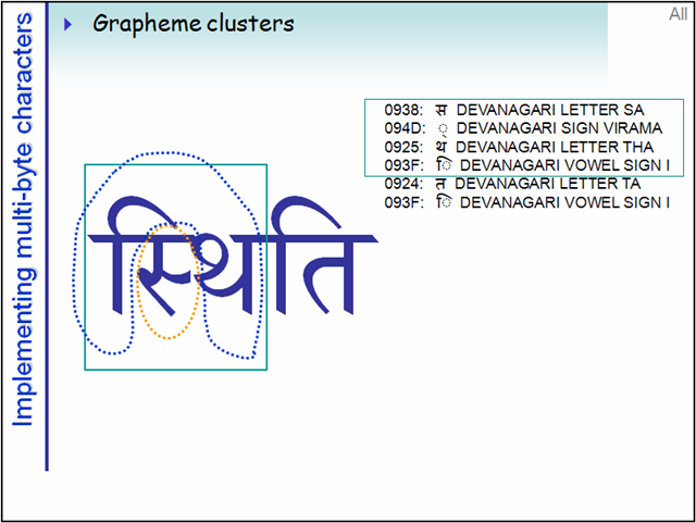
Another thing to consider is that drop or raised caps may need to include more than one character, other than punctuation. For example, IJ in Dutch may be treated as a single unit. It's also possible that Latin base characters may combine with diactritics, accents, etc which are expressed as separate characters but must be dropped/raised with the base. Some of these cases will be captured by the requirement that the default unit for applied drop/raise is a Unicode extended grapheme cluster, but that will probably not cover all requirements - for example, the IJ in Dutch when written as separate characters. So I think there's a need for a requirement that multiple characters can be combined into a drop/raised cap style. There should probably be a default set to extended grapheme clusters per Unicode, but it should probably also be possible to specify the number of characters to be included. InDesign allows you to specify the number of characters enlarged (you can even select a whole word, or more), but it appears to automatically include combining characters with preceding base characters. ON A SLIGHTLY DIFFERENT TACK... Branching out slightly beyond the remit of llreq, this is also an issue for many complex scripts, which are syllable based. In these, typically Indian and South East Asian, scripts a whole syllable has to be enlarged. Sometimes it is sufficient to apply the styling to a grapheme cluster (eg. in Tamil), but for other scripts which have more complex syllabic clusters (eg. Devanagari) the current definition of grapheme cluster is insufficient. For example, in the Hindi word स्थिति (‘sthiti’) the sequence of characters in the first syllable is as follows in memory (see the attached graphic to see how it would be displayed) स 0938 DEVANAGARI LETTER SA ् 094D DEVANAGARI SIGN VIRAMA थ 0925 DEVANAGARI LETTER THA ि 093F DEVANAGARI VOWEL SIGN I त 0924 DEVANAGARI LETTER TA ि 093F DEVANAGARI VOWEL SIGN I The extended grapheme clusters as currently defined by Unicode would be [1] स 0938 DEVANAGARI LETTER SA ् 094D DEVANAGARI SIGN VIRAMA [2] थ 0925 DEVANAGARI LETTER THA ि 093F DEVANAGARI VOWEL SIGN I [3] त 0924 DEVANAGARI LETTER TA ि 093F DEVANAGARI VOWEL SIGN I Whereas the 'drop cap' (devanagari has no capitalisation, so maybe a better term is needed?) would need to incorporate the *four* first characters, ie. [enlarged] स 0938 DEVANAGARI LETTER SA ् 094D DEVANAGARI SIGN VIRAMA थ 0925 DEVANAGARI LETTER THA ि 093F DEVANAGARI VOWEL SIGN I [normal] त 0924 DEVANAGARI LETTER TA ि 093F DEVANAGARI VOWEL SIGN I Is there a place where the Digipub IG is capturing this kind of requirement at the moment? The Indic Layout Task Force, as part of the Internationalization IG, has a document that mentions this kind of thing, although there are errors in it currently on this topic, and there is little progress being made at the moment. Perhaps in the new year we could dust that off, update it and publish it as a FPWD that the Digipub IG could point to? Would that be the best way? Cheers, RI On 15/12/2013 11:48, Tony Graham wrote: > It's not clear from the Task Force page [1] whether or not this section is > finished, but since it hasn't been updated for nearly two weeks... > > 1. It doesn't yet cover raised caps (see above). > > 2. What about punctuation, e.g., quote marks, before the initial capital? > > 3. Should the document cover optical alignment of the initial capital? > E.g., the 'D' in the graphic at [2] could have been shifted left such that > the vertical stroke of the 'D', rather than the serifs, aligns with the > left edge of the text block. > > Other characters that you may want to shift to create a visually vertical > edge include 'T', 'V', 'W', and 'Y', plus you can make the case for also > shifting 'J'. > > Rounded characters such as 'O' and 'C' can also be shifted a little to > make a better visual vertical edge rather than just touching the edge at > one point. > > 4. The graphic at [2] also illustrates the sometime habit of using small > caps for the first word, first few words, or first line to ease the > transition between the initial capital and the following text. > > 5. Should the document say anything about the initial capital being a > different colour or in a different font? > > 6. The graphic at [2] (thank you, Liam) also illustrates, I think, the > habit of added horizontal space on the non-first lines to make them more > easily readable. Something you'd need more with this 'D' than with, e.g., > an initial 'W'. > > Regards, > > > Tony Graham tgraham@mentea.net > Consultant http://www.mentea.net > Mentea 13 Kelly's Bay Beach, Skerries, Co. Dublin, Ireland > -- -- -- -- -- -- -- -- -- -- -- -- -- -- -- -- > XML, XSL-FO and XSLT consulting, training and programming > Chair, Print and Page Layout Community Group @ W3C > > [1] http://www.w3.org/dpub/IG/wiki/Task_Forces/Latinreq > [2] http://www.w3.org/TR/2010/WD-xslfo20-20101216/#initial-caps > > >
Attachments
- image/png attachment: rishida.net_docs_unicode-tutorial_images_complex_grapheme-cluster4.png
Received on Wednesday, 18 December 2013 17:12:33 UTC