- From: David Bokan via GitHub <sysbot+gh@w3.org>
- Date: Fri, 07 Oct 2022 22:25:21 +0000
- To: public-css-archive@w3.org
bokand has just created a new issue for https://github.com/w3c/csswg-drafts:
== [css-shared-element-transitions-1] Define transitions over changing viewport ==
Due to various browser UI, a transition can take place where the source and destination pages have a different size initial-containing-block and fixed/layout viewport. Some examples of UI widgets that cause this:
- Mobile URL bar (and related hide-on-scroll browser bars)
- Virtual Keyboard
- Desktop browser scrollbars
For example, most mobile browsers will force a hidden URL bar to be shown when a cross-document navigation occurs. In the other direction, a showing virtual-keyboard will be hidden when a navigation occurs. We should define exactly how transitioning elements are captured, sized, and positioned in these cases to ensure a seamless transition between the two states (i.e. elements should "jump"). Here's what we're currently implementing which we can use as a starting point for spec text, thoughts welcome.
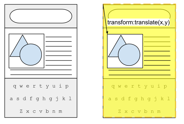
### Snapshot Viewport
We define the concept of the "snapshot viewport". This is a rect that is a consistent size and position regardless of what UI is currently shown. For example, on mobile browsers, the snapshot viewport overlays any shown UI like the URL bar and virtual keyboard:
.png?v=1665177867435)
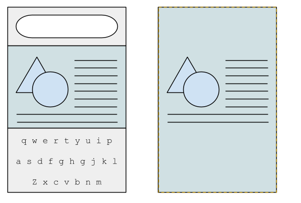
On desktop browsers, a common UI widget requiring attention is scrollbars (in particular, left-side vertical scrollbars in RTL writing modes since it shifts the content origin). The snapshot viewport is overlays and fills the full content area:
.png?v=1665178343787)
### Positioning
The snapshot viewport serves as the common coordinate space in which transitions take place. Since each shared element's transition is [positioned by its `::page-transition-container`](https://drafts.csswg.org/css-view-transitions-1/#selectordef-page-transition-container-pt-tag-selector), and this element is positioned absolutely within the `::page-transition`, we make `::page-transition` match the snapshot viewport rect:
```CSS
html::page-transition {
position: fixed;
/* Dynamically generated based on whether UI is showing or not. */
left: -15px; /* left-side vertical scrollbar */
top: -56px; /* mobile URL bar */
width: 412px;
height: 1000px;
}
```
When capturing a shared element's "screen space position", use the position relative to the snapshot viewport:
### Root snapshot
To avoid the root snapshot moving or scaling its snapshot is sized to match the snapshot viewport. The page's content is captured at its location within the snapshot viewport and regions of the snapshot covered by browser UI are rendered with the background color (or real page content, if available).
Please view or discuss this issue at https://github.com/w3c/csswg-drafts/issues/7859 using your GitHub account
--
Sent via github-notify-ml as configured in https://github.com/w3c/github-notify-ml-config
Received on Friday, 7 October 2022 22:25:23 UTC