- From: Adam via GitHub <sysbot+gh@w3.org>
- Date: Tue, 04 Oct 2022 16:11:37 +0000
- To: public-css-archive@w3.org
> Re. your issue with ragged-right lines, you didn't mention `text-align: justify` - I presume you're aware of that? Justify paragraph alignment is something different, but should also use the paragraph composer options, plus the character spacing, word spacing, and glyph scaling min/max values. Justified paragraph text on the web currently adds space between words such that the first word and last word of each line are aligned to the width of the paragraph. On the web, this causes ugly "[pigeon holes](https://www.c82.net/typography/term/pigeon-holes)" of unbalanced white space within the paragraph. This is also bad typography design as the holes don't indicate anything of importance like the end of a sentence or new paragraph or such. They require the eye to move random distances in order to keep reading and create distracting aesthetics. 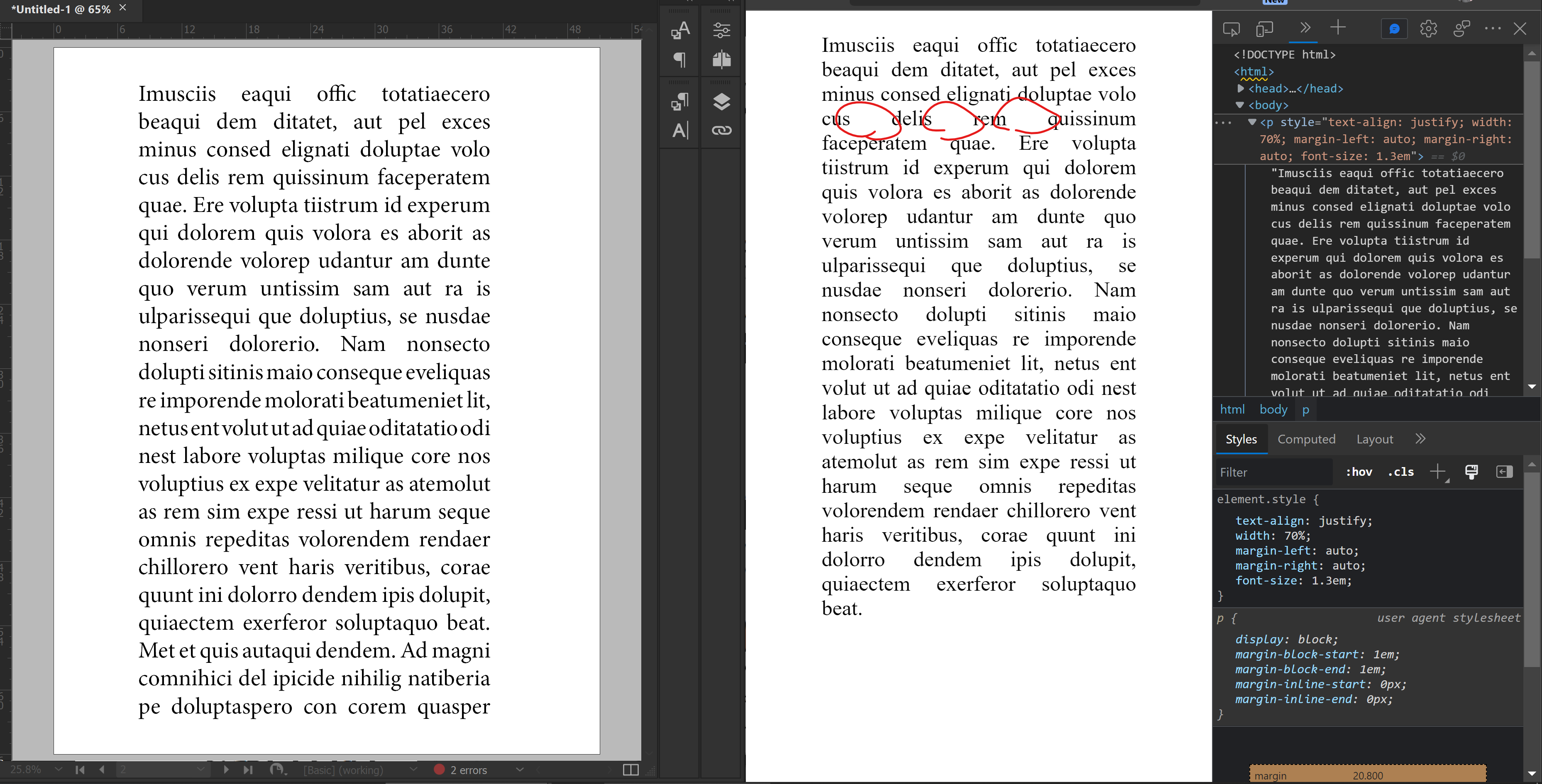 In the above screenshot, you can see Chromium on the right rendering some text with the "justify" alignment attribute. The same text on the left is in InDesign also with the "justify" alignment attribute but with a multi-line paragraph composer and some min/max settings for word spacing and character spacing. You'll notice the InDesign typography is a bit better than the web browser's typography since the spacing within each line is much more balanced due to the subtle variations in word and character spacing.  Now, in the above screenshot, some glyph scaling min/max values were added to the paragraph on the left. The changes in width to each letter are very subtle, but this makes for a much better paragraph shape with no massive "pigeon holes" at all. This is superior typography design than what is available in web browsers at the moment. However, sentence beginning/ends are not obvious in that paragraph, thus the need for a sentence spacing control in order to improve sentence skimming and readability. All of these things would also be FANTASTIC for eBook readers to support, as eBook typography is pretty terrible, too. > Before this discussion here goes on, I suggest to split the different requests up into several issues, so they can be discussed separately and it is easier for people to keep track of them. How shall I split them as different issues do you think? Like below perhaps? 1. Responsive typography runts - select nth first/last characters 2. Responsive typography paragraph line ragging - multiline composer, min/max character spacing, min/max word spacing, min/max glyph scaling 3. Responsive typography select sentence based on sentence length - min/max selector based on character count 4. Responsive typography sentence spacing - Control for increasing/decreasing space between sentences All of them kind of go together as 2 can help with 1, 3 can help with 4, and 3 can help with 1. -- GitHub Notification of comment by adamzea Please view or discuss this issue at https://github.com/w3c/csswg-drafts/issues/7704#issuecomment-1267242075 using your GitHub account -- Sent via github-notify-ml as configured in https://github.com/w3c/github-notify-ml-config
Received on Tuesday, 4 October 2022 16:11:39 UTC