- From: Andrew Somers via GitHub <sysbot+gh@w3.org>
- Date: Sun, 03 Oct 2021 18:07:22 +0000
- To: public-css-archive@w3.org
Myndex has just created a new issue for https://github.com/w3c/csswg-drafts:
== [css-fonts] Font Sizing for Accessibility ==
# Features Needed for Better Accessibility
## Part I: Font Sizing (x-height)
I'm a member of the W3 AGWG, the Low Vision Task Force, the Silver Task force, and the author of WCAG 3 Visual Contrast and the APCA contrast tool. My objective is making the web easier to read for all sighted users. The following proposed CSS properties support this goal. I'm going to list proposed additions first as briefly as possible, and then the supporting commentary afterwards.
### Problems These Will Solve:
Emerging accessibility standards regarding visual readability in WCAG 3 put a much greater emphasis on font size and weight. But neither size nor weight are standardized in terms of how a given font actually renders onscreen. There is no standard relationship of a font's size of body/x/cap.
Accessibility standards need to specify letter sizes in a way that is consistent and testable, particularly specifying the size lower-case letters appear on the screen. (See discussion below for why this is different than ` font-size-adjust `).
This post covers only x-height related size. Width, zoom, aspect ratio, weight, etc. will be covered in other issue posts.
## Proposal for a direct x-height property: ` font-x-size: `**
So that accessibility and readability standards can specify meaningful size guidelines, we need a CSS property that can **_set_** a font's size by directly specifying the desired x-height. And there are some related properties needed to support that in a stable and functional way.
` font-x-size: ` would take an absolute or relative length, and/or inherit and otherwise work very much like the present ` font-size: `, except that ` font-x-size: ` would directly set the x-height of the current element.
### Examples
` div { font-x-size: 12px; } ` // Set the font’s x-height to 12px, (more or less a font-size of 24px, depending on ratio).
` div { font-x-size: 1em; } ` // Set the font’s x-height to the font _body_ height of the parent element's font.
` div { font-x-size: 1ex; } ` // Set the current font’s x-height to match the parent element’s x-height. This would also be the behavior of the ` inherit ` keyword.
Ideally associated with this, there would also be a ` font-cap-size: ` to directly set uppercase size, and related properties for certain other languages (such as Korean) that have use for a more granular approach to size.
### Companion Property
Because x-height vs font body height is not consistent, if font size is being set via font-x-size, then the em value needs to be defined relative to the x-height, or else inherited relative values downstream can have unexpected results (a problem with ` font-size-adjust `).
Therefore, when font-x-size is used to set the font size, then the em value for that element should default to 2 times the x-height as set. This will cascade to key properties like ` em ` and ` line-height `. But 2x may not always be best, so for flexibility an additional property is **` ex-to-em:`**
When ` font-x-size: ` is used, the ` ex-to-em:` property will set the em size as 2x the x-height as default, but when added will allow fine-grained control of the em value for that element.
-----
### More Examples
```
div {
font-x-size: 12px;
ex-to-em: 1.5;
}
```
Here, ex-to-em is using a unitless measure, so the em is set to 18px. This is the same as an h-height ratio of 0.667.
-----
```
div {
font-x-size: 12px;
ex-to-em: 0.667;
}
```
Here, ex-to-em is using a unitless measure less than 1, so the em is set to 18px, exactly as above. This is allowed because the while em can be set equal to the x-height (with 1.0) em will never be set to less, therefore values over 1.0 set the em as a multiple of the x-height, and under 1.0 the em is set as the reciprocal of the ratio.
-----
```
div {
font-x-size: 12px;
ex-to-em: 20px;
}
````
Here, ex-to-em accepts a length, so is used to assert that 1em = 20px in the current scope, without otherwise affecting the current font (but it does affect em related properties like line-height). This would be a good tag to have for use in other contexts as well.
-----
```
div {
font-x-size: 12px;
}
```
Here, em defaults to 24px because font-x-size is used to set the font size to 12px.
-----
```
div {
font-size: 21px;
font-x-size: 12px;
}
```
Legacy user agents that don't support font-x-size are given a font-size earlier, with font-x-size over-riding. The most recent or most specific font-size or font-x-size will be determinant, allowing one or the other to be placed in media queries, or inline, as needed.
This would hold true for font-cap-size as well, for fine control if for instance a font needed to be used in all-caps for a button or headline to give fine and accurate control of the upper case size.
-----
## DISCUSSION
For a brief background, in April 2019 I raised some issues regarding WCAG 2 and the contrast methods used therein. As a result of those discussions I became a member of the W3 AGWG to help solve some of these issues. For the last few years I've been immersed in research into vision, contrast, readability, aiming to solve these and related issues for web content.
I looked into ` font-size-adjust:` some time ago, when it had more support than it does now. At one point it was marked as depreciated, and today it is supported only on Firefox. Unfortunately, its use is counter intuitive and/or has unexpected results but moreover, it does not support the developing standards and guidelines.
This is not about fallbacks, this is about an affirmative way to define a size on screen for a font. Ideally accessibility guideline for something such as a font size is both concrete and easy to implement, otherwise it gets ignored. If the guideline says _"body text shall be no smaller than an x-height of 9.4px"_ the content creator needs to be able to set ` font-x-size:9.4px;` and be done.
Also the present implementation breaks or causes unusual behavior in other important properties such as line-height. Since this property does not set the font size directly some calculations and/or a JS polyfill are needed for a practical solution. And that's a problem, because if it isn't widely supported, and also easy to implement, we can't really make it a useful or normative part of a guideline.
### Background on Font Sizing
**Spatial Frequency is a primary determiner of perceived contrast, and by extension readability.** In a practical sense, spatial frequency most relates to font weight & stroke width (border width), but also font size, and tracking/kerning/leading (letter and line spacing). While developing the SAPC and APCA algorithm for Silver, investigation revealed scientific consensus that spatial frequency, and not color, is the more critical factor when it comes to perception of contrast at high spatial frequencies (small and thin fonts). This has substantial implications for critical font size and weight, as well as critical color distances and contrast.
**The Font Problem:** in the early 80s, before personal computers and WYSIWYG desktop publishing, and before I was in the film industry, I did newspaper pasteup the old fashion way: sending things to a typesetter, getting it back a day later and using razor blades and hot wax to pastup. The ink was black **_only**_, never grey, so to modulate contrast we’d use a lighter or heavier weight font. Today, it takes nothing to flick the CSS color codes into some truly bad design choices.
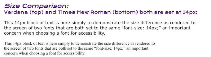
**But wait, there’s more:** this problem has accelerated since 2008 and WCAG 2.0. Back then, everyone used ”core web safe” fonts, because it was problematic and unreliable to do it any other way. Websafe fonts and "core" fonts were mostly a decent weight to render well onscreen like Verdana (a notable exception is the atrocious _Courier New_ a far too thin copy of the classic Courier.) Also a decade ago, web designers commonly used black text on a light background. And in truth, that was art school and classical design way back when: Strong contrast, especially for body text.
Yet even so, here are two common, core fonts, Verdana and Times New Roman. And both are set at the same 14px:
Fast forward to our modern era and web publishing is in the hands of anyone with the inclination. No need to know what an offset press is, or know why it was best to use only black ink for body text, modulating contrast with only font _weight_ instead.
**And Then…. Google FONTS.** Google fonts made font access easy for all web sites, hosting a thousand free fonts in all weights including too thin to see when small including for normally sighted individuals. And some sites are using these thin fonts _AND_ using them with light grey or other low contrast all at the same time. Combine this with things like webkit-smoothing, and boom, too much of the internet is unreadable for too many now.
**SIDE NOTE:** A contributing factor is that some have developed the idea the WCAG AA ”4.5:1” is a valid target for all text in all contexts, when nothing could be farther from the truth. 4.5:1 as a color contrast might be more than enough in some cases, or it could be appallingly insufficient. In example it is very insufficient for small thin fonts especially used for body text, where 10:1 is more appropriate.
**_Font Inconsistency:_** There are few real standards for fonts: there is no standard for instance that specifies the ratio of the x-height to the font-size. As a result, it is difficult to predict how content will appear on some browsers. Fonts are literally all over the place in terms of their x-height. [Take a look at this font evaluation](https://www.researchgate.net/publication/338149302_Evaluating_Fonts_Font_Family_Selection_for_Accessibility_Display_Readability) for plenty of examples of inconsistent x-height.
If we are authoring standards, we need a consistent and repeatable way to determine things such as how big a font renders on the screen. Defining the standard around x-height makes the most sense, as the vast majority of text is composed of the lower case letters. If we could affirmatively set the font's rendering size based on x-height, we could set a consistent size regardless of variations in font design (whimsy fonts notwithstanding).
In support of this, [I have a demonstration page](https://www.myndex.com/WEB/xheightExample) of the need for a better font-size method. In it you'll see that in the first test panel there is a small sampling of fonts, and they are all set at ` font-size: 24px; `, but the x-height varies from 6.7px to 13.44px. That is literally a two fold difference. Or put another way, it's the difference between 20/20 and 20/40 vision.
<img width="1064" alt="xheightexamplesfromwebpage" src="https://user-images.githubusercontent.com/42009457/135765933-a39969c5-7423-45e8-907d-ef4dba4b0f6b.png">
So to promote effective accessibility standards, we need these font size properties. And this is one of the areas of accessibility where it is clear that everyone will benefit.
Thank you,
Andy
_Andrew Somers_
_W3 AGWG Invited Expert_
_LVTF/Silver Task Force_
_Myndex Color Science Researcher_
_Inventor of the APCA & SAPC_
### [_APCA — THE REVOLUTION WILL BE READABLE™_](https://www.myndex.com/APCA/)
Please view or discuss this issue at https://github.com/w3c/csswg-drafts/issues/6709 using your GitHub account
--
Sent via github-notify-ml as configured in https://github.com/w3c/github-notify-ml-config
Received on Sunday, 3 October 2021 18:07:24 UTC