- From: Sebastian Zartner via GitHub <sysbot+gh@w3.org>
- Date: Sun, 03 May 2020 01:35:36 +0000
- To: public-css-archive@w3.org
> I think it would be nice to have per-axis properties for this so that we can have independent styling for each axis. I think we can re-use the existing [column-rule](https://drafts.csswg.org/css-multicol/#cr) properties and just add corresponding `row-*` properties. And then add a shorthand to specify both at the same time, e.g. > `rule: <row-rule> [ '/' <column-rule> ]?`. Yes, having two properties for each axis is also what I [mentioned in one of my later comments](https://github.com/w3c/csswg-drafts/issues/2748#issuecomment-450118294). It would be ok to reuse `column-rule` for that and add corresponding `row-rule-*` properties. My earlier thought was to align the names with the `gap-*` properties to make it obvious that they are related and also to allow to extend the `column-gap`, `row-gap`, and `gap` properties to set the rule. But of course that would also be possible without giving them a `gap-*` prefix. > Regarding `gap-rule-length`: it might be better to add a `rule-inset` property instead of having to deal with percentages. Especially if we add an option to extend the rule to the length of the tracks or the length of the content box (which may be different as [illustrated in this example](https://drafts.csswg.org/css-grid/#grid-align)), then it's probably easier to use an "indentation" rather than specifying a length. One thought behind `gap-rule-length` was to align it with existing properties, though I agree that defining an inset is easier to handle from an author's perspective. Percentages might still be acceptable, referring to the length of the tracks. (Letting them refer to the content box doesn't look desirable in my eyes.) > Regarding `gap-rule-interrupt`: this is nice, but might be a bit tricky to implement for images, especially if you want to stretch the image to the full rule length and slice pieces away, as opposed to rendering each segment as a separate image. I guess you could emulate it by using an opaque `row-rule-image` that is as large as the `row-gap` to simply hide the `column-rule-image` by overlapping it (assuming the row rules renders on top). An alternative would be to add a property to control the extent explicitly, e.g. `column-rule-extent: [ auto | content | segment ]`, for example: > > 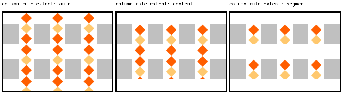 > I think that might be simpler to implement. Thank you for bringing that up! I didn't give `gap-rule-interrupt` a deeper thought in regard of the extent of images before. I really like the idea of `column-rule-extent`. And I think authors also rather expect the images to be separate like `column-rule-extent: segment` does it instead of being sliced into pieces as `gap-rule-interrupt` suggests. There should also be an equivalent in the horizontal direction, i.e. `row-rule-extent`. It looks like @yisibl's use case would already be covered by `column-rule-extent: segment`. There's one more value that should be supported which is extending the image up to the center of the gaps.  That in combination with the suggested `gap-rule-image` repetition values should make something like that possible:  Making the intersections fit like that probably requires more complex syntax and implementations and isn't needed for a first version of the feature, though it should be kept in mind when defining the syntax. > Finally, I think all these properties should apply to all boxes that support gaps for consistency, so including flex containers too. (And between items in the masonry axis too, if [this proposal](https://github.com/w3c/csswg-drafts/issues/4650) is adopted.) (Updating the issue subject accordingly.) I totally agree that this should work for grid, flexbox and multi-column layout! And [as I wrote before](https://github.com/w3c/csswg-drafts/issues/2748#issuecomment-596234193), it might even apply to table layouts (with some special handling). Sebastian -- GitHub Notification of comment by SebastianZ Please view or discuss this issue at https://github.com/w3c/csswg-drafts/issues/2748#issuecomment-623039817 using your GitHub account
Received on Sunday, 3 May 2020 01:35:37 UTC