- From: Wolfr via GitHub <sysbot+gh@w3.org>
- Date: Mon, 07 Jan 2019 10:14:27 +0000
- To: public-css-archive@w3.org
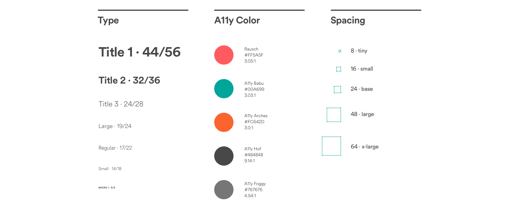
> In, uh, contrast, WCAG AA (and preferably AAA where possible) compliant contrast should always be enabled for all users. Yeah but the reality is that this rarely happens, the very Github comment button I am looking at does not pass WCAG AA. <img width="804" alt="screenshot 2019-01-07 at 10 54 57" src="https://user-images.githubusercontent.com/12690/50761449-b1c7b780-126a-11e9-876a-f2b1aa08e1c7.png"> Designers are really looking at WCAG contrast ratio numbers together with the visual end result to try and make an interface that is both accessible and aesthetically pleasing. Here's an example from AirBnB where the colors are marked with “a11y”  My initial idea was that I wanted to be able to target users who have enabled a preference for high contrast. What I found is that the thinking around this is that the contrast level should be specified in the media query. My proposal is that it should be as simple as possible for the developer, otherwise they won't do it. Who has time to understand what 0.1 or 0.5 and 0.8 means in relationship to all the various factors at play? A singular switch seems like the most dev-friendly thing to do which in turn will lead to actual usage. @alice Looking at your comment, it seems my proposal for syntax is confusing because of the existence of MS's full-on high contrast mode. I wonder whether MS's full-on high contrast mode (almost like a Windows “theme” in my memory”) act s on every website as a sort of system override or does it only change the Windows UI and doesn't touch websites? I don't have a Windows device in hand to test. Your older comments [in this thread] indicate that you have a deep understanding of the problem space. As a web developer I was mostly looking for more attention to this issue when I posted my initial comments. The WCAG guidelines pose contrast fixes as one of the most important things one can do for a11y but in reality if you try to design with those AA/AAA passes in mind you will end up with something less than visually pleasing. There's also often (inaccessible) brand guidelines that make it impossible to get your design approved if you would change the colors to follow AA/AAA logic. So as a designer you are stuck: you want to do the right thing, but there is no way out. But if you could implement some color exceptions with media queries that is a very clear solution. -- GitHub Notification of comment by Wolfr Please view or discuss this issue at https://github.com/w3c/csswg-drafts/issues/1286#issuecomment-451886494 using your GitHub account
Received on Monday, 7 January 2019 10:14:28 UTC