- From: Lars Borg <borg@adobe.com>
- Date: Thu, 28 Jan 2021 00:39:46 +0000
- To: Andrew Somers <andy@generaltitles.com>, Lea Verou <lea@verou.me>
- CC: Leonard Rosenthol <lrosenth@adobe.com>, Justin Novosad <junov@google.com>, Chris Lilley <chris@w3.org>, "public-colorweb@w3.org" <public-colorweb@w3.org>
- Message-ID: <B41636D0-9096-41EA-B65E-104DF60B9B99@adobe.com>
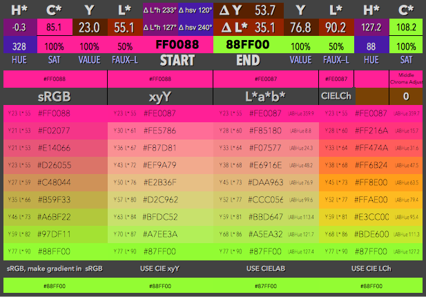
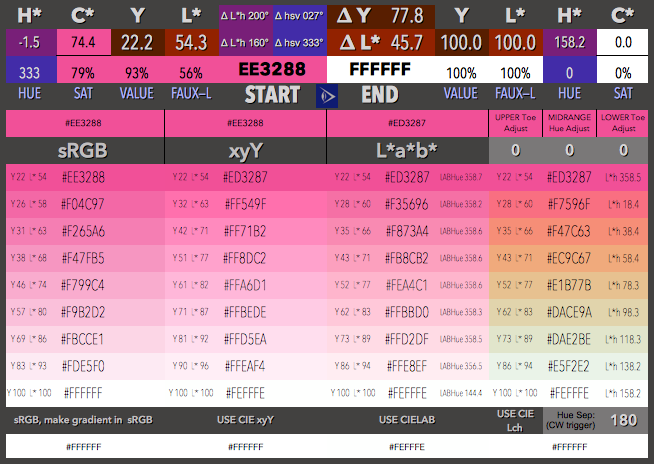
That’s a fun demo.
Yes, mapping linearly in any space with a hue coordinate can get you lots of fun and different results, none unexpected. And a tiny change in end hue can result in a 180 degree change in colors.

Would be nice to see the same in linearized sRGB.

Lars

From: Andrew Somers <andy@generaltitles.com>
Date: Wednesday, January 27, 2021 at 1:55 PM
To: Lea Verou <lea@verou.me>
Cc: Leonard Rosenthol <lrosenth@adobe.com>, Lars Borg <borg@adobe.com>, Justin Novosad <junov@google.com>, Chris Lilley <chris@w3.org>, "public-colorweb@w3.org" <public-colorweb@w3.org>
Subject: Re: Pre-meeting Thoughts on HDR Canvas

Hi Lea,

I've written some articles on this with examples.

·         There are use cases where linear is often best: emulating real light, image compositing

·         There are use cases where a perceptual space is more useful: creating gradients, simple color mixing, calibrating user controls.

And…. there are exceptions to those cases as well. And desirable or better is… dependent on what one is trying to achieve.

An example from a gist I wrote on a related subject:<https://nam04.safelinks.protection.outlook.com/?url=https%3A%2F%2Fgist.github.com%2FMyndex%2F10caff6a68e844591e83eadeebfb4347&data=04%7C01%7Cborg%40adobe.com%7Cd7c0c630b0374643a01508d8c31f086a%7Cfa7b1b5a7b34438794aed2c178decee1%7C0%7C0%7C637473885356606223%7CUnknown%7CTWFpbGZsb3d8eyJWIjoiMC4wLjAwMDAiLCJQIjoiV2luMzIiLCJBTiI6Ik1haWwiLCJXVCI6Mn0%3D%7C3000&sdata=mmlZw9Qq7swrcsrc5j%2FTLXo1vPG7BFhyWRDXvTAgWCo%3D&reserved=0>

----------------
These four gradients were created using (from left to right) sRGB, xyY (linear), L*a*b*, and LCh (from Lab).
[Screen Shot 2019-05-24 at 9 23 07 PM]<https://nam04.safelinks.protection.outlook.com/?url=https%3A%2F%2Fuser-images.githubusercontent.com%2F42009457%2F100867985-d07f5a80-344f-11eb-85ee-868d635356cd.png&data=04%7C01%7Cborg%40adobe.com%7Cd7c0c630b0374643a01508d8c31f086a%7Cfa7b1b5a7b34438794aed2c178decee1%7C0%7C0%7C637473885356616216%7CUnknown%7CTWFpbGZsb3d8eyJWIjoiMC4wLjAwMDAiLCJQIjoiV2luMzIiLCJBTiI6Ik1haWwiLCJXVCI6Mn0%3D%7C3000&sdata=sR2zJFd7KU5%2F7pQp%2F9JDTvenfr8RXr2dDbkh5Jo5teo%3D&reserved=0>
Four different spaces/methods, and four very different results. On first glance it might seem that the LCh is the most dynamic, good if that is your design goal... but look at this next slide, from saturated color to achromatic...
[Screen Shot 2019-06-19 at 9 30 28 PM]<https://nam04.safelinks.protection.outlook.com/?url=https%3A%2F%2Fuser-images.githubusercontent.com%2F42009457%2F100868304-4b487580-3450-11eb-8cf6-a47afd2a6a02.png&data=04%7C01%7Cborg%40adobe.com%7Cd7c0c630b0374643a01508d8c31f086a%7Cfa7b1b5a7b34438794aed2c178decee1%7C0%7C0%7C637473885356616216%7CUnknown%7CTWFpbGZsb3d8eyJWIjoiMC4wLjAwMDAiLCJQIjoiV2luMzIiLCJBTiI6Ik1haWwiLCJXVCI6Mn0%3D%7C3000&sdata=eve9ngOP0NckKTaVPdNMz0ZiV9wMg9HpudWK%2Bq5YgEw%3D&reserved=0>
YIKES!! LCh mangled that all to hell! When going from a saturated to a less saturated or monochromatic color, you probably don't want nearly as much hue movement. But also notice that the sRGB and the LAB look almost the same. This is to be expected. The gamma for sRGB is roughly 2.2 and the effective gamma for LAB is about 2.38, in other words, when it comes to the lightness curve, there is very little difference between sRGB and L*, if the gradient is not shifting hue, then you are not likely to notice much of a difference.
---------

More Colorful Examples:

Gradients In Space<https://nam04.safelinks.protection.outlook.com/?url=https%3A%2F%2Fwww.myndex.com%2FWEB%2FGradients&data=04%7C01%7Cborg%40adobe.com%7Cd7c0c630b0374643a01508d8c31f086a%7Cfa7b1b5a7b34438794aed2c178decee1%7C0%7C0%7C637473885356626213%7CUnknown%7CTWFpbGZsb3d8eyJWIjoiMC4wLjAwMDAiLCJQIjoiV2luMzIiLCJBTiI6Ik1haWwiLCJXVCI6Mn0%3D%7C3000&sdata=kxXMF9LtUK%2F0mUfB%2FCXbDY08zszIj%2F%2Fr%2BbRxVyCfs6o%3D&reserved=0>

Lstar Wars Episode IV - A New Color<https://nam04.safelinks.protection.outlook.com/?url=https%3A%2F%2Fwww.myndex.com%2FWEB%2FGradientsPartTwo&data=04%7C01%7Cborg%40adobe.com%7Cd7c0c630b0374643a01508d8c31f086a%7Cfa7b1b5a7b34438794aed2c178decee1%7C0%7C0%7C637473885356626213%7CUnknown%7CTWFpbGZsb3d8eyJWIjoiMC4wLjAwMDAiLCJQIjoiV2luMzIiLCJBTiI6Ik1haWwiLCJXVCI6Mn0%3D%7C3000&sdata=co1NUFxT07stRWDRktxRDIobtjEjgvYOoAN6qUyJ%2Fms%3D&reserved=0>


Cheers,


Andy


On Jan 27, 2021, at 2:49 PM, Lea Verou <lea@verou.me<mailto:lea@verou.me>> wrote:

Common and desirable are not necessarily correlated. If non linear blending is the application default, most users are “choosing” it by never making a conscious decision. I’m having trouble finding cases where non linear blending is desirable or produces a better result, for any definition of “desirable” or “better”…

--
Lea Verou ✿ http://lea.verou.me<https://nam04.safelinks.protection.outlook.com/?url=http%3A%2F%2Flea.verou.me%2F&data=04%7C01%7Cborg%40adobe.com%7Cd7c0c630b0374643a01508d8c31f086a%7Cfa7b1b5a7b34438794aed2c178decee1%7C0%7C0%7C637473885356636201%7CUnknown%7CTWFpbGZsb3d8eyJWIjoiMC4wLjAwMDAiLCJQIjoiV2luMzIiLCJBTiI6Ik1haWwiLCJXVCI6Mn0%3D%7C3000&sdata=UPea2uQq3v5l6VollSY9UX6FBtkAK7i6LAxjqzNIp8U%3D&reserved=0> ✿ @leaverou


On Jan 28, 2021, at 00:38, Leonard Rosenthol <lrosenth@adobe.com<mailto:lrosenth@adobe.com>> wrote:
I would say that pretty much every content authoring tool – be it graphics (Photoshop, Inkscape, Scribus) or documents (MSOffice, GDocs, PDF, etc.) uses gamma/non-linear blending – though also in SDR.  To change that in the web space (at least for SDR content) would also require a change of all of those authoring tools or users won’t be able to author content that matches.

I do agree, however, that in the context on HDR content it may well make sense to consider alternatives since the authoring isn’t there yet…. Provided that we fully describe a mixed SDR/HDR stack and how compositing would work in such a scenario – especially when multiple colorspaces are also involved…

Leonard

From: Lars Borg <borg@adobe.com<mailto:borg@adobe.com>>
Date: Wednesday, January 27, 2021 at 2:23 PM
To: Justin Novosad <junov@google.com<mailto:junov@google.com>>, "chris@w3.org<mailto:chris@w3.org>" <chris@w3.org<mailto:chris@w3.org>>
Cc: "public-colorweb@w3.org<mailto:public-colorweb@w3.org>" <public-colorweb@w3.org<mailto:public-colorweb@w3.org>>
Subject: Re: Pre-meeting Thoughts on HDR Canvas
Resent-From: <public-colorweb@w3.org<mailto:public-colorweb@w3.org>>
Resent-Date: Wednesday, January 27, 2021 at 2:23 PM

It is easy to assume that blending in gamma space is always undesirable.
History tells a different story. Blending in non-linear space is common.
For example, in Photoshop you can select to blend in linear or non-linear space.
It’s a creative choice. It seems most users select the non-linear option.
AFAIK video fades are typically in code space, not linear space.
So it seems we should retain this option.

Lars

From: Justin Novosad <junov@google.com<mailto:junov@google.com>>
Date: Wednesday, January 27, 2021 at 7:59 AM
To: Chris Lilley <chris@w3.org<mailto:chris@w3.org>>
Cc: "public-colorweb@w3.org<mailto:public-colorweb@w3.org>" <public-colorweb@w3.org<mailto:public-colorweb@w3.org>>
Subject: Re: Pre-meeting Thoughts on HDR Canvas
Resent-From: <public-colorweb@w3.org<mailto:public-colorweb@w3.org>>
Resent-Date: Wednesday, January 27, 2021 at 7:59 AM

Thanks Chris for correcting me.

I realize this is an old problem, but I think that adding HDR capabilities to canvas risks exacerbating it greatly because we will end up with inconsistent blending and gradient interpolation based on the canvas's working profile.
For example, if a hypothetical app selects a canvas working profile to match the output device's capabilities, these behavior discrepancies risk being perceived as bugs and will be unpleasant to work around for web developers.

On Wed, Jan 27, 2021 at 12:46 PM Chris Lilley <chris@w3.org<mailto:chris@w3.org>> wrote:

On 2021-01-27 18:32, Justin Novosad wrote:
> The CSS and SVG specifications do not explicitly address the issue of
> gamma-correct blending, but the examples in the CSS spec suggest doing
> things the "wrong" way, which ignores gamma correctness.

The SVG specification explicitly says that filer operations are in
linear-light sRGB by default (with an option to change to sRGB, where
speed is more important than getting the right result); and that all
other operations are (sadly) in gamma-encoded sRGB by default (with an
opt-in for linear-light sRGB).

The CSS Compositing specification, sadly, requires operations in
gamma-encoded sRGB. This choice was primarily driven by backwards
compatibility with existing content; and secondarily with compatibility
of blend modes, as popularized in Adobe Photoshop, which are also
computed in gamma-encoded RGB spaces.

CSS Compositing thus needs to add an opt-in for linear-light compositing.

--
Chris Lilley
@svgeesus
Technical Director @ W3C
W3C Strategy Team, Core Web Design
W3C Architecture & Technology Team, Core Web & Media
Attachments
- image/png attachment: image001.png
- image/png attachment: image002.png
Received on Thursday, 28 January 2021 00:40:04 UTC