- From: Edward Chalk <edwardchalk@gmail.com>
- Date: Mon, 28 Mar 2022 15:58:54 +0300
- To: public-coga-community@w3.org
Received on Monday, 28 March 2022 13:00:23 UTC
Hi All,

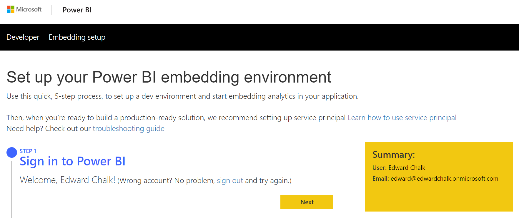
I am just signing up for a Microsoft service (https://app.powerbi.com/) and
saw this UX design, which I thought is a really nice combination of
confirmation messages combined with workflow.

[image: image.png]

[image: image.png]

[image: image.png]

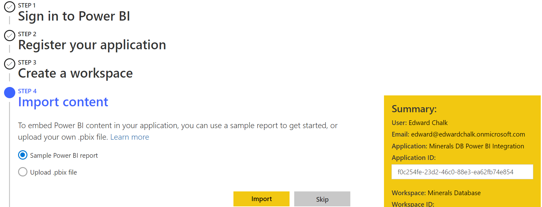
Within this workflow, we have three types of confirmation message.

1. In Step 1, the webpage specifies the name of the logged in user.
2. As the user progresses through the workflow, successive steps are ticked.
3. There is a floating yellow box on the right hand side that summarises
the data the user has entered in the previous stages.

A lot of thought has gone into enhancing screen usability here and in
providing feedback to the user before they proceed to the next stage.

Cheers,

Edward


Received on Monday, 28 March 2022 13:00:23 UTC