- From: John Foliot <john.foliot@deque.com>
- Date: Mon, 4 Jan 2016 14:51:26 -0600
- To: <public-apa@w3.org>
- Message-ID: <014501d14731$ae462fe0$0ad28fa0$@deque.com>
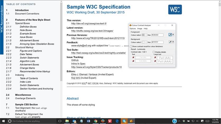
Ah, yes. New mailing list for 2016. FYI JF From: John Foliot [mailto:john.foliot@deque.com] Sent: Monday, January 4, 2016 2:48 PM To: 'fantasai' <fantasai.lists@inkedblade.net>; 'David Carlisle' <davidc@nag.co.uk>; 'Coralie Mercier' <coralie@w3.org>; spec-prod@w3.org Cc: chairs@w3.org; w3c-ac-forum@w3.org; W3C WAI Protocols & Formats <public-pfwg@w3.org> Subject: RE: Proposed Final Design for W3C Technical Reports style in 2016 fantasai [mailto:fantasai.lists@inkedblade.net] wrote: > > Hi David, > Bert Bos also commented on the link styling here: > <https://lists.w3.org/Archives/Public/spec-prod/2015OctDec/0059.html> https://lists.w3.org/Archives/Public/spec-prod/2015OctDec/0059.html > and I've updated the style sheet to be more in line with what the CSSWG > currently uses, here: > <http://fantasai.inkedblade.net/style/design/w3c-restyle/2016/sample> http://fantasai.inkedblade.net/style/design/w3c-restyle/2016/sample > > Please take a look and let me know if this works better for you. > It should be a little less faint. :) Hi All, Fantasai, while I appreciate that you've made the link less faint, the color used (#C0C0C0) still fails a color-contrast test. (http://snook.ca/technical/colour_contrast/colour.html#fg=C0C0C0,bg=FFFFFF) Figure 1: A screen capture of the sample page, with a color contrast analyzer tool inset, showing the color contrast fail To be crystal clear, the WCAG 2.0 Recommendation only speaks of “text” when referencing color contrast (so for example, it does NOT speak to icons, etc.), however since *underlined text* is indeed recognized as a link, I would argue that the color contrast requirement would be in play here, as the underlining is part of the active text, and that the visual indicator should be as visible as the text it is underlining. > > One of the major considerations for link styling was that, in an aggressively- > cross-linked document, a very obvious link styling pulls at your attention in a way > that makes it harder to track the flow of the sentence itself. In technical > documents such as the W3C specs, you really don't want to be disrupted while > you're trying to unravel a sentence, so we wanted something that would still > appear very obviously as a link when you looked at it, but that also didn't grab > your attention in a way that broke the flow of the sentence. This is indeed a problem, additionally so for some users with cognitive disabilities (ADHA, ADD, other impairments on the autistic spectrum, etc.), so agreed that this is a problem that needs addressing. However for low vision users, sufficient color contrast is required so that those users can discern a link when present. The current contrast ratio of 1.82 : 1 is far away from the required 4.5 : 1 called for by WCAG (Success Criteria 1.4.3 http://www.w3.org/TR/WCAG20/#visual-audio-contrast) Suggestion: could you lighten the line weight, darken it and perhaps use dashes or dots instead? (see in-page links at WCAG - http://www.w3.org/TR/WCAG20). I’m not a graphics person however, so feel free to explore other alternatives. Jonathan Snook’s online color contrast tool is quite useful there: http://snook.ca/technical/colour_contrast/colour.html > > Well, looking at your table, I think it's not particularly complex data (in terms of > the cells relationships), so you should probably just use class="data". This looks a > bit cleaner imho -- the extra lines are really only necessary when you have > complicated spanning relationships. > > The second thing I'd suggest is improving the table markup by adding some > <colgroup> markup, e.g. the last three columns seem to belong to a single > group, and encoding this in the markup will make the table styling highlight this > relationship as well. (You might also consider, e.g. using <th> on the entity > name's cell, if you consider that to be the header of the row.) +1 Strong semantic markup of tables is important, if not critical, to screen reader users. While WCAG does not *insist* on using <th> cells, it is strongly recommended in most instances. See http://www.w3.org/WAI/WCAG20/quickref/Overview.php#content-structure-separation-programmatic-sufficient-head > > Thank you for your experimentation and your comments! Sorry for the > extraordinarily late-sent reply, it's been sitting in my drafts box for the last > month. :| I will second Fantasai’s “thank you”, and I too apologize for late comments. JF -- John Foliot Principal Accessibility Strategist Deque Systems Inc. <mailto:john.foliot@deque.com> john.foliot@deque.com Advancing the mission of digital accessibility and inclusion
Attachments
- image/jpeg attachment: image002.jpg
Received on Monday, 4 January 2016 20:51:58 UTC