- From: Andrew Somers <me@AndySomers.com>
- Date: Sun, 25 Aug 2019 00:33:19 -0700
- To: "Patrick H. Lauke" <redux@splintered.co.uk>, WCAG <w3c-wai-gl@w3.org>, Andrew Kirkpatrick <akirkpat@adobe.com>, js@tetralogical.com
- Cc: Andrew Somers <me@AndySomers.com>, "White, Jason J" <jjwhite@ets.org>, "Abma, J.D. (Jake)" <Jake.Abma@ing.com>, Shawn Lauriat <lauriat@google.com>, Chuck Adams <charles.adams@oracle.com>, Cybele S <cybele.sack@gmail.com>
- Message-Id: <C747FF80-B008-4E12-9AA4-433B27E81682@AndySomers.com>
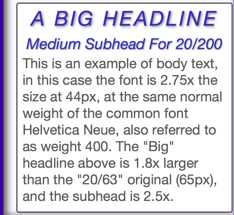
> On Aug 24, 2019, at 2:11 AM, Patrick H. Lauke <redux@splintered.co.uk> wrote:
> On 21/08/2019 17:23, Abma, J.D. (Jake) wrote:
>>
>> Hi Andrew / all,
>> The proof is always in the pudding, Silver people are focussing on everything out there, Web and more... see: https://docs.google.com/document/d/1HcCzoKvICUHCR5dM_fV4AHnkar-WJli4hxUUE0nzwlQ/edit
> I've voiced my concern before, but ... to me, this goes outside of the remit of the World Wide *Web* consortium and the *Web* Accessibility Initiative. Pretending that W3C WAI has the knowledge and authority to write guidance that is to be applied to all sorts of things that aren't web ... it's not ISO or some other more general standards body…

ON SCOPE

I was just discussing this with Chuck, and I know it is becoming a hot topic. But there are some realities that should be considered:

Because the WCAG/WAI/W3C are open and freely accessible standards, they are cited more frequently than something like ISO or ANSI which must be purchased. Free standards like the WCAG or ITU are referenced more often. This is especially true for small entities, who it can be argued are the majority of app and content developers. Even larger groups are probably not going to purchase standards unless they have a compelling need to.

AS A RESULT

It is useful to consider the impact of a particular freely available standard may have on the public at large as it becomes adopted by for more than the intended scope of web content. Certainly, *any* content, including an application, displayed on an emissive display falls under the same needs and criteria as a web page in terms of visual presentation.

Web pages can be printed onto other media — so the W3C certainly has purview for web content printed to hard copy, and again those standards may also have application for other content printed to hard copy.


FUTURE GOALS
And Why They Matter: ADAPTIVE TECH

One of the things our research has identified is the need for “Adaptive Technologies,” that is, a “one size fits all” approach is a non-starter for a variety of reasons, not the least of which is the extremely wide and complex nature of human perception and perception impairments. A needed design/accessibility feature that one impairment may need can be in opposition to the needs of another.

In the immediate term, this points to the need of SCs like reflow, so that text size zooming does not break content. But for future thinking, the path is likely aiming toward a more conjoint approach between designers/content authors and user agents/app functionalities. I brought this up in one of the GitHub threads with Alastair some months ago, and it is increasingly clear that's objectively the best path for future considerations.

And to be noted, the W3C does not only cover web content — the specifications, HTML5, CSS3, XHTML are created in concert with browser developers.And a browser is an app, and it is a user agent. And a browser is not the only user agent that uses HTML or CSS or XHTML or XML or SVG. And a browser is definitely not the only user agent that displays content on an emissive sRGB monitor.

Speaking of which, let's not forget the IEC sRGB standard is out of date/out of touch with current technology and use cases, particularly in terms of luminance. WAI needs to “expand scope” to at least acknowledge that no one is using an 80 cd/m^2 CRT monitor anymore. And with CSS4 introducing multiple colorspaces and working spaces… uh, what exactly IS “out of scope” now? CSS4 is so feature rich (and not necessarily in a good way) that WAI has to expand scope just to be in step.


WHERE DOES THE BUCK STOP

I’m not suggesting the “buck” must stop with the W3C — but consider for a moment the definitions of reflective signage contrasts in terms of world wide standards.

There isn’t one... There are half a dozen or more that are not even remotely in sync with each other. UK uses 𝚫Y (which requires expensive lab grade equipment and methods) Australia is using the kinda odd BowmanSapolinsky equation, Canada uses Michelson Contrast (MTF) and the US ADA at one times used a Weber contrast variant, though any “specified” contrast value has been dispensed with (i.e. in the US right now it’s “any” contrast EVEN THIS). A Canadian report on accessibility relied on the term “Colour Contrast” though that implies hue related contrasts which are less important than luminance or reflective value contrasts.

In other words, vision standards (and research) or often at odds, inconsistent, and the result is continuing confusion and resulting frustration.

Dr Arditi decried the assertion of some standards such as the commonly “accepted” 3:1 as lacking in any real empirical research, in his 2017 paper on the subject: https://jov.arvojournals.org/article.aspx?articleid=2628138

Some of my findings are similar — in particular, some of the contrast equations in use may predict perception at or near threshold very well, but things change at supra threshold and critical contrast levels, and they change based on adaptation levels, spatial frequency, not to mention glare, flare, and then let’s bring in the massive variety of impairment types, each needing their own separate consideration.

The point I am getting to here is that standards relating to perception accessibility (and some of the research) are less stable the more they try and isolate a condition. The properties of luminance contrast, color perception, size, weight, spacing, density — spatial frequency — accommodation, environmental/ambient illumination, emitted luminance — are inseparable and all need to be considered together, not in a vacuum.

Thus this may require considerations that may seem “out of scope” but aren’t.


What Color is a “Buck" Stop Sign Anyway??

So the “buck” stops, or at least comes to rest, with the realization that a best practice approach for maximum accessibility is adjusting to specific needs, and making that adjustment in the scope best suited for that goal. That is, the “technology node” where the need can be best addressed.

Here’s an example relating to text size. We’ll assume we have “classically” adequate contrast (meaning at least ISO 10:1 for body text, ~equiv. to WCAG 7:1). The common print size of 12 points is considered “good” for near normal vision to about 20/63. 11 to 12 points is what body or columns of text are often printed at, though some newspapers may be less. Low vision begins at 20/70 to 20/200, and above 20/200 is considered blind.

So, up to 20/63 at 12 pt (like this line @ CSS 16px) But as we get into low vision,
20/150 you need to double that to 24 points (32px).
20/200 needs triple at 33 points (44px).
20/400: 66pt/88px.

The usual way to help acuity is refractive correction (glasses), but assuming that best corrected acuity is still a low 20/200, then the best fix is increasing the size of the text. But it is both unreasonable and impractical to set a minimum font size of 44px for all web pages!

Among other things, while someone with severe low vision impairment may need 44px text, such a large text size for body text will HURT the reading speed for all those with lesser impairments or near normal vision. As mentioned earlier, what is helpful or even needed by some is hurtful, unneeded, and even damaging for others.”one size” can not fit all, nor is it necessary in today’s technology.

So what IS needed, is the ability of a user with 20/200 to adjust the content. But just zooming it ALL up is ALSO not "most useful". Consider a page with 16px body text (which needs to increase 2.75x to get to at least 44px) then some subheads at 24px that need to get up to…

Up to… let’s guess the answer before looking ahead...


If the guess was 24 px subheads need to increased to 66 for 20/200, that's actually wrong. Just as the page’s normal 36px headline certainly doesn't need to leap up to 100px !!!

Just because someone’s minimum acuity may be at 44px (a 275% increase) does not mean that text larger than 16px must all increase that same amount. And increasing the large 36px headline to 100px could potentially HURT the 20/200 individual, making it too big to fit on screen but moreover:

Those with degraded acuity (and contrast sensitivity) don’t simply need “everything larger”. Think of the impairment more as a narrowing of the total range, and not a linear shift of the wide range of normal vision. Both contrast and size have a low and a high “limit" for normal vision, and impaired vision occupies a narrower subset of that range.


ADAPTIVE TECHNOLOGY

So in this case, the example of useful adaptive technology would allow the low vision individual to raise the size of the small body text, but make proportionally smaller increases of the larger subhead and headline text. Adaptive technology means the author’s original CSS stylings are not thrown away, but simply modified, and modified in a proportional way.

But this is not just “content” — this will require action on the part of user agent developers as well, either to allow proportional adjustment, OR to allow for user style sheets that only adjust, and not over-write. While a user can reset the REM to a higher value, or use the browsers scale feature, these scale everything, so a large font headline becomes unwieldily large. Also, responsive design factors can create unexpected content failures.

Proportional resizing assists with problems such as reflow breaking pages. In the examples here, by restricting how large the biggest element zooms the container, width is also restricted and thus will fit better on mobile devices, providing larger body text relative to the device width. Also the container mostly grows vertically, allowing the big headline to to remain on one line, while the body text just flows vertically (text was trimmed in these examples):


SCREENSHOTS OF THESE THREE EXAMPLES
Adaptive Technology as a subset of Responsive Design


So getting back to the original concern — in order to provide a useful and developing standard that is helpful, the W3C/WAI has to have a scope that is not constrained to “just what you can do in HTML and CSS”. The three examples above should demonstrate why confining to “just authors" is non-feasable if real and flexible accessibility is the goal. The problems being experienced right now with SCs like reflow and user-spacing point to why putting these standards entirely on the shoulders of authors is a less than perfect solution — and I’m not even touching on the resistance to these standards in the design community over matters such as these.

And finally regarding the examples above - for 20/200, if the body text is the same and untrimmed, then the vertical expansion is 325%, and again the horizontal expansion was only 180% as was the biggest headline, while the body text increased 275% to meet the acuity needs of 20/200. Most current user agents scale everything the same, which means that container would be more than 50% larger making it more likely to have to scroll horizontally.

WHAT'S THE AUTHOR TO DO?

But the content author can’t readily effect this (at least not without a cumbersome set of multiple CSS sheets… or hmmm, maybe use of CSS variables?)). On the other hand, such math seems fairly straight forward as a code exercise — user sets the minimum body text size (say 44px) and the largest (say 30% bigger at 65px) and then all text gets scaled proportionally. An additional useful control would be to weight how the middle sizes were increased, as in leaning toward bigger or smaller.

A similar set of controls for contrast, again to be relative and proportional to the content author’s original design intent, would go much farther than some simple contrast minimums in the standards.

Consider that contrast perception is inseparable from spatial frequency/size. Also consider that contrast and acuity are separate (someone could have perfect acuity but poor contrast functioning). And then age related ocular degradation can cause bad glare, flare, scatter, and chromatic aberrations, meaning that:
Some people need LOWER contrast but higher luminance
Some people need HIGHER contrast but lower luminance.
Some monochromats need the monitor in monochrome mode AND lower luminance.
Some people need HIGHER contrast AND higher luminance.
Some people need a reduction in BLUE
Some CVD types may benefit from a complete recoloring of the content
Some people do better with reversed contrast (light text on dark)
But those that need reversed do NOT want an actual invert of the colors chosen for normal dark text on light!
Because those that need light text on dark ALSO need the colors to have the right amount of luminance of the dark BG to assist adaptation for their current environment
i.e it can’t just be black, which is what you get when you try and invert a typical white page!
Once size fits all serves no one well. And a designer alone can not really accommodate all — but a properly robust and flexible design (no content breaks, no horizontal scrolls etc) in conjunction with adaptive software adjustments to compensate for environment and accessible needs such as  scaling/size/weight and contrast/luminance all proportional to the author’s design, then all should benefit with a better user experience — a user experience that maintains author’s design intent through minimal adjustments afforded by adaptive technology based on human perception.

That's the idealized future. Which is a really long-winded way of saying:

Adopting this idealized future also means the SCOPE of the WAI must be more than merely CSS and HTML.

All the best,

Andy


Andrew Somers
Color Science Researcher
Contact Info Redacted for Public WAI List
Attachments
- text/html attachment: stored
- image/png attachment: Screen_Shot_2019-08-24_at_9.12.42_PM.png

- image/png attachment: Screen_Shot_2019-08-24_at_9.13.13_PM.png

- image/png attachment: Screen_Shot_2019-08-24_at_9.30.33_PM.png
- image/png attachment: GeneralTitles3-Just-Logo33.png

Received on Sunday, 25 August 2019 07:33:52 UTC