- From: Alastair Campbell <acampbell@nomensa.com>
- Date: Mon, 1 Jul 2019 15:53:00 +0000
- To: Jonathan Avila <jon.avila@levelaccess.com>
- CC: WCAG list <w3c-wai-gl@w3.org>
- Message-ID: <7F91DCFB-42C8-4A87-BC99-8B810744AEBD@nomensa.com>
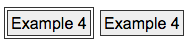
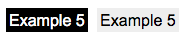
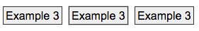
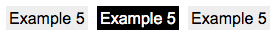
> Sorry I must have missed 12.   I can’t perceive the change at all – only the blinking caret.

Phew, that makes sense then.

I think there’s a rough ranking of preference for different button focus styles then:


  1.  A separate/new outline so the difference between focused / unfocused is very clear:
[cid:image001.png@01D52D12.7DCD3780]and [cid:image002.png@01D52D12.7DCD3780]

  2.  A non-separated outline:
[cid:image003.png@01D52D12.7DCD3780]

  3.  A colour inversion or background change:
[cid:image004.png@01D52D12.7DCD3780]

  4.  A color change that doesn’t meet 3:1, e.g. a light outline on a light background.
[cid:image005.png@01D5302D.70315340] (This example would fail the SC as written.)

Some of the difference between levels 1/2/3 is due to expectations. For example, in example 2 (non-separated outline) above it is conventional that a thicker outline would be the different one (i.e. focused), but if there was a third button and it had a thick border, the thin one would be the odd-one out! That makes it difficult to create an SC with a more prescriptive design approach.

Similarly, *if* you can see 3 buttons for example 5 it is clear that the one with a black background is the odd one out:
[cid:image005.png@01D52D12.7DCD3780]

If you can see the hue then a yellow highlight on a dark background is good.
[cid:image007.png@01D5302D.70315340]

However, if you can’t perceive the hue, taking an extreme contrast-only view an outer outline will look like a size difference. E.g. on a dark background, a light outline around a light box makes the box bigger.
[cid:image008.png@01D5302D.70315340]


The grey and yellow outlines for the inputs are equivalent contrast-wise, but the grey really makes the point about what would pass, and what you can discern without hue.

So if there is an indicator that looks like an obvious addition to the control, that is easiest to understand, such as off-setting the outline outwards.
[cid:image009.png@01D5302D.70315340]

On the other hand, that’s quite hard to define/test across controls types unless we are very prescriptive about the design of the focus  indicator. (If someone can think of good wording that would work across links/buttons/inputs/slider-thumbs etc, please let us know!)

Cheers,

-Alastair
Attachments
- image/png attachment: image001.png

- image/png attachment: image002.png
- image/png attachment: image003.png

- image/png attachment: image004.png
- image/png attachment: image005.png
- image/png attachment: image006.png
- image/png attachment: image007.png

- image/png attachment: image008.png

- image/png attachment: image009.png

Received on Monday, 1 July 2019 15:53:25 UTC