- From: Myles C. Maxfield <mmaxfield@apple.com>
- Date: Wed, 28 Sep 2016 15:05:22 -0700
- To: Dominik Röttsches <drott@google.com>
- Cc: fantasai <fantasai.lists@inkedblade.net>, "public-css-testsuite@w3.org" <public-css-testsuite@w3.org>, John Daggett <jdaggett@gmail.com>, Rossen Atanassov <rossen.atanassov@microsoft.com>
- Message-Id: <0CA69D27-7398-47B9-BF1F-B25249C5668B@apple.com>
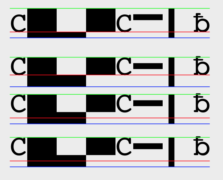
Here’s a good comparison of the behavior of the different approaches (the image was created using CoreText, not browser tech):


The red line is the glyph origin of the primary font. The green line is the top of the ascent of the primary font and the blue line is the bottom of the descent of the primary font. The text being rendered here is “CbpÉCΧΥƀ” and is the same on each line.

The first line is rendered with a font fallback list of Ahem, Courier. You can see that everything is straightforward.

The second line is rendered with a fallback list of AhemBaselineShift, Courier. You can see that the glyph origins for both fonts are collinear, and that the ascent/descent has been adjusted.

The third line is rendered with a fallback list of Ahembsln, Courier. Ahembsln has an additional “bsln” table, and the only glyphs which have their control points modified are the glyphs for p and É (all the other glyphs are untouched). You can see that the ascent and descent are the same as in the first case, but the secondary font is moved up. This is because the bsln table describes that the baseline to use during placement of fallback glyphs is 200 FUnits (or 1/5 of an em) higher than the glyph origin.

The fourth line is the same as the third, except that the Ahem font here uses the BASE table instead of the bsln table (but both of these tables describe the same thing, so the result is identical).

> On Sep 26, 2016, at 1:06 AM, Dominik Röttsches <drott@google.com> wrote:
>
> Hi Myles,
>
> On Fri, Sep 23, 2016 at 6:57 PM, Myles C. Maxfield <mmaxfield@apple.com <mailto:mmaxfield@apple.com>> wrote:
> +John & Rossen & Dominik for the question at the end. (Sorry if I added the wrong person, but I'm hoping you could find the answer out 😊)
>
> In the font I attached to the previous email, I modified the control points of all the glyphs. I subtracted 200 from all the glyphs' Y-coordinates, as well as from the font's ascent and the font's descent. Then I fixed up the paths for the É and p glyphs so their edges are correctly still at Y=0. (And then deleted the C glyph because the Ç glyph is already in the font and has the same shape.)
>
> Regarding the other two fonts I made: there are many tables which can be in a font, and most browsers ignore most of those tables (which isn't a bug; it just means they don't get extra fancy stuff). It appears that none of the browsers use the "bsln" table nor the "BASE" table (WebKit doesn't even claim to use them, but I can't speak for the other browser vendors). Testing browsers using a mechanism which isn't claimed to be supported anywhere would be a mistake.
>
> If this is the question you meant to have answered: blsn seems to AAT only so we dont't support that. I briefly checked info on BASE <https://www.microsoft.com/typography/otspec/base.htm> but I don't think we currently incorporate information from the BASE table into line layout in Chrome. Would probably be interesting to look into it more, though.
>
> Dominik
>
>
>
>
> I would be thrilled to know if other browsers claim to use these baseline tables. If they do, we can test with these two fonts with the additional baseline tables. Otherwise, testing with them would be meaningless.
>
> Thanks,
> Myles
>
> On Sep 23, 2016, at 12:16 PM, fantasai <fantasai.lists@inkedblade.net <mailto:fantasai.lists@inkedblade.net>> wrote:
>
>> On 09/22/2016 07:37 PM, Myles C. Maxfield wrote:
>>> Here it is. It seems to work on Chrome, Firefox, and Safari (and I haven’t tried on Edge).
>>>
>>> This font hardcodes the baseline shift by simply adjusting the control
>>> points of all the glyph contours. Alternatively, I also made two extra
>>> fonts, one which uses the “bsln” table, and one which uses the “BASE”
>>> table, to move the baseline without modifying the glyph contours.
>>> However, I’ve found that no browsers seem to honor these tables (but
>>> I know the tables are correct because a native app directly using
>>> CoreText reacts to the tables appropriately). If you want these two
>>> additional fonts, feel free to contact me, but I figured I wouldn’t
>>> include them here since they are likely not what you are looking for.
>>
>> Okay, I don't think I actually understood what you're saying here. :)
>> In the first case, did you just shift the glyph above the y=0 line?
>> Or did you move the y=0 line with respect to the ascent/descent?
>> Or something else?
>>
>> (If those tables are supposed to work, then, yes, please give me a copy
>> of those fonts as well; all three should have different font names though.)
>>
>> ~fantasai
>>
>
Attachments
- text/html attachment: stored
- image/png attachment: Screen_Shot_2016-09-28_at_2.47.22_PM.png
Received on Wednesday, 28 September 2016 22:05:56 UTC