- From: Richard Ishida <ishida@w3.org>
- Date: Tue, 10 Feb 2015 16:29:28 +0000
- To: Florian Rivoal <florian@rivoal.net>
- CC: www-style@w3.org, www International <www-international@w3.org>
- Message-ID: <54DA31E8.3030404@w3.org>
hi Florian,
On 23/01/2015 14:21, Florian Rivoal wrote:
> To be able to achieve the full effect of your examples, we would also need to be able to apply borders and padding inwards. Currently,http://dev.w3.org/csswg/css-inline/#initial-letter-box only defines a classical model for padding, border and margin (growing outwards from the content-box, which is the one that gets sized).
>
> The devanagari examples should probably be possible to style with something like this:
> ::first-letter {
> initial-letter: 3;
> box-sizing: border-box;
> border:solid black;
> padding: 5px; /* Maybe */
> }
>
> Which means we need to define the model for when initial-letter and box-sizing are applied together. How about this:
>
> When box-sizing is not content-box, the outer size of the box designated by box-sizing is sized according to the initial-letter property, and aligned with the surrounding text based on initial-letter-align. The content-box's size is calculated from it after subtracting paddings and borders as appropriate, and the glyph is sized to just fit this content-box vertically - or horizontally in a vertical writing mode, which incidentally also centers it.
>
> If you look at the boxes in the Hebrew and Korean and Devanagari examples you posted, it seems that something close to that, rather than initial-letter-align center, is what is happening: the background color is properly aligned on the relevant aspect of the surrounding script, implying initial-letter-align is still doing its job to place that box, but then the letter inside it is padded inwards, and in the case of Devanagari a border is also applied.
I follow your reasoning, that for the 'box' type of initial letter the
box-sizing property could be a trigger for alignment of the initial
letter text, and that when box-sizing is present initial-letter would
affect the box, not the glyph alignment.
One concern I have is related to handling of combining marks and
ensuring that they are neatly tucked in with the area that remains after
padding. Firefox's implementation of box-sizing doesn't do a good job of
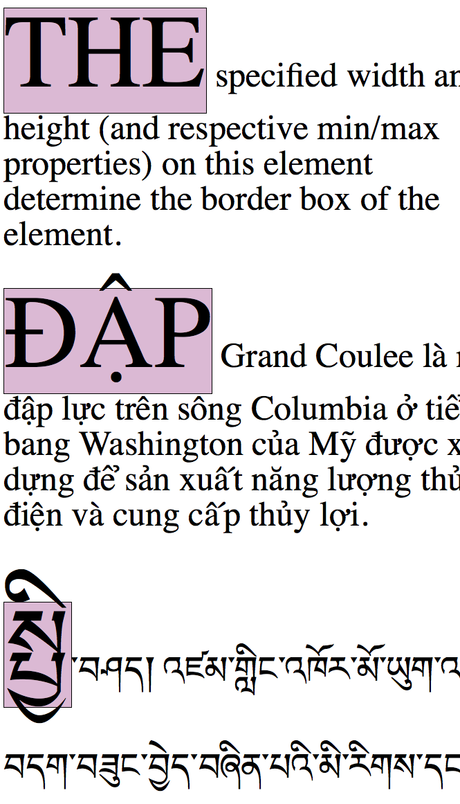
getting these inside the box. For example, I tried this code:
.drop {
color: black;
background: #DBB9D4;
font-size: 124px;
box-sizing: border-box;
padding: 0px;
border: 1px solid black;
text-transform: uppercase;
}
p { font-size: 48px; }
on this markup
<p><span class=drop>The</span> specified width and height (and
respective min/max properties) on this element determine the border box
of the element.</p>
<p><span class=drop>Đập</span> Grand Coulee là một đập lực trên sông
Columbia ở tiểu bang Washington của Mỹ được xây dựng để sản xuất năng
lượng thủy điện và cung cấp thủy lợi.</p>
<p><span class=drop>སྤྱི</span>་བཤད། འཛམ་གླིང་འཁོར་མོ་ཡུག་འདི་བདག་བཟུང་བྱེད་བཞིན་པའི་
མི་རིགས་དང</p>
(I'm not trying to do drop caps here, just exploring the box-sizing
behaviour.)
See the attachment for the result.
What concerned me was that the combining characters leaked outside the
box. I think that one could add enough padding to avoid this, but it is
a messy job for an author, and may require different settings for each
initial-letter (not all have combining characters). With my author hat
on, i'd just want to say 'make it all fit', and have combining character
accounted for too. I think we'd need to fix that.
Note also that there is a gap in the English example where the beard of
the type is empty (because there's no descender).
Then we would have two main scenarios:
1. where the box is the main determiner of positioning and size of the
initial letter text (what's proposed above), and
2. where some other approach produces the size - which may be the
distance between cap height and alphabetic baseline, or
indic/tibetan/etc top line and (something else), or the equivalent in
ideographic text...
With this second approach, too, there will be combining characters and
subjoined characters to account for, and it will be necessary to clear
space for them so that they don't overlap the surrounding text.
Maybe this is the same issue?
ri
Attachments
- image/png attachment: Screen_Shot_2015-02-10_at_16.16.17.png
Received on Tuesday, 10 February 2015 16:29:39 UTC