- From: Brian Manthos <brianman@microsoft.com>
- Date: Tue, 16 Aug 2011 19:27:18 +0000
- To: Brad Kemper <brad.kemper@gmail.com>, Alan Gresley <alan@css-class.com>
- CC: Tab Atkins Jr. <jackalmage@gmail.com>, "www-style@w3.org" <www-style@w3.org>
- Message-ID: <9710FCC2E88860489239BE0308AC5D17120F4F@TK5EX14MBXC264.redmond.corp.microsoft.co>
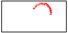
Attached is a less crude rendering of the end point path as you interpolate the angle in one quadrant (and the HTM used to produce the intermediate from which I made the overlapped rendering).

-Brian

-----Original Message-----
From: www-style-request@w3.org [mailto:www-style-request@w3.org] On Behalf Of Brian Manthos
Sent: Tuesday, August 16, 2011 11:27 AM
To: Brad Kemper; Alan Gresley
Cc: Tab Atkins Jr.; www-style@w3.org
Subject: RE: [css3-images] gradients keywords and logical (Re: [CSSWG] Minutes and Resolutions Telecon 2011-08-10)

Concur with Brad.

Regarding circumscribing...

The old (WD) and new (ED) rendering of corner-to-corner *only* changes what angle is chosen.  The interpolation of angles is unchanged.  On that note, the path that an endpoint takes as you interpolate across angles is *not* circular for at least non-square boxes.  It might be a pair of partial circles or ellipses (like two olympic rings without the middle part), but it's definitely not a single circle.

Attached is a crude rendering; observe the purple line approximations of the path that the end point takes during interpolation of the angle.

-Brian

> -----Original Message-----
> From: Brad Kemper [mailto:brad.kemper@gmail.com]
> Sent: Tuesday, August 16, 2011 8:16 AM
> To: Alan Gresley
> Cc: Brian Manthos; Tab Atkins Jr.; www-style@w3.org
> Subject: Re: [css3-images] gradients keywords and logical (Re: [CSSWG]
> Minutes and Resolutions Telecon 2011-08-10)
>
> Neither of those variations is correct. Since "Magic Corners" merely
> creates a certain angle and then acts like a 'deg' from there on, the
> transitions should be equivalent to this (if using current WebKit
> nightly):
>
> <style>
> div {
> background: -webkit-linear-gradient(-15deg, rgba(255, 0, 0, 0.4),
> rgba(255, 255, 255, 0.4), rgba(0, 0, 255, 0.4)); height:386px;
> width:102px;
> -webkit-transition: all 2s;
>
> }
> div:hover {
> background: -webkit-linear-gradient(-90deg, rgba(255, 0, 0, 0.4),
> rgba(255, 255, 255, 0.4), rgba(0, 0, 255, 0.4)); } </style> <div>
> </div>
>
> Webkit doesn't currently transition the gradient, but if it did, all
> the in-betweens should act exactly as if they had a 'deg' notation,
> and therefor the 0% and 100% color-stops should always intersect at
> least one corner. In your examples they do not.
>
>
> On Aug 15, 2011, at 10:29 PM, Alan Gresley wrote:
>
> > On 16/08/2011 11:51 AM, Brian Manthos wrote:
> >> Alan Gresley:
> >>> The code simulates the newer "magic corners" gradient.
> >>>
> >>> The issue I have is when these are transitioned or animated. If
> >>> the transitioned is from 'to bottom right' (as in the code) to 'to
> >>> bottom', the length between the endpoints (red and blue) go from
> >>> roughly 200px to 400px. Also instead of the rectangle being
> >>> circumscribed by the gradient path (or direction) it is inscribed
> >>> by the gradient path. I would like the ability to control if a
> >>> gradient path is circumscribing or inscribing a box in a
> >>> transition or animation.
> >>
> >> An example (maybe just a revisit of a previous one) would help me
> >> (and maybe others) understand the use case.
> >
> >
> > I have now uploaded an example to simulate the newer "magic corners".
> >
> > http://css-class.com/test/css/3/gradients/corners-circumscribed.htm
> >
> >
> >> The example I have in mind is something where you show 2 rows of 5
> >> boxes.  The first row contains the transition you expect with
> current
> >> spec.  The second row contains the transition you would like.  The
> >> 1st - 5th columns are { start, 25%, 50%, 75%, end }.  Maybe fill
> >> the boxes using SVG background-image?
> >
> >
> > This is a simulated transition from corner to side.
> >
> > http://css-class.com/test/css/3/gradients/corners-circumscribed2.htm
> >
> >
> > I could not change the values of the gradients since they are not
> transitional as yet so the red and blue extreme points are slightly
> outside the rectangle.
> >
> > I don't mine this sort of transition but I would also like to be
> > able
> to do a transition where the gradient path is always circumscribing a
> box and the distance between the red and blue extremes of the gradient
> remains constant. This can only happen if the initial newer "magic
> corners" gradient can also extends to the edge of the circumscribing
> circle. Here is a example.
> >
> > http://css-class.com/test/css/3/gradients/corners-circumscribed3.htm
> >
> >
> > For this to happen, there needs to be a new keyword for
> > circumscribed
> gradients (that if the current behavior remains the default behavior).
> I happy for this to appear in css4-images. The reason why I believe
> that such gradient should be allowed is that you can use linear and
> radial gradient together and currently radial gradients only
> circumscribe a box.
> >
> >
> >
> > --
> > Alan Gresley
> > http://css-3d.org/
> > http://css-class.com/
>
Attachments
- image/png attachment: AngleEndPointPath1_RenderingOverlapped.png
- text/html attachment: AngleEndPointPath1.htm
Received on Tuesday, 16 August 2011 19:27:48 UTC