- From: Shawn Henry <shawn@w3.org>
- Date: Tue, 14 Feb 2006 22:01:50 -0600
- To: shadi@w3.org
- Cc: Judy Brewer <jbrewer@w3.org>, wai-eo-editors <wai-eo-editors@w3.org>
- Message-ID: <43F2A7AE.1040704@w3.org>
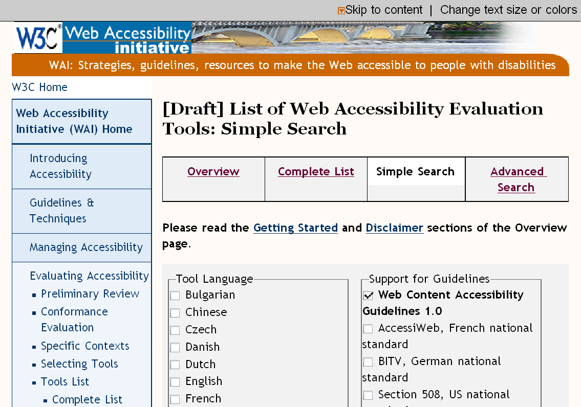
>> * High: It is not standard to use fieldset as a label for a group of >> checkboxes (or radio/option buttons), afaik. This could cause some >> problems with AT, as Andrew pointed out. (Sorry that I didn't note >> this before. :( > I understand the problem with radio buttons and options but checkboxes > have a different usage. They also must have different names according to > HTML. This is also highlighted by the WAI curriculum: > <http://www.w3.org/WAI/wcag-curric/sam96-0.htm> > >> * High: Remove fieldsets, use plain text labels for checkboxes, >> probably ending in colons. > > So, remove the fieldset around the checkbox groups and also remove the > labels for each checkbox? > >> * High: Remove fieldsets, use plain text labels for checkboxes, >> probably ending in colons. > > As above. I'm unsure what you mean exactly. Let’s talk on this, instead of try to communicate it via e-mail. OK? >>> Ref: <http://www.w3.org/WAI/EO/Drafts/eval/tools/simple> > >> * High: I understood from the last EOWG discussion that there would be >> just the Language and the Guidelines options? I thought we decided >> that the Functionality was too difficult to understand and potentially >> confusing for the Simple Search. > > True, I just wanted you and Judy to have a chance to see it. I like it > now and think it is more useful (because it potentially returns way less > results) but am happy to take it down too. Let me know. Hum, now I see in IRC log: “Judy: Propose that we go ahead with the simple search page with just languages and functionality and re-doing format” I *do* like how you have re-worded the functionality items – they are pretty durn clear now… I somewhat favor having only 2 options here – but it is a trade off – simpler search is nice to keep simple; however, fewer options yields more results. Perhaps we can do some quick, informal usability testing? :-) at TP? If we do end up with 3 fieldset boxes, I think it would look best if the 2 columns were the same height (by adding empty rows at the end of the shortest); however, I’m not sure that is worth the extra effort? >> * Also note that a *major* advantage to just having 2 options (rather >> than 3) is that the Search button can go above the fold, to the right >> of the Language, under the Guidelines. > > I intentionally put it down because it is easier to find (more logical > place). For example for screen magnification. Again, I'm happy to change > (I expect the languages box to grow anyway). I think once take care of extra space in middle this won’t be a problem. Also note that buttons are sometimes bottom right. I still think above the fold is most important. (but also reserve the right to not like it moved once see it :-/ >> * Medium: Make the columns closer together, that is, have less space >> between the Languages and the Guidelines. This is important for people >> using screen magnification (in the current layout they could get lost >> in the white space in the center). (from EO IRC log: >> http://www.w3.org/2006/02/03-eo-irc.html#T14-31-40) > > The solution for this problem was the gray background (to communicate > form contents). If you feel less space between the boxes looks visually > better, then I will reduce (it is currently 1em). oops, I’m not talking about the space between the fieldset box borders, I’m talking about all the empty space currently within the Tool Language fieldset box - that is, the space between the end of the longest one “Portuguese –Brazil” and the right edge of its fieldset box. I agree that the gray background helps mitigate potential problem with magnifier user getting lost; however, still wonder if want to limit empty space in box? Am fine with leaving to editor’s discretion! oh, here’s another reason to fix the spacing: to limit word wrapping on the items in the right column. see attached screen grab of my default view. there’s lots of empty space in the Languages box but then the right column is all wrapping. the two columns need to be adjusted based on length of content, to limit wrapping >>> Ref: <http://www.w3.org/WAI/EO/Drafts/eval/tools/advanced> >> >> * High: In Guidelines options - Put WCAG at top in bold (like in >> Simple Search page) > > OK, easy fix. Should it be pre-checked (as in the simple search)? Um… not sure. probably… except it looks a bit odd to be the only one checked. >> * I appreciate your attempt at grouping the options! After hearing the >> discussion in EO (which yielded no plausible suggestions for grouping) >> and seeing a pass at it, I think that any grouping is going to be too >> generic/arbitrary/non-specific to be useful. Specifically, seeing the >> group names in "Search Options" (orange links in box top right), I >> find them not at all useful; where as the previous listing of each >> option was very useful. > > Yes, agreed. Note that it is also possible to add back the old search > options (in the right side bar) yet keep the grouping. Just a thought, I > am not too hung on the grouping... Right. (and I still don’t think the grouping helps- but still open to it if you or others feel strongly :) >> * Were you going to link from the options to descriptions in Selecting >> Tools? > > Yes and no. The selecting tools and the tools list have drifted far > apart by now. I think we should continue working on the tools list to > make sure the terms are usable, then go back and update the selecting > tools accordingly. Do you agree with this approach? Absolutely, whatever you think best as editor of both, I’ll fully support. Note that I also think it’s ok to put getting them in total synch as a lower priority for later. >> * In Platform Integration options - Consider re-ordering so the most >> common ones are listed first > > Wouldn't that seem like we are advertising Windows? I prefer them > alphabetically sorted. Otherwise, please give me the sort order you deem > most useful. 1. I think usability should trump here and the most common ones should go first. I can see a non-geek skimming the list [BSD Unix...Linux...Solaris...NET], getting scared off and maybe not even seeing Windows, Mac, and Web-based. However, if you disagree, I’m OK leaving as is. 2. I think you’d know better what order, since you know/have the data showing which are more common support in tools. And you probably have a better idea of me what is used more commonly as well. But I’ll take a pass at in the Spirit of cooperation: Web based (remote) Windows ? MacOS X ? Linux ? Java ? BSD Unix ? Solaris ?.NET >> * I like how you got the Search buttons throughout & think the Back to >> Top is good; however, if they don't stay in future tweaks (e.g., >> changing grouping), I think that's OK, too. > > I tried it after each group of checkboxes but that was way too much. > I'll play around and see what other options there are (maybe after each > two?). Yup, agree that would be too much. Probably after each 2 would be too much as well. Is a conflict to have them ready to click on easily vs. complicating the visual design & cognitive load. Would be simpler visually to just have the one at top and bottom. So it’s a tough call. >> Both, but way low: >> * If you do use fieldsets, it would be easier to read and look better >> if you added a space before and after the label, so the border doesn't >> run into the letters; however, I'm not sure if that would cause other >> problems. Also it looks nice if the items are lined up under the >> label, that is, they have the same left alignment. > > I will play around with CSS padding/margin for the legend of the > fieldset but I don't know how well supported this is across browsers. I was thinking on either side of the text > As to the list alignment, on the simple search I reduced the list > indentation to make the boxes more compact. On the advanced however, we > have tons of space. Do you prefer less list indentation or more legend > indentation? (not sure how well the latter works across browsers though.) Hmm, I still prefer them aligned. The place to save space is right of the tools list within the fieldset box, per above. >> * Low: In Guidelines options - not sure about "US" abbreviation? >> should it be USA? or written out? > > I think USA is very formal and kind of conservative but I am not too > fussed either way. Any preferences from your side? don’t like just “US” - seems improper - but don’t care much at all either way. Suspect Judy does (though not sure which way) All for now, ~ Shawn
Attachments
- image/png attachment: wrappin.png
Received on Wednesday, 15 February 2006 04:02:14 UTC