- From: Alastair Campbell <acampbell@nomensa.com>
- Date: Tue, 10 Dec 2019 14:39:30 +0000
- To: "Abma, J.D. (Jake)" <Jake.Abma@ing.com>
- CC: WCAG list <w3c-wai-gl@w3.org>
- Message-ID: <76B4026F-E17E-4BCF-96DB-B5E852E00F19@nomensa.com>
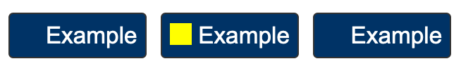
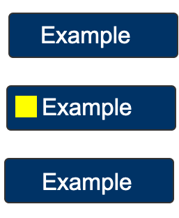
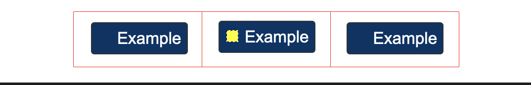
Hi Jake,

Given the parameters & definitions set-out I would fail the first example, not the second:

Example 1:
If that were a client’s design pattern, I’d suggest either making the yellow square proportional to the size of the button, or using an outline / underline method.

NB: I haven’t come across this design in the wild, it was a made-up example to show the principle!

Example 2:
For the example with the expanded but invisible hit-area around the component, I’d refer to the definition of user-interface component which is:
“a part of the content that is perceived by users as a single control for a distinct function” (my bold)

Therefore I wouldn’t expand the required focus indicator size based on an artificially expanded hit area.

In general I’d default to the element (e.g. <a>) that is the component, but if that doesn’t align with the visuals and it becomes a question, then it is based on perception of the component.

Cheers,

-Alastair


From: "Abma, J.D. (Jake)"

Ok I get that and also clear from a starting point for this SC, but with the examples given, what is your response / solution for the two examples?

Have a good solution to cover these to start with Or... will you stand by the fact that they should fail this SC?

PASS: Example from Understanding doc:

[cid:image001.png@01D5AF67.A7DA46D0]
FAIL: Same button but wider for bigger touch target OR even wider for mobile

[cid:image002.png@01D5AF67.A7DA46D0]

FAIL: Same buttons, but touch target area is made bigger and focusable

[cid:image003.png@01D5AF67.A7DA46D0]
Attachments
- image/png attachment: image001.png
- image/png attachment: image002.png
- image/png attachment: image003.png
Received on Tuesday, 10 December 2019 14:39:35 UTC