- From: Andrew Somers <me@AndySomers.com>
- Date: Tue, 9 Jul 2019 08:02:16 -0700
- To: Bruce Bailey <Bailey@access-board.gov>
- Cc: Andrew Somers <me@AndySomers.com>, David MacDonald <david100@sympatico.ca>, "w3c-waI-gl@w3. org" <w3c-wai-gl@w3.org>, Alastair Campbell <acampbell@nomensa.com>
- Message-Id: <285FE78E-6234-4952-97BE-F4B348D8ACB0@AndySomers.com>
Hi Bruce,

as part of the things I have been looking into, regarding simulating CVD, the coblis simulator you link below is not using a perceptually accurate simulation of color deficiency (in fact the authors of the javascript in use even say as much).

I have built a web app for CVD simulation, and it’s live here:

https://www.myndex.com/CVD/

It is using the accurate Brettel model for Protan and Deutran. Please feel free to use it, and please let me know if you have any issues with it (I just wrote it over the weekend).

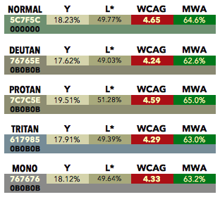
The ratios you mention using the corblis simulator seem a bit off. Using COLOR ORACLE I was getting:


Though ColorOracle has a small black boost that is part of the gamut reduction of the Brettel model. This is partly what led me to create the web app linked above (I wash out and realign the black point on output in my sim).

> For [1] I get a luminosity contrast ratio of 4.7:1 (but hex value I am sampling is 637E5F, not 5C7F5C)
> For [2] and [3] I get a luminosity contrast ratio of 4.6:1


If you are sampling on the screen using a tool like Apple’s “digital color meter” then you are not getting the actual color values, but the values that are adjusted via the color management ICC profile. To get “accurate”values, load the images into GIMP or Photoshop and use sRGB as the working space while sampling.

> So [1] has marginal apparent contrast, but has marginal contrast for everyone, and someone with color blindness is not facing a disproportionate barrier.  So the algorithm is doing the job it is supposed to do!

Someone with dichromate CVD will *almost never* face a “disproportionate barrier”. In fact it is nearly impossible to make a color scheme that is “worse” for a dichromat than a normal observer, provided at least a modest luminance contrast is used.

This has nothing to do with the WCAG “algorithm”, and only a little to do with the contrast standards involved.

Primary RED is the one color that is problematic for Protans. But when we are talking about computer monitors, it isn’t the issue some make it out to be, and not by a long shot.

1) The red primary in sRGB is actually red-orange, and substantially stimulates the M (green) cone.
2) As a result, red on an sRGB monitor will never be “invisible”, though it does drop in luminance by about half, whcih perceptually is a 30% reduction.
3) So yes, colors using red do get a bit darker, perceptually about 30% darker.
4) BUT - this is actually HELPFUL.

Say what??!

Yes, that red gets darker is normally HELPFUL. Because it is nearly impossible to make RED the BRIGHTEST color in a color pair. As a result red is associated with the DARKEST color in most color pairs, so when red gets darker fo the Protan, it ACTUALLY IMPROVES CONTRAST.

In fact there is a very narrow area to try and make it “bad” and that is brightest red on a very very dark green. But this combination fails all reasonable luminance contrast tests in the first place, and otherwise is well known as bad design practice.

The other case where red can be brighter than the other color is red against blue - though again it is well known (among trained designers) that red/blue is a very BAD combination — not for CVD, but for everyone, due to severe chromatic aberration.

Remember that the majority of luminance - by far - is composed of green. In the sRGB colorspace, Green is 71% of luminance. Red 21%, and Blue is 7% (and in fact Blue is 0% luminance in some color spaces).

Dichromats also do not differ from normally sighted in terms of general contrast sensitivity.


No special algorithm is needed - red is dark already, and blue is even darker. Tritans are practically unaffected by the loss of blue (and in fact we - ALL OF US - are tritan in our foveas - our most central vision has no blue cones, only red and green - this is nature’s way of dealing with chromatic aberration).

To have red as the brightest of two colors AND have reasonable luminance, full FF0000 red needs to be against near black. And even this is not a bad combo because, again, the “red" in an sRGB monitor is well above the cutoff for the M cone.

EXAMPLES (using my CVD simulator, but I got similar results using Color-Oracle which uses the same Brettel et al model).


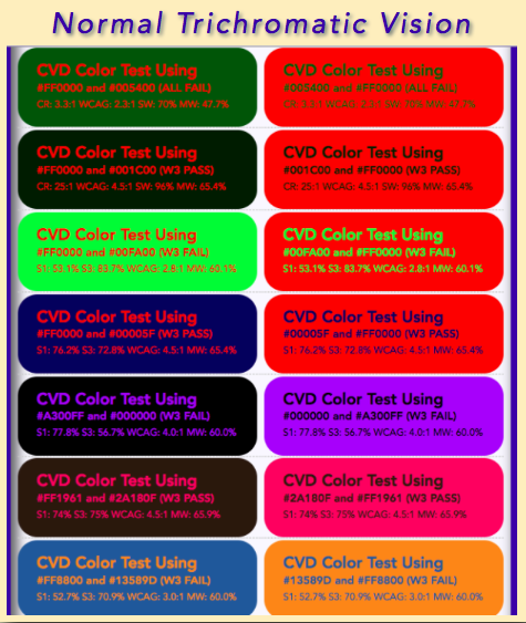
Consider these color pairs:

The top pair is a clear fail for any and all math and design principals, but I put it there because it is the one very narrow use case where the colors are invisible to the protan, because the red here is actually brighter than the green.

About the only time you can legitimately have red the brightest color AND adequate luminance is when red at full against near black (second row)

Note that these many of these color combinations represent BAD DESIGN PRACTICE n the first place.


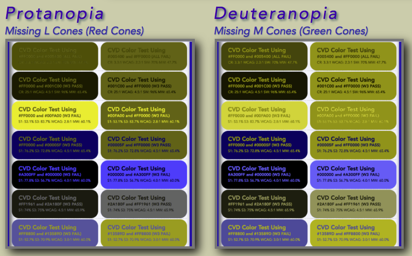
And the sim shows:


As expected, the protan is unable to see the top row as it was selected specifically to force a fail for a protan, by making the red the brighter of two colors.

Notice that all CVD types see most of the other pairs (including WCAG fails) fairly well. Though again the Protan has problems with the red on blue with red as the brightest color.

Anytime RED is the brightest of a color pair, the Protan individual will experience reduced contrast - but red as brightest is rare. Normally, red will be part of the darker of two colors nd this will actually ENHANCE contrast for the Protan individual.

Not also that the Deutan’s perception of contrast is not particularly different than a normally sighted individual. This is because the red cone overlaps the green cone very substantially, at the shorter wavelengths the ed and green cones have nearly identical spectral response.

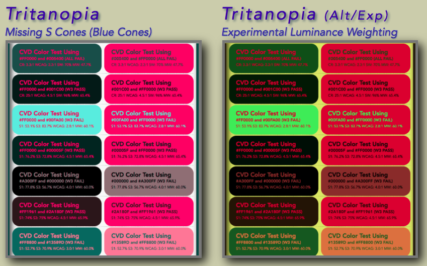
And for Tritan (note the LEFT tritan is based on Brettel, the one on the right is an experimental version with a darker luminance weighting in the blue area.


Because blue is so low in luminance, it will always be the darker color in a pair. See in the Brettel model (left) that they seem to have even better contrast than the normally sighted individual. My experimental version (right) de-enhances this effect slightly.

And again, remember that we are all tritan in the fovea (center vision). And blue against black has always been a “bad design practice”.

For ALL forms of vision (except the very very rare Blue Cone Monochromat) good design practice keeps BLUE as the darker of any color pair, and RED as usually the darker of any color pair, except against BLACK.

Most colors will have a substantial quantity of green, and these will normally be the brightest in a pair, and will naturally push toward a luminance contrast that results in best legibility for everyone.


Of course, I am not getting into adaptation and all the other issues for this email, I just wanted to clarify a few issues as they apply to CVD, namely that CVD does not need any significant “special attention” beyond a few things that are already understood as bad design practice.

sRGB Primary Blue (violet) should not be used alone for text or high detail stimuli.
Blue should always be the darkest of a color pair when contrast is important.
Primary Red should never be used against bright primary blue due to chromatic aberration.
Red should be the darkest color when present in a given color pair.
If red is the brightest of two colors, the darker color should not be primary green.

MOST IMPORTANT: Adequate luminance contrast is key — color contrast is useful for design “flavor” but color contrast alone is not enough for differentiation.

I’d like to say this is all well known by the professional design community, but considering the problems with so many websites, I’d have to say that one of the important considerations for Silver is that of clearly stating these principals.


Andy

Andrew Somers
Color Science Research
-contact info redacted for list-


> On Jun 6, 2019, at 11:28 AM, Bruce Bailey <Bailey@access-board.gov> wrote:
>
> I am okay with the algorithm permitting certain poor contrast combinations because I would argue that its main purposes is to catch for colorblindness.  David, I fed your image [1] into:
> http://www.color-blindness.com/coblis-color-blindness-simulator <http://www.color-blindness.com/coblis-color-blindness-simulator>
>
> Then I selected Red-Blind/Protanopia and got [2]:
> <image002.png>
>
> Then I select Green-Blind/Deuteranopia to get [3]:
> <image003.png>
>
> For [1] I get a luminosity contrast ratio of 4.7:1 (but hex value I am sampling is 637E5F, not 5C7F5C)
> For [2] and [3] I get a luminosity contrast ratio of 4.6:1
>
> So [1] has marginal apparent contrast, but has marginal contrast for everyone, and someone with color blindness is not facing a disproportionate barrier.  So the algorithm is doing the job it is supposed to do!
>
>
> From: David MacDonald <david100@sympatico.ca <mailto:david100@sympatico.ca>>
> Sent: Monday, May 27, 2019 11:06 AM
> To: Gregg Vanderheiden RTF <gregg@raisingthefloor.org <mailto:gregg@raisingthefloor.org>>
> Cc: Dick <wayneedick@gmail.com <mailto:wayneedick@gmail.com>>; w3c-waI-gl@w3. org <w3c-wai-gl@w3.org <mailto:w3c-wai-gl@w3.org>>; Tom Jewett <tom@knowbility.org <mailto:tom@knowbility.org>>; IG - WAI Interest Group List list <w3c-wai-ig@w3.org <mailto:w3c-wai-ig@w3.org>>
> Subject: Re: A color tutorial from Tom Jewett
>
> For me, I like the algorithm in general and think we should keep it.
>
> There are, however, a few color combinations that seem a little weird to me. Usually, a threshold contrast (4.5:1) it is when one is black. I think there has been a little buzz around that in the public.
>
> I'd like to see a study identifying these types of combinations that seem harder to see than some failing contrasts, with suggestions on adjustments we can adjust the algorithm.
>
>
> <image001.png>
>
>
> Cheers,
> David MacDonald
>
> CanAdapt Solutions Inc.
> Tel:  613-806-9005
> LinkedIn
>  <https://nam01.safelinks.protection.outlook.com/?url=http%3A%2F%2Fwww.linkedin.com%2Fin%2Fdavidmacdonald100&data=02%7C01%7Cbailey%40access-board.gov%7C1b5326da65c547a55a4a08d6e2b513ff%7Cfc6093f5e55e4f93b2cf26d0822201c9%7C0%7C0%7C636945664695477655&sdata=GBjLUsQLwH0siu6Ys2kpvoAAiP9bAE2BnGD1yb8MtkM%3D&reserved=0>
> twitter.com/davidmacd <https://nam01.safelinks.protection.outlook.com/?url=http%3A%2F%2Ftwitter.com%2Fdavidmacd&data=02%7C01%7Cbailey%40access-board.gov%7C1b5326da65c547a55a4a08d6e2b513ff%7Cfc6093f5e55e4f93b2cf26d0822201c9%7C0%7C0%7C636945664695487667&sdata=IRoBFCtPwJirZ6he8nR%2FAx6gwrzlSioDYjcNLaUrGBA%3D&reserved=0>
> GitHub <https://nam01.safelinks.protection.outlook.com/?url=https%3A%2F%2Fgithub.com%2FDavidMacDonald&data=02%7C01%7Cbailey%40access-board.gov%7C1b5326da65c547a55a4a08d6e2b513ff%7Cfc6093f5e55e4f93b2cf26d0822201c9%7C0%7C0%7C636945664695497671&sdata=CRZWB%2BtB86wJC%2BBRLqy1IlpGqLco79SRLczLglftNzs%3D&reserved=0>
> www.Can-Adapt.com <https://nam01.safelinks.protection.outlook.com/?url=http%3A%2F%2Fwww.can-adapt.com%2F&data=02%7C01%7Cbailey%40access-board.gov%7C1b5326da65c547a55a4a08d6e2b513ff%7Cfc6093f5e55e4f93b2cf26d0822201c9%7C0%7C0%7C636945664695507679&sdata=pw%2Bz5BQ0%2B0Qujai2o8jp0rZ%2BdjamhpI1IUngfS1r7EE%3D&reserved=0>
>
>   Adapting the web to all users
>             Including those with disabilities
>
> If you are not the intended recipient, please review our privacy policy <https://nam01.safelinks.protection.outlook.com/?url=http%3A%2F%2Fwww.davidmacd.com%2Fdisclaimer.html&data=02%7C01%7Cbailey%40access-board.gov%7C1b5326da65c547a55a4a08d6e2b513ff%7Cfc6093f5e55e4f93b2cf26d0822201c9%7C0%7C0%7C636945664695517688&sdata=mESjvdFJnlfPa8Q%2BxplcLiRTXq%2B1alIQnXIrwPhWbNY%3D&reserved=0>
>
>
> On Sun, May 26, 2019 at 11:19 PM Gregg Vanderheiden RTF <gregg@raisingthefloor.org <mailto:gregg@raisingthefloor.org>> wrote:
> Hi Wayne    (sorry tired)
>
> Here is some information that might be helpful.
>
> This topic seems to come up again every few years.
>
> Before diving into it again — it might be helpful to know all the work and research that went into developing the measure in the first place.  It takes into account much more than most measures of contrast do - - including both low vision and the different types of color blindness.
>
> The current contrast measure was developed based on both international standards and research on low-vision and color blindness - and was done in collaboration with research scientist at the Lighthouse for the blind.  Over a year was spent on researching and developing it.   It was based on international standards and then adjusted to control for legibility and contrast when the different types of color blindness and low vision were applied.     We did this work because we were unable to find any other researchers who had done any work to account for these when coming up with their contrast measures.
>
> The current measure takes into account the following things
> Reseach on standard contrasts levels
> Research quantifying the need for increased contrast with reduced visual acuity
> The quantification of the differences in contrast perceived with different color combinations for people with different types of color vision differences (including Protan, Deutan, Tritan, and Mono or Achro (no color) vision differences.
> The range of contrast that would allow three items to maintain color contrast with each other.  (That is -   A contrasts sufficiently with B which contrasts sufficiently with C  without A and C having to be pure black and white.
> And the full range of colors that would be possible and still meet any color contrast requirements.   (In WCAG’s case   4.5:1 and 7:1)
>
> Any new efforts to revisit should be at least as thorough and take all of these into account quantitatively.
> By the way —If anyone is aware of such - please do let me know so I can capture that other information on the DeveloperSpace <https://nam01.safelinks.protection.outlook.com/?url=http%3A%2F%2Fds.gpii.net%2F&data=02%7C01%7Cbailey%40access-board.gov%7C1b5326da65c547a55a4a08d6e2b513ff%7Cfc6093f5e55e4f93b2cf26d0822201c9%7C0%7C0%7C636945664695527696&sdata=K9GCkFZ4COd6duUtIgH2Ip6gY%2BPOaunYDpuQaqRqCl8%3D&reserved=0>  - a  central reference being developed to support developers, policy etc.
> (the MasterList <https://nam01.safelinks.protection.outlook.com/?url=https%3A%2F%2Fds.gpii.net%2Flearn%2Faccessibility-masterlist&data=02%7C01%7Cbailey%40access-board.gov%7C1b5326da65c547a55a4a08d6e2b513ff%7Cfc6093f5e55e4f93b2cf26d0822201c9%7C0%7C0%7C636945664695537704&sdata=xb%2B66wkoeI8LdFfi2eln47%2B81Vn%2FTH5%2Fuhd3CTUCo9k%3D&reserved=0> may also be of interest — with a full page devoted to applications, tools and research for each of the 80+ access strategies identified  - with a $50 reward for any strategy not listed or covered by a listed strategy )
>
>
> As to the age of the tool — we are using tools that are hundreds of years old in science all the time.
>  The age is not really relevant.
>
> Is there something else that makes you think the old tool is no longer valid?
>
> If so — that is where we should start.  With what the perceived problem is with the old tool.
> What has changed that made it no longer work?
>
> All the best.
>
> Gregg
>
>
>
> On May 23, 2019, at 2:53 PM, Wayne Dick <wayneedick@gmail.com <mailto:wayneedick@gmail.com>> wrote:
>
> I think it is time to look at contrast and color.
> Our formula may be the one, but it may not. This would really be a research effort.
> As mentioned before, we can calibrate any new test on the same scale we use now so that the user interface of tests won't need to change much.
> What we need muster is our talent in the mathematics, physics, electrical engineering, vision science, photography and art.
>
> There has been enough concern expressed about the current formula that it seems reasonable to review our research and improve it if needed.
>
> Maybe we need a different formula. Maybe we need to do more with accessibility testing to ensure standardized evaluation. I just don't know, but I am concerned with the distrust of our numbers.
>
> I could use some suggestions about how to proceed organizationally. This is not controversial. We are using a 10 year old tool in rapidly evolving technology. A calm scientific review is in order. Tom Jewett and I are happy to contribute.
>
> Best to All, Wayne
>
> Best, Wayne
Attachments
- text/html attachment: stored
- image/png attachment: Screen_Shot_2019-06-30_at_4.27.33_AM.png

- image/png attachment: Screen_Shot_2019-07-09_at_6.38.47_AM.png

- image/png attachment: Screen_Shot_2019-07-09_at_6.39.04_AM.png

- image/png attachment: Screen_Shot_2019-07-09_at_6.39.18_AM.png

Received on Tuesday, 9 July 2019 15:02:56 UTC