- From: James A. <A.James@soton.ac.uk>
- Date: Thu, 7 Feb 2019 18:05:55 +0000
- To: Alastair Campbell <acampbell@nomensa.com>, "WCAG list (w3c-wai-gl@w3.org)" <w3c-wai-gl@w3.org>
- Message-ID: <VI1PR04MB63209E588DAF0A967E942566B0680@VI1PR04MB6320.eurprd04.prod.outlook.com>
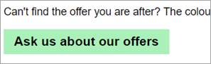
Sorry for resurrecting this thread but I have been reviewing it and the 1.4.11 understanding document with colleagues and we feel there is a common component that’s not covered and we need some clarification.

We are looking at coloured buttons without a border and there doesn’t seem to be any examples that cover this in the understanding document.

In the example below (also the second button in https://codepen.io/abijames/full/QYqPOR) there is a button where the colour does not have sufficient contrast with the page background but the text within the button does have sufficient contrast with both the button colour and the page background.

[cid:image002.jpg@01D4BF0F.C37A8BF0]

Currently the  understanding document says:
“if the visual indicator of the control is the only way to identify the control, then that indicator must have sufficient contrast. If text (or an icon) within a button is visible and there is no visual indication of the hit area then the Success Criterion is passed.”

We have been discussing the following scenarios:

  *   if there is a visual indicator of the control other than through the colour of the hit area (e.g. through styling of the text as in this example), does it pass?
  *   if it easier to pass this success criteria when no indication of the hit area is provided (particularly with icon buttons), would that actually be more detrimental to accessibility/usability?

It would be really helpful to have guidance on coloured buttons without a border as I can see that it could be easier to fulfil the success criteria if the text was presented just as a link but this would have a negative impact on those with cognitive difficulties as well as usability. And designers will be very grumpy….

Many thanks

Abi James


From: Alastair Campbell <acampbell@nomensa.com>
Sent: 17 January 2019 10:56
To: WCAG list (w3c-wai-gl@w3.org) <w3c-wai-gl@w3.org>
Subject: Re: Color contrast principle

David wrote:
> If the grey outline is merged with the dark blue background wouldn't the contrast be between the input and the dark gray background.

As we’re dealing with luminance, most contrasting colour combinations are a dark colour vs a light colour. A colour in the middle is very likely to fall into the dark or light side, so be ‘subsumed’ into one side or the other. (Insert star-wars joke here.)

it is possible to have three contrasting colours, light, middle and dark, and if that is the case then great, the silver could contrast with both and could be taken as the measure.

What we’re saying is that if that 3-way contrast isn’t the case, *and* it does not impact understanding the component, then you can consider it part of the closest match (light/dark).

Logically, if the inner and outer colour do contrast, then the middle colour either will either:

  *   contrast with both (unlikely but good), or
  *   contrast with one side (be subsumed into the non-contrasting side)
  *   contrast with neither (be ignored).

That last one might look worrying, but could be considered to essentially be like a gradient. If that is thick enough to interfere with the comprehension of the control, it would be an issue. I’m struggling to think of an example of that though. If the outer and inner colours contrast enough, that should be ok. If it is particularly thick (e.g. a border between maps segments), it is likely to be considered its own graphical object.


JF wrote:
> I think the word we may be searching for is subsume

Works for me, that would make it:

If components use several colors, any color which does not interfere with identifying the component can be ignored for the purpose of measuring contrast ratio. For example, a 3D drop-shadow on an input, or a dark border line between contrasting [backgrounds is considered to be subsumed into the color closest in brightness (luminance)].

The following example shows an input that has a light background on the inside and a dark background around it. The input also has a dark grey border which [is considered to be subsumed] into the dark background. The border does not interfere with identifying the component, so the contrast ratio is taken between the white background and dark blue background.


Having agreed the last update to this understanding doc, we’ll publish that first and this change will go into the next updates for non-text contrast, I’ll start a new branch/PR for it.

-Alastair
Attachments
- image/jpeg attachment: image002.jpg
Received on Thursday, 7 February 2019 18:50:28 UTC