- From: Alastair Campbell <acampbell@nomensa.com>
- Date: Wed, 16 Jan 2019 00:04:52 +0000
- To: "WCAG list (w3c-wai-gl@w3.org)" <w3c-wai-gl@w3.org>
- Message-ID: <AM5PR0902MB200295F8D26EF8A66C533B99B9820@AM5PR0902MB2002.eurprd09.prod.outlook.>
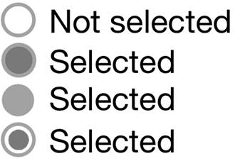
Hi everyone,

There was some confusion on the call about the second example under the "Adjacent colors" heading here:
https://cdn.staticaly.com/gh/w3c/wcag/non-text-contrast-updates/understanding/21/non-text-contrast.html?x=5
[A text box with a dark background and light border, with a white background.]

The aim was to show a general principle of measuring adjacent colours, perhaps it needs some adjustment?

The principle is that: If there is a non-contrasting colour between two contrasting ones, assume that it merges with the non-contrasting colour, then does it pass?

In that case, assume the silver border merges into the blue background, so it is essentially white vs dark blue.

This is important because it meets the user-need and allows for many more design possibilities. (Designs that would fail the SC without causing an impact on people.)

Without that, it would essentially mean two-colour only controls.

There is a similar principle going on for the radio-button example (selected / not-selected) further down.
[Three radio buttons, the first a plain circle marked unselected. The second shows the circle filled with the same color as the border. The third has a slightly darker filling than the border.]

All of those pass, but the middle two demonstrate the principle that if the middle contrasts with the outside, we can ignore the outer circle of the radio - it is a change of shape.

If anyone can think of a better explanation for the understanding doc... I'm all ears!

Kind regards,

-Alastair

--

www.nomensa.com<http://www.nomensa.com/> / @alastc
Attachments
- image/jpeg attachment: image002.jpg

- image/jpeg attachment: image005.jpg
Received on Wednesday, 16 January 2019 00:05:17 UTC