- From: David MacDonald <david100@sympatico.ca>
- Date: Tue, 29 May 2018 15:36:50 -0400
- To: Jonathan Avila <jon.avila@levelaccess.com>
- Cc: WCAG <w3c-wai-gl@w3.org>
- Message-ID: <CAAdDpDYe5O1iAwrEHEfWvUTGQZCeFnUntY3hQ2Qcfh3gc6iDdA@mail.gmail.com>
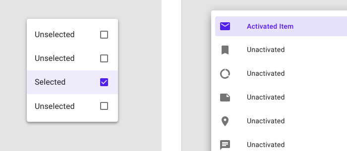
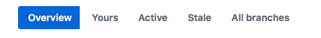
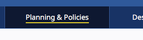
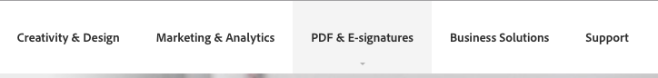
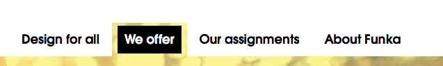
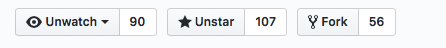
I think the hover state would not have to ensure *every* visible border has
3:1 contrast, just those necessary to identify the UI

Cheers,
David MacDonald


*Can**Adapt* *Solutions Inc.*

Tel:  613.235.4902

LinkedIn
<http://www.linkedin.com/in/davidmacdonald100>

twitter.com/davidmacd

GitHub <https://github.com/DavidMacDonald>

www.Can-Adapt.com <http://www.can-adapt.com/>


*  Adapting the web to all users*
*            Including those with disabilities*

If you are not the intended recipient, please review our privacy policy
<http://www.davidmacd.com/disclaimer.html>

On Tue, May 29, 2018 at 2:51 PM, Jonathan Avila <jon.avila@levelaccess.com>
wrote:

> Did the outcome of today’s discussion have an impact on the UI portion of
> hover contrast as discussed other than not requiring boundaries.  Did we
> determine that mouse pointer change in lieu of requiring >= 3:1 ratio
> contrast on any provided hover indicator would be sufficient?
>
> Jonathan
>
>
>
> *From:* Detlev Fischer [mailto:detlev.fischer@testkreis.de]
> *Sent:* Sunday, May 27, 2018 5:33 AM
> *To:* David MacDonald
> *Cc:* Andrew Kirkpatrick; WCAG
> *Subject:* Re: Resolving 1.4.11
>
>
>
> I think what is missing in the assessment of contrast is the implied
> information users gain from the grouping of items (menus, select options).
> We need to acknowledge that Gestalt features and visual context help
> communicating the fact that elements are user interface controls. So a
> vertically aligned  horizontal menu with evenly spaced items communicates
> by its arrangements (and often, its top-of the page, or top-of-a-segment
> position) that these are links (or certainly contributes to that
> interpretation), especially if one item in a row of menu links is
> discernibly focused. This suggests that others on the same row can equally
> be selected (and focus be highlighted the same way).
>
>
>
> I recognise that going beyond the atomic assessment of one individual
> component creates difficulties for testing because it suggests some grey
> areas that the understanding text may largely illuminate (turn to b&w).
>
>
>
> In recognition of the obvious practical problems for designers to
> implement this, I lean towards the most liberal interpretation of this SC
> possible. I think the focus indication (keyboard op) should only need to
> meet 3:1 against background OR default state (author’s pick) with no
> requirements for hover if any affordances such as a menu type arrangement
> (alignment, styling, additional icon) allow a recognition that something is
> a control AND, for graphics-only controls, that the salient part of the
> control has 3:1.
>
>
>
> Not sure if this helps...
>
> Detlev
>
> Sent from phone
>
>
> Am 27.05.2018 um 10:04 schrieb David MacDonald <david100@sympatico.ca>:
>
> > Part of what I’m thinking is that what is required is that enough
> information exists in aggregate that the user can know that there is
> something to interact with. This may mean that one boundary is ok, or more,
> or fewer – it is context dependent.
>
>
>
> ohhh... that's interesting, I though the requirement was to know where the
> clickable area is, i.e., if I click on the inside of the border its part of
> the interface and outside of the border does nothing... so knowing where
> the actual boundary line is was part of the thing...
>
>
> Cheers,
> David MacDonald
>
>
>
> *Can**Adapt* *Solutions Inc.*
>
> Tel:  613.235.4902
>
> LinkedIn
> <http://www.linkedin.com/in/davidmacdonald100>
>
> twitter.com/davidmacd
>
> GitHub <https://github.com/DavidMacDonald>
>
> www.Can-Adapt.com <http://www.can-adapt.com/>
>
>
>
> *  Adapting the web to all users*
>
> *            Including those with disabilities*
>
>
>
> If you are not the intended recipient, please review our privacy policy
> <http://www.davidmacd.com/disclaimer.html>
>
>
>
> On Sat, May 26, 2018 at 11:27 PM, Andrew Kirkpatrick <akirkpat@adobe.com>
> wrote:
>
> Comments within:
>
>
>
> Given the limited implementation experience, I think we should take the
> most liberal interpretation possible in the understanding doc without
> sending us back the CR. A future version can strengthen requirements but
> with backward compatibility future versions can't be loosened until Silver.
>
>
>
> > ... Visual information used to indicate states
> <https://na01.safelinks.protection.outlook.com/?url=https%3A%2F%2Fwww.w3.org%2FTR%2FWCAG21%2F%23dfn-states&data=02%7C01%7Cakirkpat%40adobe.com%7C988a6db6044a40d402fb08d5c373e9f4%7Cfa7b1b5a7b34438794aed2c178decee1%7C0%7C0%7C636629824974117373&sdata=ER2gpeFXaM0sZ14wgm%2Fm577McigioTbK8mYcmXAmvgs%3D&reserved=0>
>  and boundaries of user interface components
> <https://na01.safelinks.protection.outlook.com/?url=https%3A%2F%2Fwww.w3.org%2FTR%2FWCAG21%2F%23dfn-user-interface-components&data=02%7C01%7Cakirkpat%40adobe.com%7C988a6db6044a40d402fb08d5c373e9f4%7Cfa7b1b5a7b34438794aed2c178decee1%7C0%7C0%7C636629824974117373&sdata=KTzZ9%2BM2CMEhB5ueIIbfk6av70ILjFoB78BzvIkfHF4%3D&reserved=0>
> ,...
>
>
> I think having just one boundary (i.e, underline in #12, overline in #2)
> with the proper ratio should be ok... if so we need to interpret the plural
> of "boundaries" as:
>
>
> Part of what I’m thinking is that what is required is that enough
> information exists in aggregate that the user can know that there is
> something to interact with. This may mean that one boundary is ok, or more,
> or fewer – it is context dependent.
>
>
>
> "All of your component*(s)* have boundary*(s). There are are more than one
> components on the page therefore boundaries is plural"
>
>
>
> I don’t think that is going to be a very strong argument.
>
>
>
> My questions about the pass/fail determinations
>
>    - Not sure why #3 passes. The button and the border are less than 3:1
>
> This has to do with my statement that “If a color is less than 3:1, you
> need to pretend that it doesn’t exist at all and assess whether the
> component passes based on other information.”
>
> Would the same control fail if the button background color was the same as
> the adjacent color of the page background and there was no light colored
> border at all? (you’ll need to pretend that I am competent at Photoshop
> here…).  For this example, I might say that because the “90” is associated
> with the button a border that makes the grouping clear is needed, and in
> that case the border would need to be 3:1.
>
> <image001.png>
>
> I think that the big question is why a button with no color used to
> indicate the boundaries passes, but a button with a too-light background
> (but darker than nothing) would fail.
>
>
>
> This is why I don’t think that the background is needed in this example
> and why I think that it passes (although I might fail it because of the
> “90” part which I wasn’t thinking about originally).
>
>    - Not sure why #4 passes for the non selected items, is that because
>    they are (inactive). I wouldn't call them that because they are clickable.
>
> Again for this one – what if there was no light grey line at all? Would
> you fail that? (If so, on what basis?)
>
>
>    - Not sure why 7 passes. The arrow dropdown doesn't have sufficient
>    contrast
>
> This is the same as the previous one, except thinking about hover when the
> gray appears. The hover state is apparent because the mouse cursor changes,
> and the gray and the little triangle are not important information. I’m
> sure some might say that the triangle is needed because it indicates the
> menu will drop down, but if it wasn’t there (as it isn’t for many menus)
> you wouldn’t miss it. I wouldn’t feel the same way for a select box because
> there are additional keyboard expectations for a select box that come with
> the indication of the role.
>
>    - Not sure why 10 passes. The boundaries for the clickable region
>    (Search) is less than 3:1
>
> This is very similar to #4. Do the language and browsealoud buttons on
> that page pass? Is the solution to make this pass for the author to remove
> the white box and reduce the contrast?
>
>    - Not sure why 13 passes. The boundaries for the clickable region
>    (light purple) is less than 3:1
>
> If the light purple wasn’t there, would you fail it? Do you think that the
> items below the light purple item also trigger a failure? I’d say that a
> reasonable person can pretty accurately identify the region for each item
> with no color at all, in this example.
>
>
>
> So, for me, if the light purple background was gone, then the active or
> selected state is the dark purple on the icon and text, and that meets 3:1.
>
>
>
> Thanks for looking at this – will be interested to hear your responses!
>
> AWK
>
>
>
>
>
> On Sat, May 26, 2018 at 6:42 PM, Andrew Kirkpatrick <akirkpat@adobe.com>
> wrote:
>
> AGWG’ers,
>
>
>
> **WARNING – lengthy but important and time-critical email!**
>
>
>
> We have a few concerns raised about 1.4.11 Non-text contrast:
>
>
>
>    1. Concern from Funka (see Word doc attachment at
>    https://lists.w3.org/Archives/Public/public-comments-wcag20/
>    2018May/0001.html
>    <https://na01.safelinks.protection.outlook.com/?url=https%3A%2F%2Flists.w3.org%2FArchives%2FPublic%2Fpublic-comments-wcag20%2F2018May%2F0001.html&data=02%7C01%7Cakirkpat%40adobe.com%7C988a6db6044a40d402fb08d5c373e9f4%7Cfa7b1b5a7b34438794aed2c178decee1%7C0%7C0%7C636629824974117373&sdata=uNFWFw98MaqRcnZMaCFLv27Uls2pm8rkX%2BrADaMiFhs%3D&reserved=0>)
>    that the Color limitations for buttons with text on a colored background
>    are too limiting. People either won’t be able to use yellow or will need to
>    use an extra border and that will be unpopular for designers. This is the
>    same issue as the concern about boundaries in Issue 914:
>    https://github.com/w3c/wcag21/issues/914
>    <https://na01.safelinks.protection.outlook.com/?url=https%3A%2F%2Fgithub.com%2Fw3c%2Fwcag21%2Fissues%2F914&data=02%7C01%7Cakirkpat%40adobe.com%7C988a6db6044a40d402fb08d5c373e9f4%7Cfa7b1b5a7b34438794aed2c178decee1%7C0%7C0%7C636629824974273627&sdata=9sc7ZNJX4l5pd0banawcAEmubxiCFwYF%2B4ThdbNHI1Q%3D&reserved=0>.
>
>    2. Does the hover state indicator need to have 3:1? (Issue 913:
>    https://github.com/w3c/wcag21/issues/913
>    <https://na01.safelinks.protection.outlook.com/?url=https%3A%2F%2Fgithub.com%2Fw3c%2Fwcag21%2Fissues%2F913&data=02%7C01%7Cakirkpat%40adobe.com%7C988a6db6044a40d402fb08d5c373e9f4%7Cfa7b1b5a7b34438794aed2c178decee1%7C0%7C0%7C636629824974273627&sdata=k6321BO%2BKHwS3xy2zSlGswai2mRWrDllEumGwJ15Ehs%3D&reserved=0>
>    )
>
>
>
> *So, what do we do? I think that it helps to look at a bunch of examples:*
>
>
>
> As a reminder, this is the SC text:
>
> 1.4.11
>
> The visual presentation
> <https://na01.safelinks.protection.outlook.com/?url=https%3A%2F%2Fwww.w3.org%2FTR%2FWCAG21%2F%23dfn-presentation&data=02%7C01%7Cakirkpat%40adobe.com%7C988a6db6044a40d402fb08d5c373e9f4%7Cfa7b1b5a7b34438794aed2c178decee1%7C0%7C0%7C636629824974273627&sdata=ZXUUyw8vEAy%2Flg3vF1VkOwV%2FfYUej%2FCcAN4aI%2Bbvg6g%3D&reserved=0>
>  of the following have a contrast ratio
> <https://na01.safelinks.protection.outlook.com/?url=https%3A%2F%2Fwww.w3.org%2FTR%2FWCAG21%2F%23dfn-contrast-ratio&data=02%7C01%7Cakirkpat%40adobe.com%7C988a6db6044a40d402fb08d5c373e9f4%7Cfa7b1b5a7b34438794aed2c178decee1%7C0%7C0%7C636629824974273627&sdata=ZLQpGnryihkz8RUu8vcKZlWSxIi37XMIzRU4b4aB3qQ%3D&reserved=0>
>  of at least 3:1 against adjacent color(s):
>
> *User Interface Components*
>
> Visual information used to indicate states
> <https://na01.safelinks.protection.outlook.com/?url=https%3A%2F%2Fwww.w3.org%2FTR%2FWCAG21%2F%23dfn-states&data=02%7C01%7Cakirkpat%40adobe.com%7C988a6db6044a40d402fb08d5c373e9f4%7Cfa7b1b5a7b34438794aed2c178decee1%7C0%7C0%7C636629824974273627&sdata=AWl1X9v6Vpfw6y1jgiAYrF%2B%2FpRHcpFlQDq1CJcSEvHI%3D&reserved=0>
>  and boundaries of user interface components
> <https://na01.safelinks.protection.outlook.com/?url=https%3A%2F%2Fwww.w3.org%2FTR%2FWCAG21%2F%23dfn-user-interface-components&data=02%7C01%7Cakirkpat%40adobe.com%7C988a6db6044a40d402fb08d5c373e9f4%7Cfa7b1b5a7b34438794aed2c178decee1%7C0%7C0%7C636629824974273627&sdata=AShcj7ZJknS46iqQTLL9pXZJbMCfBT66jn6%2BhfeUcM4%3D&reserved=0>,
> except for inactive components or where the appearance of the component is
> determined by the user agent and not modified by the author;
>
> *Graphical Objects*
>
> Parts of graphics required to understand the content, except when a
> particular presentation of graphics is essential
> <https://na01.safelinks.protection.outlook.com/?url=https%3A%2F%2Fwww.w3.org%2FTR%2FWCAG21%2F%23dfn-essential&data=02%7C01%7Cakirkpat%40adobe.com%7C988a6db6044a40d402fb08d5c373e9f4%7Cfa7b1b5a7b34438794aed2c178decee1%7C0%7C0%7C636629824974273627&sdata=AkUWzGxZzavTTGaptQtOHa1KlOpDlJOwHLjP5eUxDYA%3D&reserved=0>
>  to the information being conveyed.
>
>
>
>
>
>    1. Knowbility’s search box. There is 4.5:1 text that indicates that
>    there is something for the user to activate. It is a search box and when
>    you click on it the placeholder text shifts to the left and exposes the
>    full area of the input.
>
>
>
> [image: cid:image001.png@01D3F520.E2DCDC00]
>
> <image004.png>
>
>
>
>    1. Github’s tab interface. It is pretty clear which tab has the
>    selected state because of the red accent, but there is definitely not 3:1
>    contrast between the background colors of “code” and “issues”, nor is the
>    line between these 3:1.
>
> <image005.png>
>
>
>
>    1. Github buttons. For the “unwatch” button, the contrast between the
>    inside of the button and the outside is 1.08:1, and between the border line
>    and the outside background is 1.62:1. The contrast between the unwatch text
>    and the little triangle that indicates the drop down is 13.79:1.
>
> [image: cid:image004.png@01D3F520.E2DCDC00]
>
>    1. Github buttons #2. The contrast everywhere is sufficient except in
>    the thin border line around the not-currently-selected items.
>
> <image007.png>
>
>    1. New WAI site. The difference in contrast between a hovered item and
>    a non-hovered item in the nav is 1:40:1, but there is a high-contrast
>    underline that is also part of the hover.
>
> [image: cid:image006.png@01D3F520.E2DCDC00]
>
>    1. CNN. Contrast of hovered and non-hovered text is greater than
>    4.5:1. Contrast between the hovered and non-hovered text is 1.84:1.
>
> [image: cid:image007.png@01D3F520.E2DCDC00]
>
>
>
>    1. Adobe. The light gray background appears on hover and the tiny
>    little triangle appears. The text has sufficient contrast in hover and
>    non-hover states, but the hover background and triangle don’t.
>
>
>
> [image: cid:image008.png@01D3F520.E2DCDC00]
>
>
>
>    1. LevelAccess – high-contrast throughout.
>
>
>
> <image011.png>
>
>
>
>    1. Funka. Active/selected tab shows sufficient contrast for state. The
>    non-selected tabs don’t use color to indicate the boundaries.
>
> [image: cid:image010.png@01D3F520.E2DCDC00]
>
>
>
>    1. Funka Search. The three items in the top nav – the left two don’t
>    use color to indicate the boundary. The right button does but the contrast
>    isn’t 3:1.
>
> [image: cid:image011.png@01D3F520.E2DCDC00]
>
>    1. Funka search open. Once the search button is open, everything seems
>    to have suffient 4.5/3:1 contrast.
>
> <image014.png>
>
>
>
>    1. Material design. Text fields come in two forms. The example on the
>    left has a field background that is less than 3:1 with the background, but
>    the line marking the bottom boundary of the field is 3.28:1 on the
>    background. For the triangle in the drop down the ratio is 3.02:1 relative
>    to the field background.  On the right, the border has a 3.64:1 ratio to
>    the background, but it goes all the way around.
>
> <image015.png>
>
>
>
>    1. Material design selection. The selected item on the left has a
>    greater than 3:1 ratio for the checked/unchecked box, but the purple
>    background is not 3:1. On the right, the purple activated color has >6:1
>    contrast against the light purple and >7:1 against the white, but the
>    purple background is less than 3:1 against the white.
>
> [image: cid:image014.png@01D3F520.E2DCDC00]
>
>
>
>    1. GoFundMe donate page: The “your name” label text (not properly
>    labeled) is >4.5:1, but the field border and placeholder text are less than
>    3:1.
>
> <image017.png>
>
>    1. Buttons with specific boundaries – contrast between states is
>    1.75:1, so to some people this just looks like one green area.
>
> <image018.png>
>
>
>
>    1. Facebook marketplace active area indicator. The greatest contrast
>    is the whitish background of groups and the thin border between that and
>    the light grey background. 1.22:1 contrast.
>
> <image019.png>
>
>
>
>    1. Bootstrap checkbox. The checkbox is 1.30:1 contrast relative to the
>    background.
>
> [image: cid:image018.jpg@01D3F520.E2DCDC00]
>
> https://getbootstrap.com/docs/4.1/components/forms/#inlineFormCustomSelect
> <https://na01.safelinks.protection.outlook.com/?url=https%3A%2F%2Fgetbootstrap.com%2Fdocs%2F4.1%2Fcomponents%2Fforms%2F%23inlineFormCustomSelect&data=02%7C01%7Cakirkpat%40adobe.com%7C05736cdf6373468230e408d5c31ae33d%7Cfa7b1b5a7b34438794aed2c178decee1%7C0%7C0%7C636629442639781231&sdata=TMFTI316LNA3T8bUUPXyKIZFx7xFqdw5wbyvsbke4Tw%3D&reserved=0>
>
>
>
>
>
>
>
> *Interpretation:*
>
> My interpretation of the SC, and what I believe that the WG intended is
> that:
>
>    1. Visual information that is important to identifying the state or
>    existence (boundary) needs to be at least 3:1.
>    2. All visual aspects of a UI Component at not required to meet 3:1,
>    only if it is required to identity the state or existence of the control.
>    3. For some components, text that is 4.5:1 is entirely sufficient to
>    meet the requirements of 1.4.11.
>
>
>    1. Are we requiring a full boundary around links (which are UI
>       Components)? I don’t believe so.
>       2. Are we ok with a set of tabs like in example #9 above, or does
>       each tab need a full boundary to indicate the click area? I believe so.
>
>
>    1. If a color is less than 3:1, you need to pretend that it doesn’t
>    exist at all and assess whether the component passes based on other
>    information.
>
>
>    1. Compare the same set of tabs in example #9 and consider whether it
>       is less accessible if the non-active tabs have a pale color background.
>
>
>    1. Hover is covered, but not relative to the component’s own non-hover
>    state. What is covered is that the hover state needs to meet the 3:1 ratio
>    for any non-text content. This means that if there is an icon in a button
>    that fades out when hovered, it would fail (just like is the case for 1.4.3
>    if text in a hovered button fades on hover).
>
>
>
> *With my interpretation the examples above are rated:*
>
>    1. Pass
>    2. Borderline fail – perhaps an uncomfortable pass?
>    3. Pass
>    4. Pass
>    5. Pass
>    6. Pass
>    7. Pass
>    8. Pass
>    9. Pass
>    10. Pass
>    11. Pass
>    12. Pass – the right side example passes easily. The left side, with
>    the underline border is, I think, an uncomfortable pass. Like a lined paper
>    form, people can figure out the rough size of the fields by proximity and
>    spacing, so one line is minimally sufficient.
>    13. Pass
>    14. Is interesting – this example clearly fails, but if the control
>    was properly associated with the label would that help since that creates a
>    clickable region that has sufficient contrast and then the control becomes
>    more visible when focused because of the focus rectangle or input carat?
>    15. Fail – the contrast for the boundary is particularly significant
>    in this situation.
>    16. Fail – the contrast for the selected state. This is an example of
>    communicating information by color alone and the contrast doesn’t make up
>    for the color.
>    17. Fail - Similar to #14. Some might argue that if the label is
>    properly associated that this makes the text label and image part of one
>    control and therefore ok, and we should be clear about that in a technique
>    or failure.
>
>
>
> If you find that you are agreeing that my interpretation reflects the
> intent of the Working Group, or that you are disagreeing that it reflects
> the intent of the Working Group, please say so.
>
>
>
> I have a pull request that implements changes in the Understanding
> document in line with this: https://github.com/w3c/wcag21/
> pull/943/files?utf8=
> <https://na01.safelinks.protection.outlook.com/?url=https%3A%2F%2Fgithub.com%2Fw3c%2Fwcag21%2Fpull%2F943%2Ffiles%3Futf8%3D&data=02%7C01%7Cakirkpat%40adobe.com%7C988a6db6044a40d402fb08d5c373e9f4%7Cfa7b1b5a7b34438794aed2c178decee1%7C0%7C0%7C636629824974273627&sdata=%2BLBflG2avB07JulzIlFWOOgT1dro61YV9BFq59BRtBo%3D&reserved=0>
> ✓&diff=split
>
>
>
> *Is there a downside?*
>
> One of the comments we received requested that we implement a requirement
> for a thicker boundary around components. This would unquestionably help
> people, but also creates problems in that we are specifying UI Components,
> including links and other interactive controls. Are we requiring that
> individual items within a select/drop down show clear boundaries since each
> is a separate clickable region? Both of these come into play if the strict
> interpretation of this SC is the intent of the group.
>
>
>
> I believe that we need to be unified and clear about this SC’s
> interpretation, and soon!
>
>
>
> AWK
>
>
>
>
>
>
>
>
Attachments
- image/png attachment: image005.png

- image/png attachment: image009.png
- image/png attachment: image001.png
- image/png attachment: image004.png
- image/png attachment: image006.png
- image/png attachment: image007.png
- image/png attachment: image008.png

- image/png attachment: image002.png

- image/png attachment: image003.png
- image/jpeg attachment: image011.jpg
Received on Tuesday, 29 May 2018 19:37:21 UTC