- From: Greg Lowney <gcl-0039@access-research.org>
- Date: Wed, 23 Sep 2009 10:58:06 -0800
- To: Ian Jacobs <ij@w3.org>
- CC: site-comments@w3.org
- Message-ID: <4ABA6FBE.2020205@access-research.org>
Hi Ian,
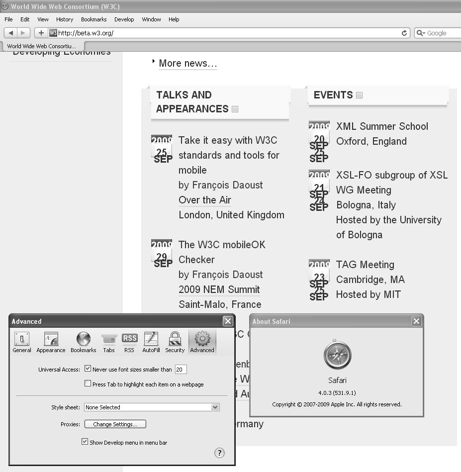
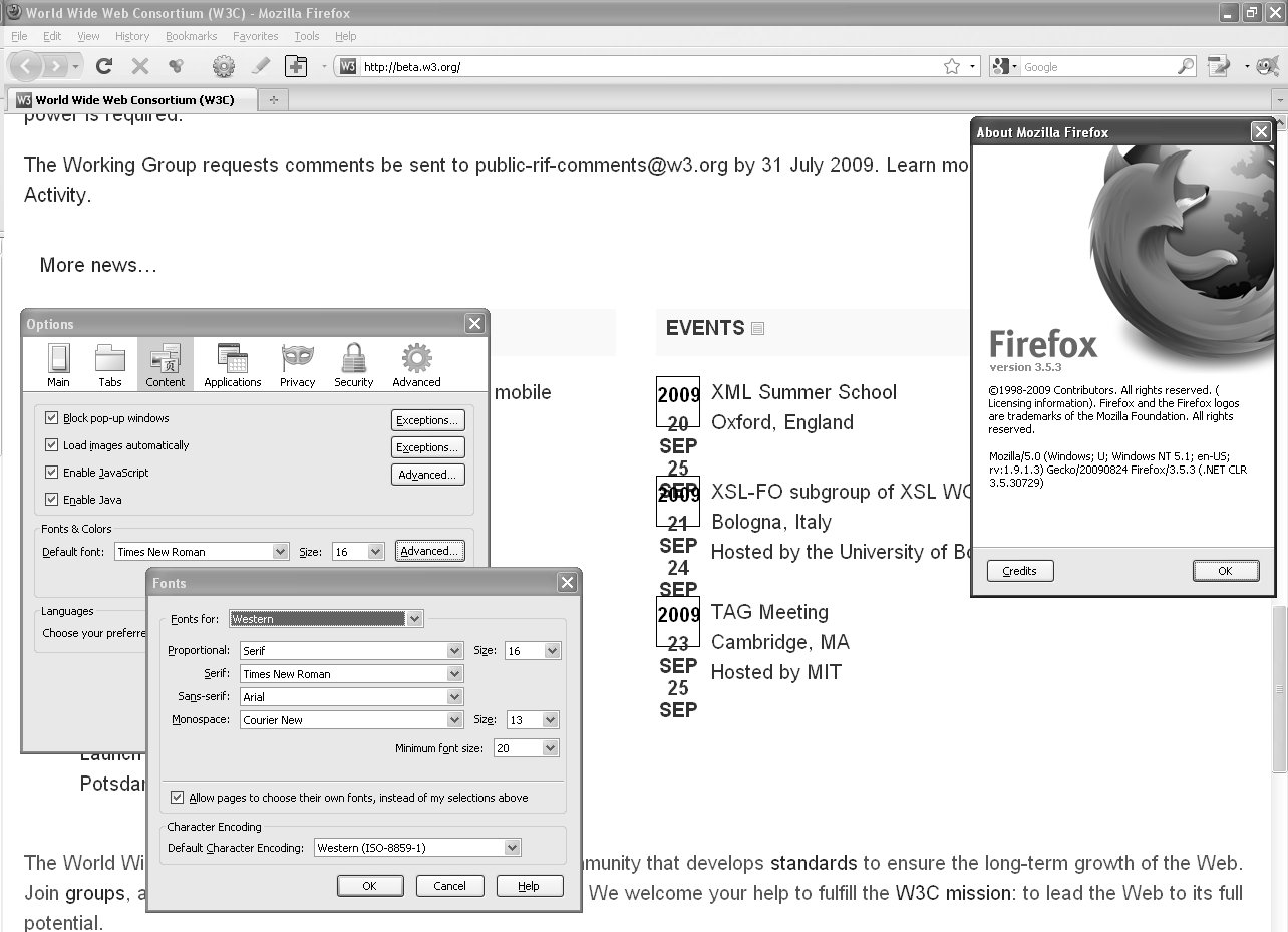
As you requested, attached is the screen shots in Firefox 3.5 (print layout) and Safari 4 (desktop layout) showing dates overlapping when the browser's minimum font size is set to 20.
Thanks,
Greg
-------- Original Message --------
Subject: Re: Comments on Beta Web site design
From: Ian Jacobs <ij@w3.org>
To: Greg Lowney <gcl-0039@access-research.org>
Cc: site-comments@w3.org
Date: Wed, 23 Sep 2009 10:20:35 -0500
On 17 Sep 2009, at 6:08 PM, Greg Lowney wrote:
A few comments after a quick pass over the current incarnation of
http://beta.w3.org/, as of 2009-09-17 1 PM PDT.
Hi Greg,
Thank you for the comments! I have incorporated them into our todo list:
http://www.w3.org/2009/11/beta-comments.html
Some comments below.
• The tiny triangle used to indicate expanded/contracted content
is too subtle, making it both hard to tell if something is expanded or
contracted and hard to see that you have the option. (Just because
Apple uses it doesn’t, in this case, make it good—easily
perceivable—user interface design.)
We will look into this but may leave as is. A "plus" sign might work
(which we used to have).
• When you tab to the three views buttons (print, mobile, desktop)
the focus rectangle stretches all the way from the edge of the W3C
logo to the button that has the focus, including any other buttons to
its left. It should be only on the button that has the focus.
We'll try to fix this.
• I consider the style imposed for links (a thick but very light
blue underline) to be too subtle and hard to see, especially on the
light gray background where the contrast is very low.
We'll investigate (but may leave as-is before deployment).
• When overriding author-specified colors (e.g. in Firefox,
turning off Tools -> Options -> Content -> Colors -> Allow pages to
choose their own colors, instead of my selections above) and leaving
the default white background, all icons become invisible, being white
lines on the default white background. (This includes the buttons for
Print, Mobile, and Desktop views are invisible, as well as icons in
the list of Standards.)
We'll try to fix that.
• Interesting that neither the U.S. nor North America are not
listed in “W3C By Region”; are the designers U.S.-based and consider
it above such categories :-)
This point has been made one other time. The main www.w3.org site is in
English and not geared to any particular region. The W3C by Region sites
are hosted by W3C Offices and there's no Office in the US or North America.
I'm not sure how to communicate this via the menu.
• The Tab order is quite inconsistent with the visual layout. The
Tab order should generally go left to right, top to bottom, except
where there is a good reason to do otherwise. The current page starts
with the “Skip” link on the right side, third line down, then jumps to
the upper left for the W3C logo, then goes to the Search field (far
right, second row down), then UP to the drop-down list of regions,
then RIGHT to the Go button, then skips LEFT to the left-most view
button, then RIGHT through the other enabled view buttons, then down
and to the left to the Standards page tab and rightwards through them,
then SKIPS RIGHT to the “Seach” button that should have been
immediately after the Search box., etc.
When designing the home page navigation I received a suggestion that we
ensure that three links in particular be easy to tab to:
* skip link
* home page link (for quick re-orientation)
* search link
I can certainly remove the second two and the tab order would become
much more consistent with the document order.
• The “Permalink” buttons should have unique Alt text, as in
“Permalink for W3C Announced Two New Co-Chairs…”.
That problem will be fixed as part of a general cleanup of permalinks.
• When Images are turned off there is nothing replacing the View
button icons; there should be Alt text for these images.
We are likely to address that by replacing the view buttons with a short
text string.
• DIV elements used to divide the page into navigational sections
should have Title attributes giving them human-friendly names, so that
users of assistive technology can navigate easily.
In general we try to use headers for this purpose. I'm not sure that I
will also title DIV elements when the headers convey the structure of
the page. We've worked to ensure that the home page outline is complete
and clear. Are there other pages you are referring to?
• When Images are turned off, and using the default color scheme
that has a white background, the years for events are nearly
invisible, being white text on a light gray background.
We'll fix.
• When text size is enlarged sufficiently (in Firefox 3 or Safari
4, View -> Zoom), the links for Standards, Participate, etc. disappear
altogether as the text is below the bottom edge of the div.
We'll investigate. I'm not sure that we will fix that one because it
took me increasing the font size 7 stops before I encountered that, and
the problem does not manifest itself in the mobile view (which may be a
better view at very large text sizes).
• With a large minimum text size set the links for Standards,
Participate, etc. are cut off because the size of the div containing
them does not grow to accommodate their increased height. (In Firefox
3, Tools -> Options -> Content -> Fonts & Colors -> Advanced ->
Minimum Font Size; in Safari 4, Edit -> Preferences -> Never use fonts
smaller than -> 20.)
That seems like it is the same issue as the previous one.
• With a large minimum text size set the Event dates overlap each
other as their containing boxes don’t grow in height to accommodate
them. In Safari 4, the lines of text for one entry overlap each other
because their vertical spacing does not increase sufficiently. (In
Firefox 3, Tools -> Options -> Content -> Fonts & Colors -> Advanced
-> Minimum Font Size; in Safari 4, Edit -> Preferences -> Never use
fonts smaller than -> 20.)
If you are referring to events on the home page, I'm not seeing that
either in Firefox or Safari. Could you send me a screen shot?
• In Internet Explorer 6, the page does not respect text size
changes specified by the user (View -> Text size -> Largest).
Thank you for sending that one; we will be turning our attention to IE 6
support once we have resolved the issues we can address before deployment.
• When increasing the font size (e.g. in Firefox 3, View -> Zoom)
the bottom section of the page does not text-wrap to the window width.
(The rest of the page does.)
We will investigate that one as well.
Oddly enough, I've also encountered some strange but not replicable
behavior. For example, once the two sections on the left were both
labeled "Web for All", once the amount of content increased when I
browsed away and back, etc.
We are making changes regularly, and so some intermittent weirdness may
have gone away.
Thanks again,
_ Ian
--
Ian Jacobs (ij@w3.org) http://www.w3.org/People/Jacobs/
Tel: +1 718 260 9447
Attachments
- image/jpeg attachment: 2009-09-23_bug_in_beta.w3.org_with_Safari_minimum_font_size_20.jpg
- image/jpeg attachment: 2009-09-23_Bug_in_beta.w3.org_with_Firefox_minimum_font_size_20.jpg
Received on Wednesday, 23 September 2009 17:59:49 UTC