- From: Sorin Stefan <shorys@gmail.com>
- Date: Tue, 24 Mar 2009 13:50:10 +0000
- To: site-comments@w3.org
- Message-Id: <3a174b830903201224l3637f0aq2969661cf3aff1b@mail.gmail.com>
Hi,
Here's my small feedback:

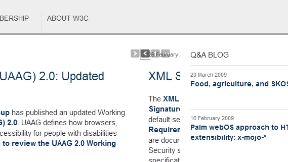
1. When moving news items left/right the date is shown above the gray
buttons/arrows. Tested with FF3.0.7
(see attach bug1.jpg)

2. The same pagination of the news items is not that intuitive. Why is
there a "1" in there. What does it mean and why is not changing to "2"
when slides to the second item. Looks like a pagination but doesn't
quite feels like one :)

3. Main menu (STANDARDS etc.) is not highlighted when selecting a
certain section. If I'm in Participate the only way of me knowing that
is looking at the breadcrumb below (W3C >> Participate) but the menu
should be highlighted too because you are showing me that on mouseover
anyway ;)

I can find more of this if you want ...
let me know
thanks and good job
--
Sorin Stefan
web developer
www.myintuition.ca
Attachments
Received on Tuesday, 24 March 2009 14:29:22 UTC
