- From: Jen Simmons <jen@jensimmons.com>
- Date: Mon, 12 May 2014 10:30:11 -0400
- To: Amelia Bellamy-Royds <amelia.bellamy.royds@gmail.com>
- Cc: Eliot Graff <Eliot.Graff@microsoft.com>, List WebPlatform public <public-webplatform@w3.org>
- Message-ID: <CAB0bRKMyBM0KhNST4_nEWcU-M_CJGgURc39CxsLE_ac4=_ohQQ@mail.gmail.com>
*DESIGN — PART 2*
[In this email, I'll show you some sketches of where we can put the
readiness markers, with some different options. Take a look at the images,
and see which options you prefer.]
Ok, so let's pretend that we all agree that we will not put the readiness
marker visually in a box on in the main content box. Where does it go?
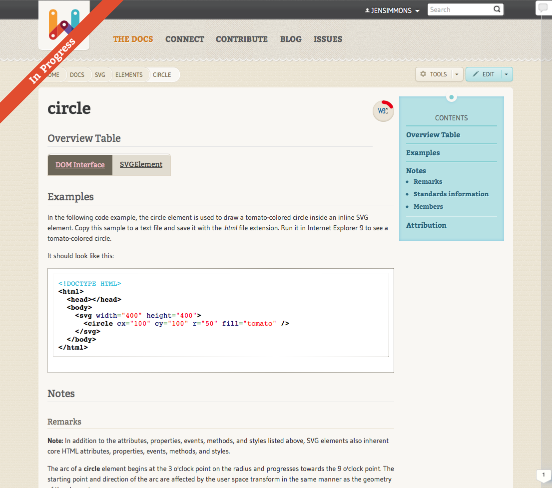
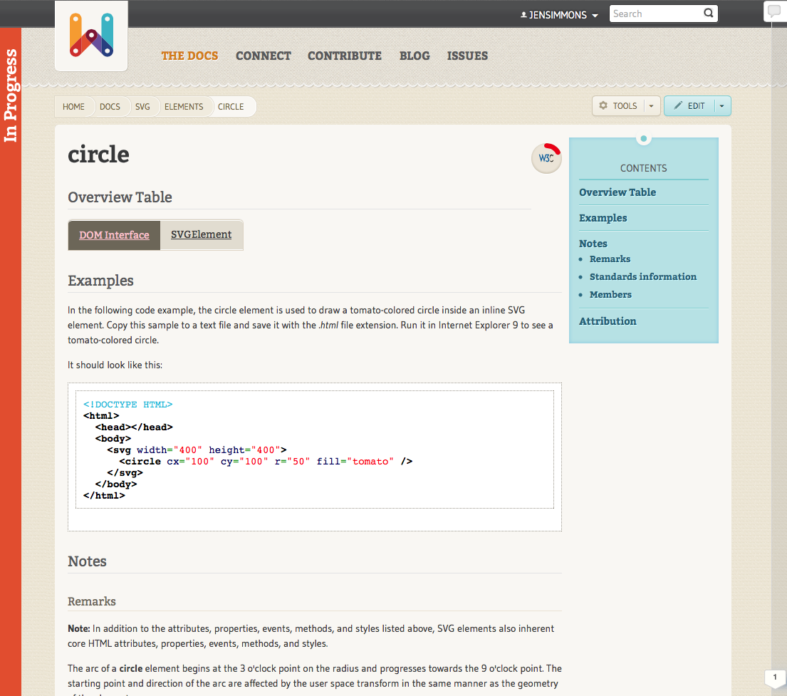
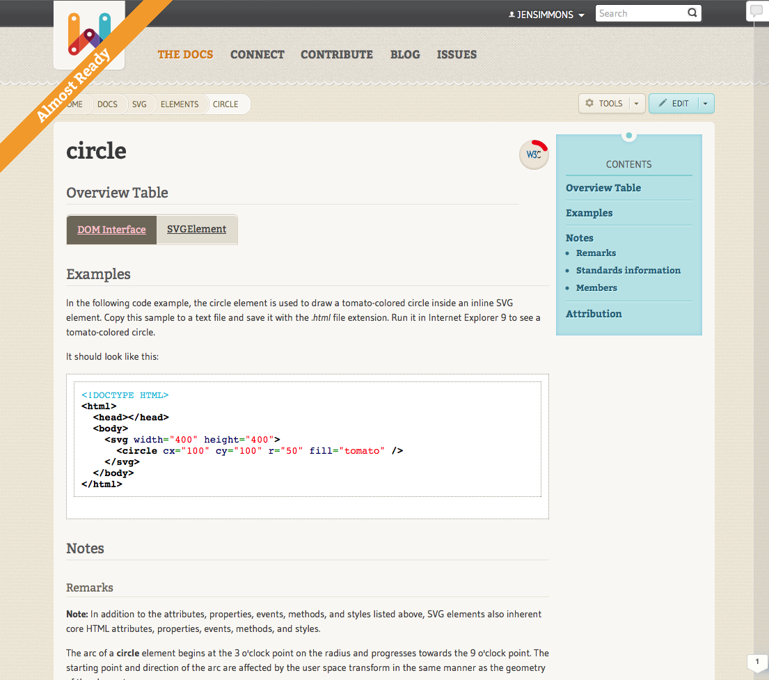
I'm playing with two ideas — 1) a diagonal ribbon across a top corner of
the page, and 2) a strip of color down the side of the page. Neither idea
is new or unique. Both will be quickly familiar to users.
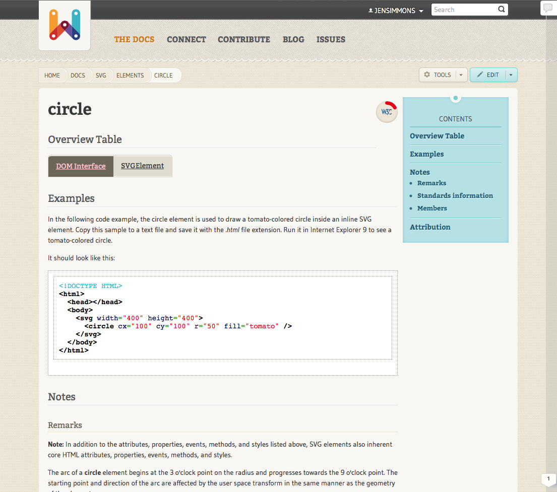
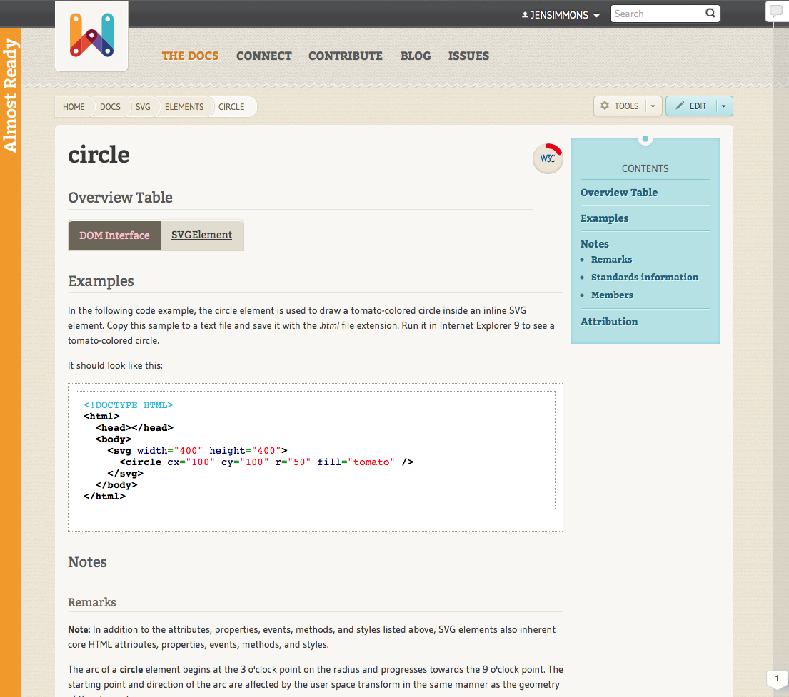
Let me first show you simple implementations of each. In both cases, the
words "In Progress" / "Almost Ready" are a link to a page that explains
what these mean and encourages people to contribute.
[image: Inline image 2][image: Inline image 4][image: Inline image 3][image:
Inline image 1]
Thoughts?
Jen
Jen Simmons
designer, consultant and speaker
host of The Web Ahead
jensimmons.com
5by5.tv/webahead
twitter: jensimmons <http://twitter.com/jensimmons>
On Mon, May 12, 2014 at 10:20 AM, Jen Simmons <jen@jensimmons.com> wrote:
> *DESIGN — PART 1*
> [I'm going to write separate emails, each with a major point. This first
> one is making a case for removing *all * warning boxes of any kind from
> the space above the content inside the white box. It's a detailed argument,
> but that's the only thing I'll talk about in here, and then start a new
> email for the next point.]
>
>
> I agree with Eilot and Doug in the last couple emails — to keep the
> readiness marker simple.
>
> I've been planning for the change to readiness states to allow us to get
> rid of having *any* kind of giant box of meta-message at the top of the
> page. I want the user to be able to get straight to the content, not be hit
> first with information about the website.
>
> Remember, a lot of users will 1) need to know Some Thing about
> HTML/CSS/SVG/JS/APIs, 2) google for help on The Thing, and 3) (hopefully
> soon) see a WPD page as a top search result and click on it. They might be
> coming to WPD for the first time. They might have never heard of WPD
> before. They might come to WPD all the time, and start to like it more than
> MDN, and land on WPD pages all the time without every taking any time to
> explore the site or understand the culture that created it. I want to
> encourage this behavior to happen more and more, even if it isn't happening
> yet.
>
> If there's a giant box of meta-stuff in the way of getting straight to the
> content, that slows people down from what they want to do. It doesn't
> really matter if the box is purple, or red & pink, or yellow, or any other
> color — it gets in the way.
>
> I want to move the Readiness Status off the main content box completely —
> the same way the edit button, the tools button, and the breadcrumb are
> outside the white content box.
>
>
> *Let me show you what I mean.*
>
> Here's a current CSS Property page:
>
> [image: Inline image 1]
>
> It's hard for a new / disoriented / busy / confused person to see what's
> going on here. There's friction introduced into the experience. A user has
> to struggle a bit to figure this out. We could debate whether that's a tiny
> bit or a large bit, but in every case, there's struggle.
>
> Here's the same page without any warning / metadata about what the WPD web
> masters think about the content:
>
> [image: Inline image 2]
>
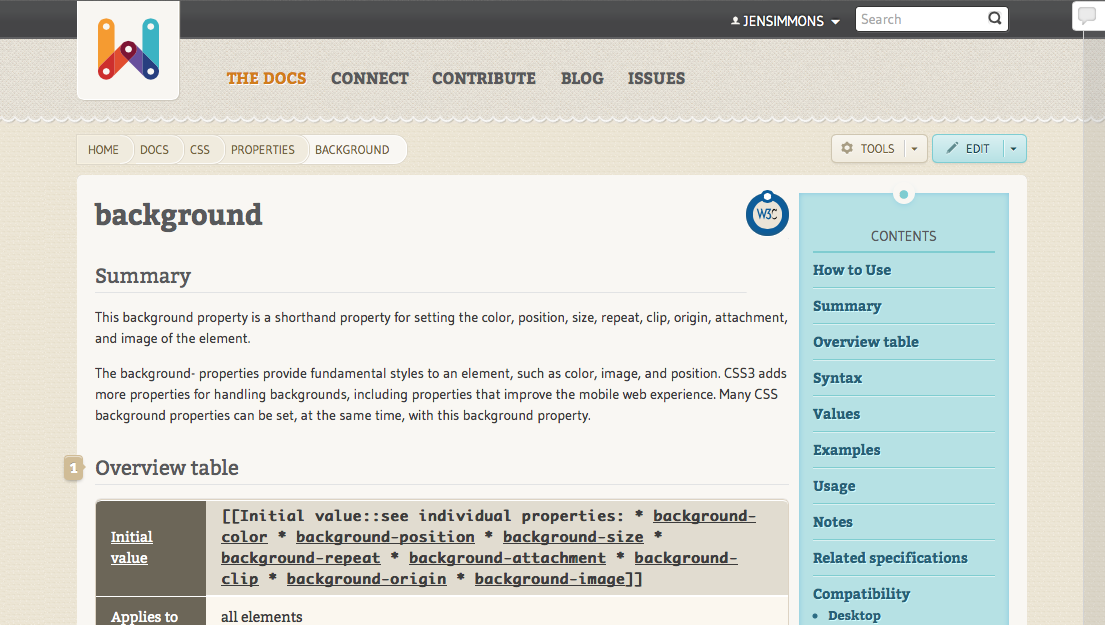
> This makes the page much clearer. Boom. "background". I know where to put
> my eyes in the first half-second. I don't start by wondering what's going
> on.
>
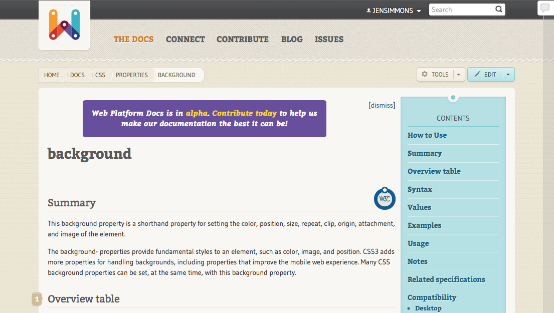
> Here's another example.
>
> Current SVG Element page:
>
> [image: Inline image 3]
>
> I find this even more confusing, because there doesn't seem to be a title.
>
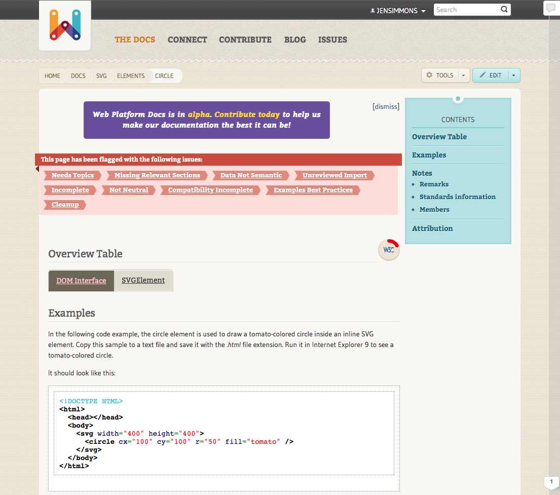
> Let's remove the warnings and add a simple title.
>
> [image: Inline image 4]
>
> Much clearer.
>
> So, I feel very strongly that we should never put a warning box above the
> content. There are many other places to convey what we need to convey.
>
> Ok, so the next question is — where do we put it?
>
> I'll answer that in my next email.
>
> Jen
>
>
> Jen Simmons
> designer, consultant and speaker
> host of The Web Ahead
> jensimmons.com
> 5by5.tv/webahead
> twitter: jensimmons <http://twitter.com/jensimmons>
>
>
>
> On Mon, May 12, 2014 at 9:34 AM, Jen Simmons <jen@jensimmons.com> wrote:
>
>> We also need to come to a final decision about definitions of the
>>> different states. Specifically: should "In Progress" only be used if the
>>> article is actively being edited, or for anything that is half done? What
>>> defines "Almost Done"?
>>
>>
>> I think that "In Progess" is for anything half-done, whether it's being
>> actively edited or hasn't been touched in a while. It doesn't affect normal
>> users (people looking for info, as opposed to people who are editing)
>> whether the last edit was last week, last month, or last year. If the
>> content is half-baked, it's "in progress".
>>
>> As for "Almost Done" — I think what defined something as Almost, instead
>> of In Progress or Ready will change all the time and be very different from
>> one kind of situation to another. I don't think we should be too
>> prescriptive about what makes a page get Almost instead of Ready. Perhaps
>> the best way to standardize it all is to say this:
>>
>>
>>
>> *Ready to Use*
>> A document should be marked Ready to Use if a developer who is looking
>> for reference material on this topic can randomly land on this page and get
>> complete, accurate information. The information on a Ready to Use page is
>> not outdated, and it's not incomplete in a way that would make the
>> information confusing. Much of the documentation on webplatform.org will
>> need to be continuously be revised and updated as standards and techniques
>> change, so Ready to Use pages don't have to always be 100% perfect. They
>> may need minor errors or quick updates. Hopefully those kinds of edits are
>> simple done as soon as the need for an edit is discovered. In that case,
>> switching the readiness status of the page in a more complex workflow
>> process isn't needed.
>>
>> *Almost Complete*
>> A document should be marked Almost Complete if it's 80% ready, but still
>> needs something that's clearly missing or inaccurate. Almost Complete
>> might be used when the descriptions are good, but there are no examples. Or
>> when the editing that humans can do is complete, but there's still
>> something else that needs to be coded in the system to make the pages ready
>> — such as connecting the compatibility tables. This could be used as a way
>> to mark a group of pages for review if an initiative needs such a tool, as
>> a kind of Q/A stage. Or this status might not be used at all; pages can go
>> straight from In Progress to Ready to Use if the circumstances warrant it.
>>
>> *In Progress*
>> A document should be marked In Progress if work on it has officially
>> begun, but it's not close to being ready yet. This marker will tell
>> developers who may stumble across the page — hey, don't trust this
>> documentation yet: It's not a reliable source of information, it's a page
>> that's being heavily rewritten. Any page that's more than 10%, but less
>> than 80% done should be marked In Progress. It doesn't matter whether there
>> is active work being done on it currently or not.
>>
>> *Coming Later*
>> A document should be marked Coming Later when it's just an idea. This can
>> be used when someone has created a page, with a URL and a title, but not
>> much else. It should also be used when content is imported from an outside
>> source, but has not been looked at by WPD contributors or restructured for
>> our system yet.
>>
>>
>> Lets put this information someplace for contributors to see. And rewrite
>> it to be better.
>>
>>
>> Lots of design screenshots coming next....
>>
>> Jen
>>
>> Jen Simmons
>> designer, consultant and speaker
>> host of The Web Ahead
>> jensimmons.com
>> 5by5.tv/webahead
>> twitter: jensimmons <http://twitter.com/jensimmons>
>>
>>
>>
>> On Sun, May 11, 2014 at 2:22 PM, Amelia Bellamy-Royds <
>> amelia.bellamy.royds@gmail.com> wrote:
>>
>>> Thanks for the feedback Eliot. I'm definitely okay with switching to a
>>> short and sweet approach if people want to get away from having big site
>>> metadata blocks at the top of each page.
>>>
>>> Your idea of putting the extra content, invitation to edit etc., into
>>> the state definition page would provide another way to make the connection
>>> between "this isn't done" and "please help finish it!".
>>>
>>> As far as I know, the only written definitions are the sample ones I
>>> drafted for the property page:
>>> http://docs.webplatform.org/test/Property:State
>>>
>>> However, if we're going to put a lot of content in there with the
>>> definitions it might be worth creating a separate page in the WPD
>>> namespace, effectively replacing the current FAQs about "What does alpha
>>> mean?"
>>>
>>> ...Amelia
>>>
>>>
>>>
>>> On 11 May 2014 12:00, Eliot Graff <Eliot.Graff@microsoft.com> wrote:
>>>
>>>> Hi Amelia.
>>>>
>>>>
>>>>
>>>> Thanks so much for undertaking this. When this is done the site will
>>>> look a ton cleaner.
>>>>
>>>>
>>>>
>>>> To me, the crucial information is this first sentence, and I think the
>>>> ultimate solution is to just call this out:
>>>>
>>>>
>>>>
>>>> *This article is Almost Done*
>>>>
>>>>
>>>>
>>>> If we make the term a link to the page with the definitions, we’ll
>>>> satisfy the requirements for this feature:
>>>>
>>>>
>>>>
>>>> *This article is **Almost Done* <http://URL_for_page_with_defintions>
>>>>
>>>>
>>>>
>>>> The target page can have the definitions plus any other information we
>>>> want to add about editing resources, joining community, etc.
>>>>
>>>>
>>>>
>>>> Sorry if I am forgetting, but do we have a wiki or page entry with
>>>> drafts for the definitions of the readiness states? I remember talking
>>>> about it, but I can’t find a link to anything. If we do, I am happy to
>>>> chime in there.
>>>>
>>>>
>>>>
>>>> Again, thank you so much for driving this forward.
>>>>
>>>>
>>>>
>>>> Eliot
>>>>
>>>>
>>>>
>>>> *From:* Amelia Bellamy-Royds [mailto:amelia.bellamy.royds@gmail.com]
>>>> *Sent:* Saturday, May 10, 2014 10:32 PM
>>>> *To:* Eliezer Bernart; Jen Simmons
>>>> *Cc:* List WebPlatform public
>>>> *Subject:* Re: new plan to replace flags with Readiness Markers
>>>>
>>>>
>>>>
>>>> This has been put on the back-burner for a couple weeks, but I've got a
>>>> bare-bones mock-up ready-to-go on the test wiki that I think meets all the
>>>> goals that have been discussed.
>>>>
>>>>
>>>>
>>>> If I could get feedback on the structure & wording before Tuesday, then
>>>> I can start rolling it out on the main site.
>>>>
>>>>
>>>>
>>>> There is still the possibility of making it prettier, with colour
>>>> coding or icons, and suggestions or comments are welcome. (I think this is
>>>> Jen's domain...) But getting it functional is the first priority.
>>>>
>>>>
>>>>
>>>> We also need to come to a final decision about definitions of the
>>>> different states. Specifically: should "In Progress" only be used if the
>>>> article is actively being edited, or for anything that is half done? What
>>>> defines "Almost Done"?
>>>>
>>>>
>>>>
>>>> The mock-up, without custom CSS, looks like [1]:
>>>>
>>>>
>>>> max-height
>>>>
>>>> *This article is Almost Done*
>>>> *: Find out more about article readiness states
>>>> <http://docs.webplatform.org/test/Property:State>, or get involved to help
>>>> make Web Platform Docs better
>>>> <http://docs.webplatform.org/test/WPD:Contributors_Guide>! Already signed
>>>> up? Go to the edit page
>>>> <http://docs.webplatform.org/t/index.php?title=css/properties/max-height&action=edit>to
>>>> find out what still needs to be done.*
>>>>
>>>> Things to note:
>>>>
>>>>
>>>>
>>>> * It takes up a large chunk of real estate on the top of the page, but
>>>> remember that it will be replacing the big purple warning box [2]. The
>>>> extra text serves the same purpose as the warning box, but now it's on a
>>>> page-by-page basis instead of everywhere.
>>>>
>>>>
>>>>
>>>> * As agreed in the teleconference of April 29 [3], if the state is
>>>> marked "Ready to Use", nothing prints out.
>>>>
>>>>
>>>>
>>>> * Also as agreed, the status details field is not used at all on the
>>>> final page (View mode), but would still show up when editing the form. The
>>>> form will also have a link to the Property page [4] with definitions of the
>>>> different states.
>>>>
>>>>
>>>>
>>>> * The info text is the same regardless of state, all that changes is
>>>> the "This article is..." heading.
>>>>
>>>>
>>>>
>>>> * The box uses the existing "Note" template, but the note is wrapped in
>>>> a div with a state-dependent class name, so we can target it later for
>>>> specific CSS (e.g. to match the colours and icons used on the home page).
>>>> For Ready To Use articles, there is an empty div if we decide to add an
>>>> icon later.
>>>>
>>>>
>>>>
>>>> If you want to play around with CSS, the final structure created by
>>>> the templates is
>>>>
>>>>
>>>>
>>>> <div class="article-state State_Class"><div class="note">
>>>>
>>>> <p><b>This article is {{{State}}}:</b><br/>
>>>>
>>>> Find out more...</p>
>>>>
>>>> </div></div>
>>>>
>>>>
>>>>
>>>> where State_Class would be one of Ready_to_Use, Almost_Done,
>>>> In_Progress, Coming_Later, or Unreviewed.
>>>>
>>>>
>>>>
>>>> * For the test wiki, the above is currently encapsulated in its own
>>>> template [5], but for roll-out it would just replace the existing flags
>>>> template, and would appear on all pages that currently have the ability to
>>>> display flags.
>>>>
>>>>
>>>>
>>>> And of course, the template is just the first step. Once we get it up,
>>>> we still have to go through and review everything to assign a state!
>>>>
>>>>
>>>>
>>>> ...Amelia
>>>>
>>>>
>>>>
>>>> [1]: http://docs.webplatform.org/test/css/properties/max-height
>>>>
>>>> [2]:
>>>> http://lists.w3.org/Archives/Public/public-webplatform/2014Apr/0031.html
>>>>
>>>> [3]:
>>>> http://lists.w3.org/Archives/Public/public-webplatform/2014Apr/0117.html
>>>>
>>>> [4]: http://docs.webplatform.org/test/Property:State
>>>>
>>>> [5]: http://docs.webplatform.org/test/Template:State
>>>>
>>>>
>>>>
>>>>
>>>>
>>>>
>>>>
>>>>
>>>>
>>>> On 28 April 2014 20:54, Eliezer Bernart <eliezer.bernart@gmail.com>
>>>> wrote:
>>>>
>>>> Hello,
>>>>
>>>> The topic will be discussed with more emphasis tomorrow in the meeting,
>>>> based on the agenda topics. So let's wait for the final decisions and then
>>>> we can make our moves.
>>>>
>>>> Thank you Amelia, for your efforts!
>>>>
>>>>
>>>>
>>>>
>>>> Eliezer
>>>>
>>>>
>>>>
>>>> @eliezerbernart
>>>>
>>>> eliezerb
>>>>
>>>>
>>>>
>>>> On Sat, Apr 26, 2014 at 4:51 PM, Amelia Bellamy-Royds <
>>>> amelia.bellamy.royds@gmail.com> wrote:
>>>>
>>>> Hey Eliezer (and all),
>>>>
>>>>
>>>>
>>>> I've been playing around with the test wiki, trying to figure out a way
>>>> to get a "show details" set-up to work.
>>>>
>>>>
>>>>
>>>> One common approach is to use a hidden checkbox (so that the label of
>>>> the checkbox is the link, and a combination of :checked pseudoclass
>>>> selectors and sibling selectors is used to show hide content). However,
>>>> Mediawiki converts any `<input>` tags to plain text, so that doesn't work.
>>>> Same goes for `<details>`/`<summary>` tags, which also have the downside
>>>> of not being supported in many browsers.
>>>>
>>>>
>>>>
>>>> Another approach, which is slightly better semantically but which has
>>>> the side effect of jumping the scroll position, is to use a same-page link
>>>> to target the details and then use a `:target` pseudo-class to display the
>>>> content. I've got that implemented in the test template [1], so that it
>>>> prints to the page like
>>>>
>>>>
>>>>
>>>> *Page status:* <http://docs.webplatform.org/test/Property:State> Almost
>>>> Done Details...<http://docs.webplatform.org/test/css/properties/max-height#showStateDetails>
>>>>
>>>>
>>>>
>>>> Note that to avoid having two different links one after another, I've
>>>> removed the link on "Almost Done" and instead added a link to the "Page
>>>> status" heading. That link goes to the property page [2], which I've
>>>> edited a bit to show my idea of having it as a useful reference page, with
>>>> definitions of the different property values and links to
>>>> search-by-property for each value.
>>>>
>>>>
>>>>
>>>> However, even in the test wiki I don't seem to have permission to make
>>>> the relevant changes to the common CSS file [3] to enable the show/hide
>>>> functionality. It would need to be edited to add this block:
>>>>
>>>>
>>>>
>>>> div#showStateDetails:not(*:target) #stateDetails{
>>>>
>>>> /* hide if the browser supports the :target pseudoclass AND
>>>>
>>>> the showStateDetails target isn't active */
>>>>
>>>> display: none; speak:none;
>>>>
>>>> }
>>>>
>>>> div#showStateDetails:target #stateDetailsLink {
>>>>
>>>> /* hide after being activated */
>>>>
>>>> display: none; speak:none;
>>>>
>>>> }
>>>>
>>>>
>>>>
>>>>
>>>>
>>>> [1]:
>>>> http://docs.webplatform.org/t/index.php?title=Template:State&action=edit
>>>>
>>>> [2]: http://docs.webplatform.org/test/Property:State
>>>>
>>>> [3]: http://docs.webplatform.org/test/MediaWiki:Common.css
>>>>
>>>>
>>>>
>>>> -ABR
>>>>
>>>> P.S. I hadn't clued in to the fact that there was a full wiki copy for
>>>> playing around. I'll know in the future not to dump sample code into an
>>>> email when I can create a functional sample page instead!
>>>>
>>>>
>>>>
>>>> On 24 April 2014 22:07, Eliezer Bernart <eliezer.bernart@gmail.com>
>>>> wrote:
>>>>
>>>> Hey folks!
>>>>
>>>> Today I worked on the new State templates (our old Flags Templates) on
>>>> test wiki.
>>>>
>>>> I followed some of the points talked today on IRC.
>>>>
>>>> So here is a Summary of what I did:
>>>>
>>>> a) Using the name "State" for the Semantic Templates [1][2] and
>>>> Properties [3][4];
>>>>
>>>> b) Keeping the text field "State Details" in the semantic form [5].
>>>> It's really large, but we can easily resize it to any dimension;
>>>>
>>>> c) State is a Dropdown with only the allowed values in the semantic
>>>> property State [3]. We still have a blank option, that I'm trying to figure
>>>> out a way to remove, if someone know how to do, please update the template
>>>> or let me know.
>>>>
>>>> d) The field "State Details"[4] will not be displayed in the form when
>>>> the user select the option "Ready to Use" in the State field.
>>>>
>>>> e) On the document [6], it's being displayed the link to all the pages
>>>> with the same State;
>>>>
>>>> f) I was not able to find a way to create the <a> tag and make a button
>>>> to hide and show the div which has the content of the "State Details"
>>>> section. If someone has any idea of how do that, please let us know!
>>>>
>>>> g) The "Flags" template [7] was removed from the form, and in that
>>>> place included the "State" template [1].
>>>>
>>>>
>>>>
>>>> If I forgot something or you think that something need to be changed,
>>>> please let us know! To see the changes you just need hit the edit button in
>>>> any document [6].
>>>>
>>>> Thank you all!
>>>>
>>>>
>>>> [1] http://docs.webplatform.org/test/Template:State
>>>> [2] http://docs.webplatform.org/test/Template:State_Form_Section
>>>> [3] http://docs.webplatform.org/test/Property:State
>>>> [4] http://docs.webplatform.org/test/Property:State_Details
>>>>
>>>> [5]
>>>> http://docs.webplatform.org/t/index.php?title=css/properties/max-height&action=formedit
>>>> [6] http://docs.webplatform.org/test/css/properties/max-height
>>>> [7] http://docs.webplatform.org/test/Template:Flags
>>>>
>>>>
>>>>
>>>>
>>>> Eliezer
>>>>
>>>>
>>>>
>>>> @eliezerbernart
>>>>
>>>> eliezerb
>>>>
>>>>
>>>>
>>>> On Tue, Apr 22, 2014 at 3:52 PM, Jen Simmons <jen@jensimmons.com>
>>>> wrote:
>>>>
>>>> Ahhh! This email escaped from me before it was done!!
>>>>
>>>>
>>>>
>>>> I was about to write a section about the open text field:
>>>>
>>>> * 2) an open text field where editors can leave comments about
>>>> what is needed. *
>>>>
>>>> Rather than trying to organize information about what each
>>>> page needs into a pre-fab list of checkboxes (that everyone has to learn
>>>> about before it becomes accurate or useful), we decided to have an open box
>>>> where people can write whatever is appropriate. "Needs an example". Or "I
>>>> changed this foo thing, but I'm not sure. Will someone check it?" Over time
>>>> if we see a need to have something more, we can add some kind of flag
>>>> system later.
>>>>
>>>>
>>>>
>>>> We will use the readiness marker to also add a class to the body
>>>> element of each doc page, like:
>>>>
>>>> <body class="almost-done">
>>>>
>>>> That way we can use the class to style the page however we want. We can
>>>> put a colored stripe down the side of the page, or put a diagonal banner
>>>> across a corner, or whatever. The body class alone provides everything
>>>> needed to make the state of the page clear to the end user.
>>>>
>>>>
>>>>
>>>> We might want to consider adding the state to the text of the page as
>>>> well, for accessibility reasons. We should think this through. It's not
>>>> needed in cases where there is no screen reader.
>>>>
>>>>
>>>>
>>>> I'm hoping that having the readiness state clearly displayed on each
>>>> page will
>>>>
>>>> 1) help improve the trustworthiness of our content, and
>>>>
>>>> 2) encourage people to help edit the content. If it says "almost
>>>> ready", you can click & see in a clear box what's needed. Sign in, edit,
>>>> change the state, and save — and when you save, the color coding state for
>>>> the whole page will change. Exciting!!
>>>>
>>>>
>>>>
>>>> We also want to figure out how we can better make lists of things. I
>>>> want to see all HTML pages that are Almost Ready. I want to see everything
>>>> that was moved to In Progress last week, etc.
>>>>
>>>>
>>>>
>>>> Questions? Comments?
>>>>
>>>>
>>>>
>>>> Jen
>>>>
>>>>
>>>>
>>>>
>>>> Jen Simmons
>>>>
>>>> designer, consultant and speaker
>>>>
>>>> host of The Web Ahead
>>>>
>>>> jensimmons.com
>>>>
>>>> 5by5.tv/webahead
>>>>
>>>> twitter: jensimmons <http://twitter.com/jensimmons>
>>>>
>>>>
>>>>
>>>>
>>>>
>>>> On Tue, Apr 22, 2014 at 2:44 PM, Jen Simmons <jen@jensimmons.com>
>>>> wrote:
>>>>
>>>> On today's call, we had a long and fruitful discussion about the
>>>> flags on the site, and the plan to change them. We revised the revised
>>>> plan. Here's what we decided:
>>>>
>>>>
>>>>
>>>> *A) Remove the mediawiki template that provides the current flag
>>>> system. *
>>>>
>>>>
>>>>
>>>> This will keep the existing data in the database, but hide all evidence
>>>> of it. Flags will no longer be displayed on a page for a regular user, and
>>>> the flag form checkboxes will no longer show up for someone who's editing
>>>> the page.
>>>>
>>>>
>>>>
>>>> This will fix the problem that's been happening — people being scared
>>>> away from the site by a long list of RED THINGS that SOUND SCARY but are
>>>> actually quite hard to understand. Rather than trying to implement a
>>>> complex educational process to teach everyone what all those flags mean, a
>>>> decision was made long ago to simplify them. Today we realized rather than
>>>> replacing them with simpler editor-focused technical to-do-list terms, we
>>>> should be replacing them with end-user-focused information about the
>>>> quality of the content. Thus will will:
>>>>
>>>>
>>>> *B) Add a "Readiness Marker" — two new fields to all Doc pages:*
>>>> * 1) a drop down select with five choices: *
>>>>
>>>> > Ready to Use
>>>> > Almost Done
>>>> > In Progress
>>>> > Coming Later
>>>>
>>>> > -unknown- (default)
>>>>
>>>> * 2) an open text field where editors can leave comments about
>>>> what is needed. *
>>>>
>>>>
>>>>
>>>>
>>>>
>>>>
>>>>
>>>> There was a lot of discussion about the fact the current flags
>>>> kinda-sorta don't even work right now. If you click on a flag term, it
>>>> should go to a list of all content with that flag — and it doesn't. Of
>>>> course, as smart developers in the meeting people's started thinking
>>>> through how we could make this work... but a decision was made that this is
>>>> not a priority and we have other things that are more pressing to work on
>>>> (like getting the compatibility tables done). So we will *not* be
>>>> working on any kind of flag system that makes lists of content anytime soon.
>>>>
>>>>
>>>>
>>>> It was agreed that we do need better ways for contributors to find
>>>> tasks, and more easily find a set of pages to edit. We agreed that this
>>>> should be approached from a design perspective (let's first ask: what kind
>>>> of lists do people want? what kind of tools could be helpful? what is it
>>>> people are looking for?) and then come up with a plan to choose technology
>>>> to fulfill that need (which might include a new set of flags), instead of
>>>> focusing on the flags alone and forcing a solution that might not meet the
>>>> needs at hand.
>>>>
>>>>
>>>>
>>>>
>>>>
>>>>
>>>>
>>>>
>>>>
>>>>
>>>> Jen Simmons
>>>>
>>>> designer, consultant and speaker
>>>>
>>>> host of The Web Ahead
>>>>
>>>> jensimmons.com
>>>>
>>>> 5by5.tv/webahead
>>>>
>>>> twitter: jensimmons <http://twitter.com/jensimmons>
>>>>
>>>>
>>>>
>>>>
>>>>
>>>>
>>>>
>>>>
>>>>
>>>>
>>>>
>>>>
>>>>
>>>
>>>
>>
>
Attachments
- image/png attachment: ex2-simplified.png
- image/png attachment: ex2-stripe-almost.png
- image/png attachment: ex1-before.png
- image/png attachment: ex2-before.png
- image/png attachment: ex1-simplified.png
- image/png attachment: ex2-ribbon-inprogress.png
- image/png attachment: ex2-stripe-inprogress.png
- image/png attachment: ex2-ribbon-almost.png
Received on Monday, 12 May 2014 14:30:43 UTC