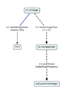
FWIW, we spent some time designing intuitive visualizations of OWL a
few years ago for our COE graphic tool. One conclusion was that it is
very confusing when OWL properties are sometimes seen as links and
sometimes seen as nodes, and that it is much better to keep the
graphic 'types' aligned consistently. So we represent domain and range
by a special arc graphic (bold dashed lines) running from the domain,
through the property arc, to the range. This way, the properties stay
as arc labels and the classes as node labels. The result is intuitive
(because people easily think of an OWL property as having a direction)
so very easy to learn; and once learned, very easy to see, even in
quite complex ontologies. Here's an example from the Wine ontology:
On Jun 25, 2009, at 5:23 AM, Bernhard Schandl wrote:

> Brian,
>
>> I think you're "better" graphic has an extra rdf:domain where an
>> rdf:range should be.
>
> many thanks, fixed that. This shows again how careful one has to be
> when it comes to visualization ;-)
>
> Best, Bernhard
>
>
>
>

------------------------------------------------------------
IHMC                                     (850)434 8903 or (650)494 3973
40 South Alcaniz St.           (850)202 4416   office
Pensacola                            (850)202 4440   fax
FL 32502                              (850)291 0667   mobile
phayesAT-SIGNihmc.us       http://www.ihmc.us/users/phayes